Let’s start a new design project together!
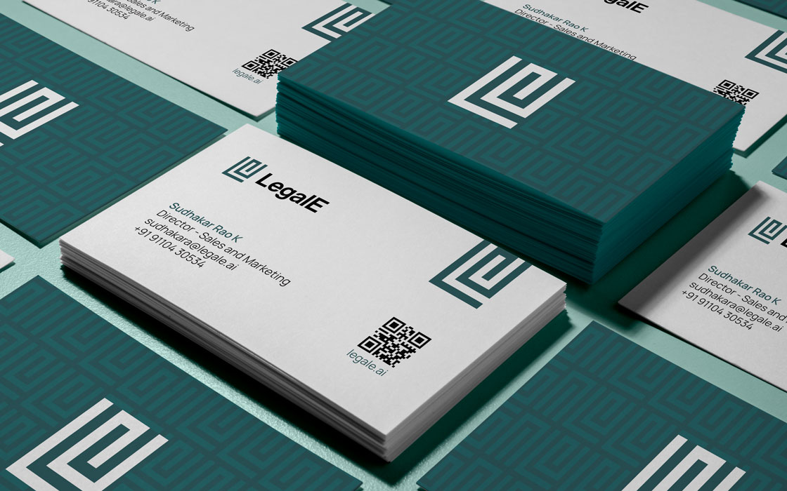
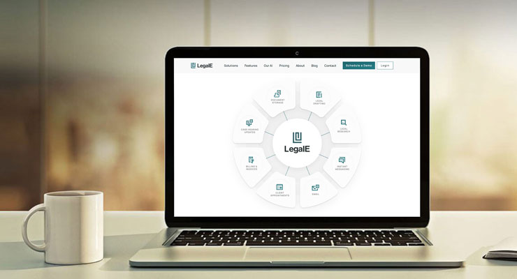
LegalE is a legal practice management app designed to simplify the practice for lawyers by digitizing and organizing files.
Rezonant helped create a strong brand identity and positioning for LegalE.
Challenge
LegalE is a digital law practice platform, designed to help lawyers take their practice to the cloud. The challenge was to come up with a memorable name and a unique visual identity which resonates with their unconventional idea.
Strategy
Rezonant carried out a detailed benchmarking study for the naming and branding of LegalE.
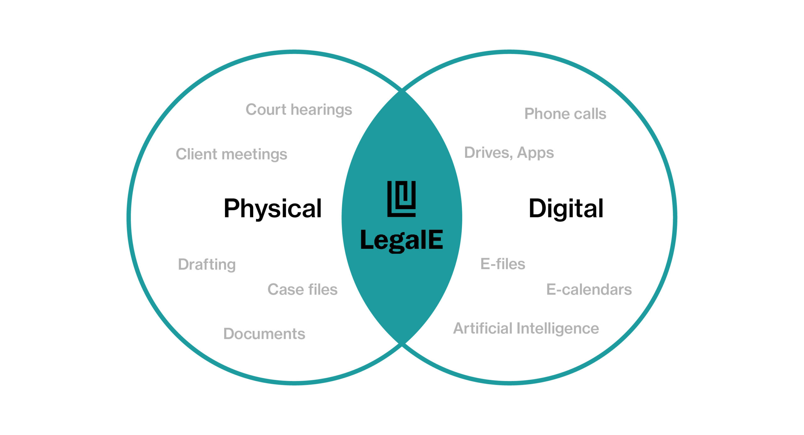
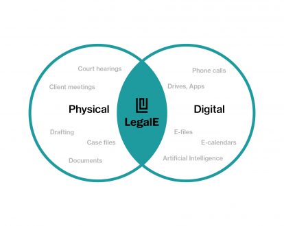
The platform aims to introduce a digital arm into the legal world. Building on this principle, the name LegalE was derived, translating to the tech aspect of the legal world.
Design
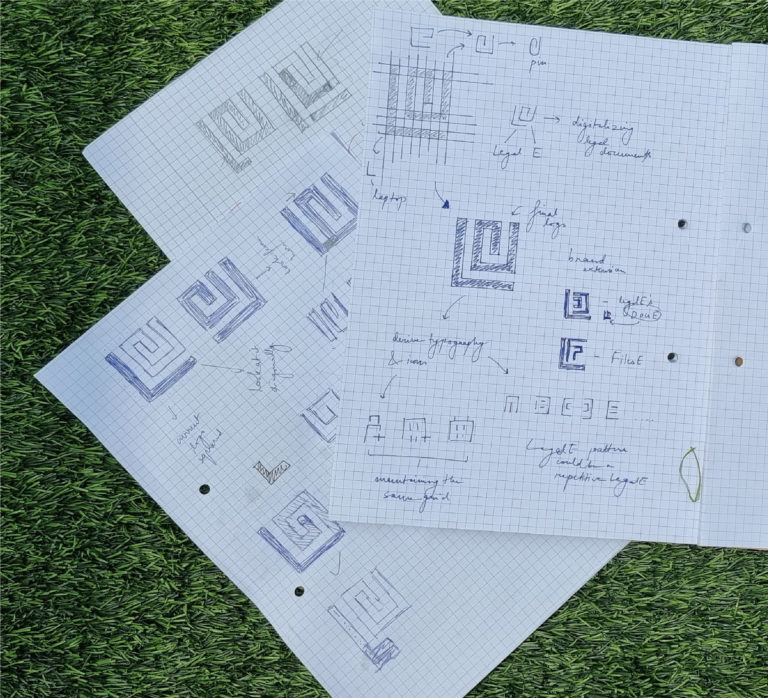
The brand identity is an extension of the name LegalE. It further expands on the amalgamation of the digital and physical aspects of the legal world.
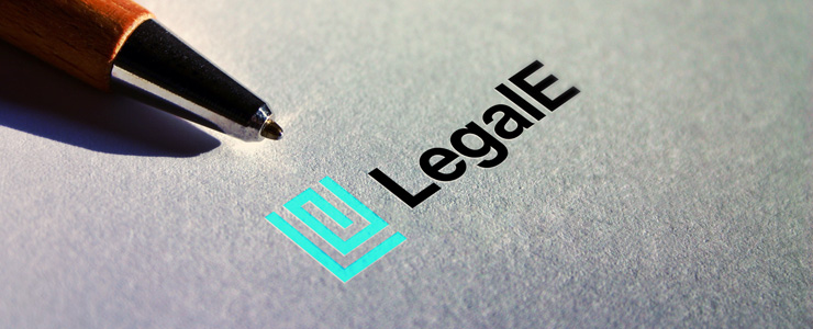
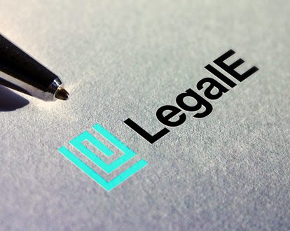
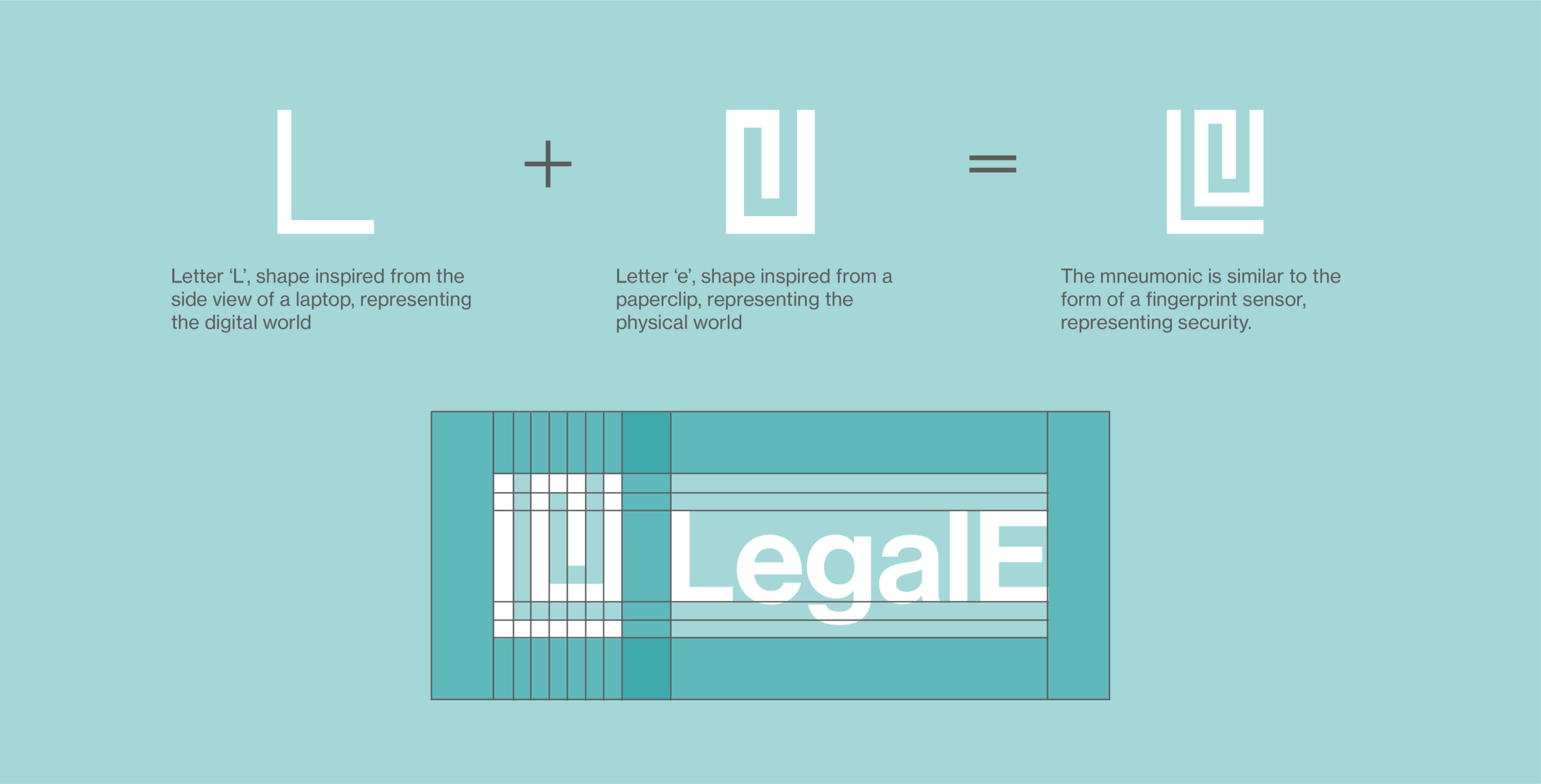
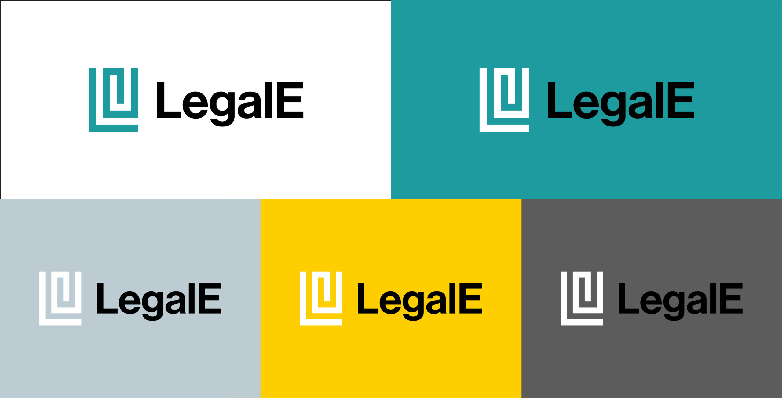
The logo consists of three elements –
- Paper Clip representing physical documents
- Laptop representing the digitalization of data
- Thumbprint representing security of confidential data
The logo is a combination of physical and digital components with an added element of security.
Brand Colours
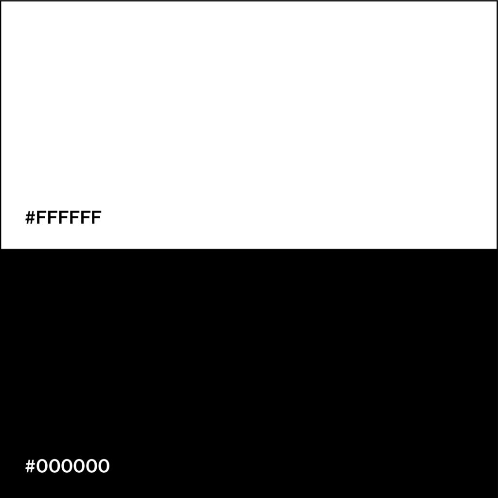
Black and white are the key colours used across the identity. Black signifies authority, seriousness and power while white symbolizes a new beginning. Black and white are also the most commonly associated colours with lawyers.
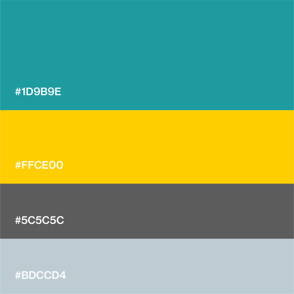
Teal and Yellow add a pop of colour to the palette. Yellow has been used as an accent colour to draw attention to different elements and add an element of interest. Greys have been used to balance out the palette.
Typography
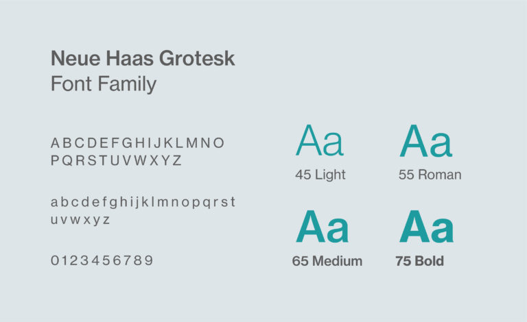
The typeface used as a part of the brand identity is Neue Haas Grotesk.
It was designed by Christian Schwartz, Max Miedinger and published by Linotype. Neue Haas Grotesk contains 22 styles and family package options. Varying contrasts and excellent legibility make this font a perfect fit for LegalE’s design language.
It also resonates with the sharp corners and bold lines used in the logomark.
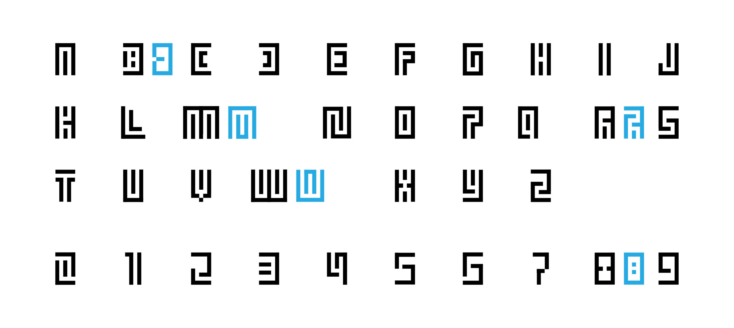
Custom Display Typeface
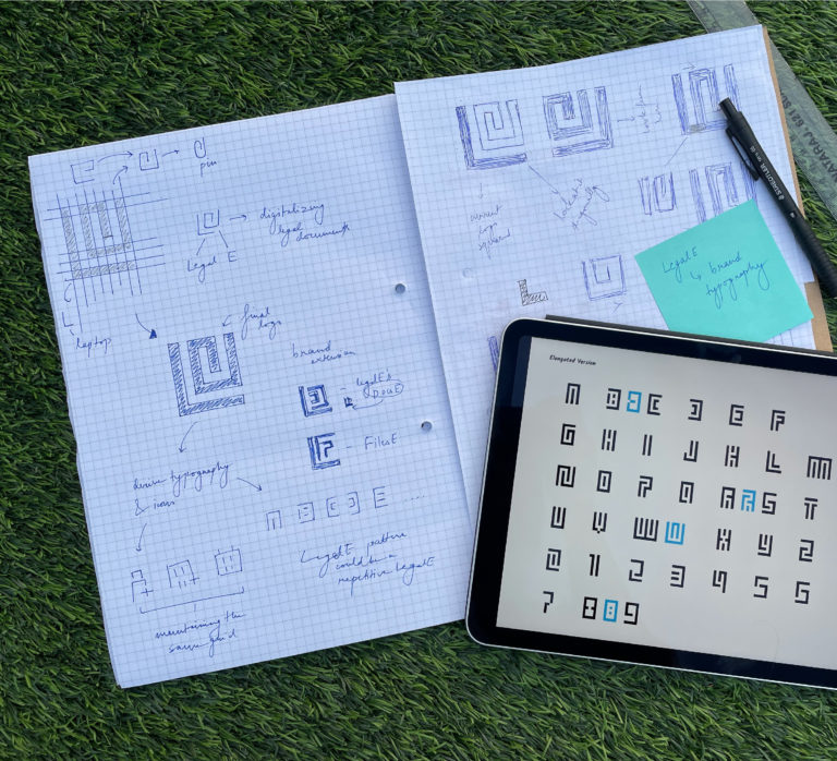
We developed a custom typeface as an extension of the brand identity. Retaining the sharp edges and equal positive and negative spaces, the typeface has been derived from the logomark itself.
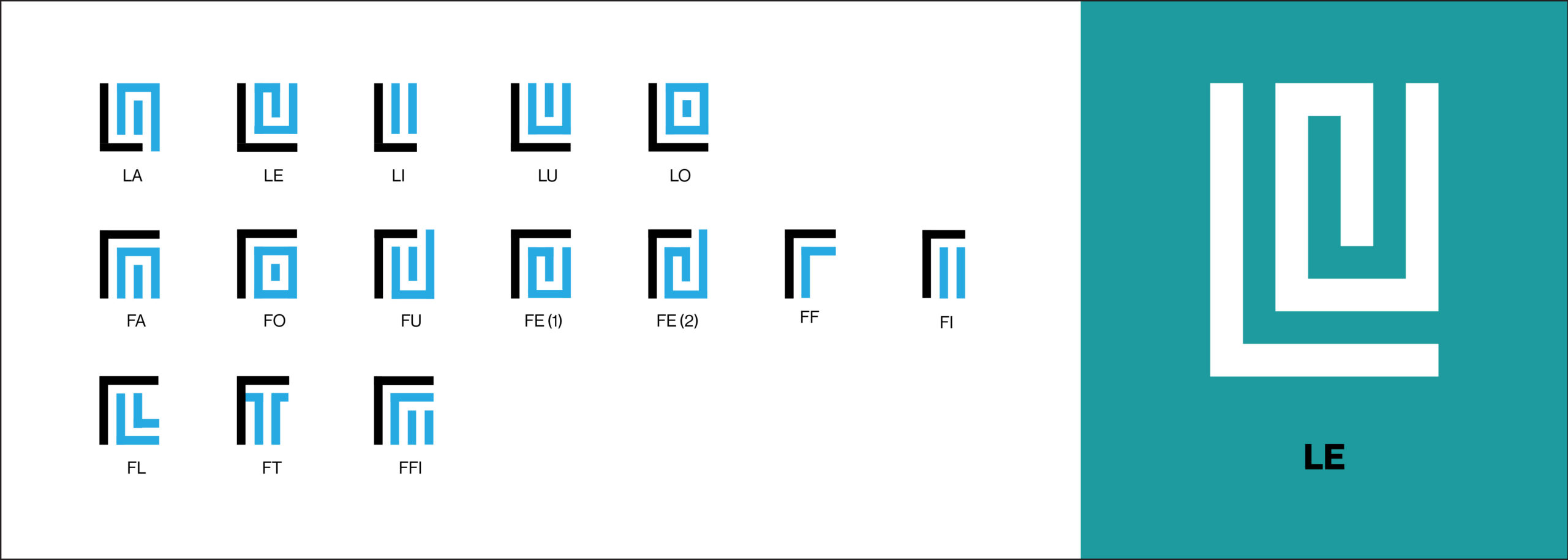
We then used the typeface to create some ligatures similar to the one used for LE in the logomark. This typeface is exclusive to the brand and can be used anywhere to promote the brand.
Brand Patterns
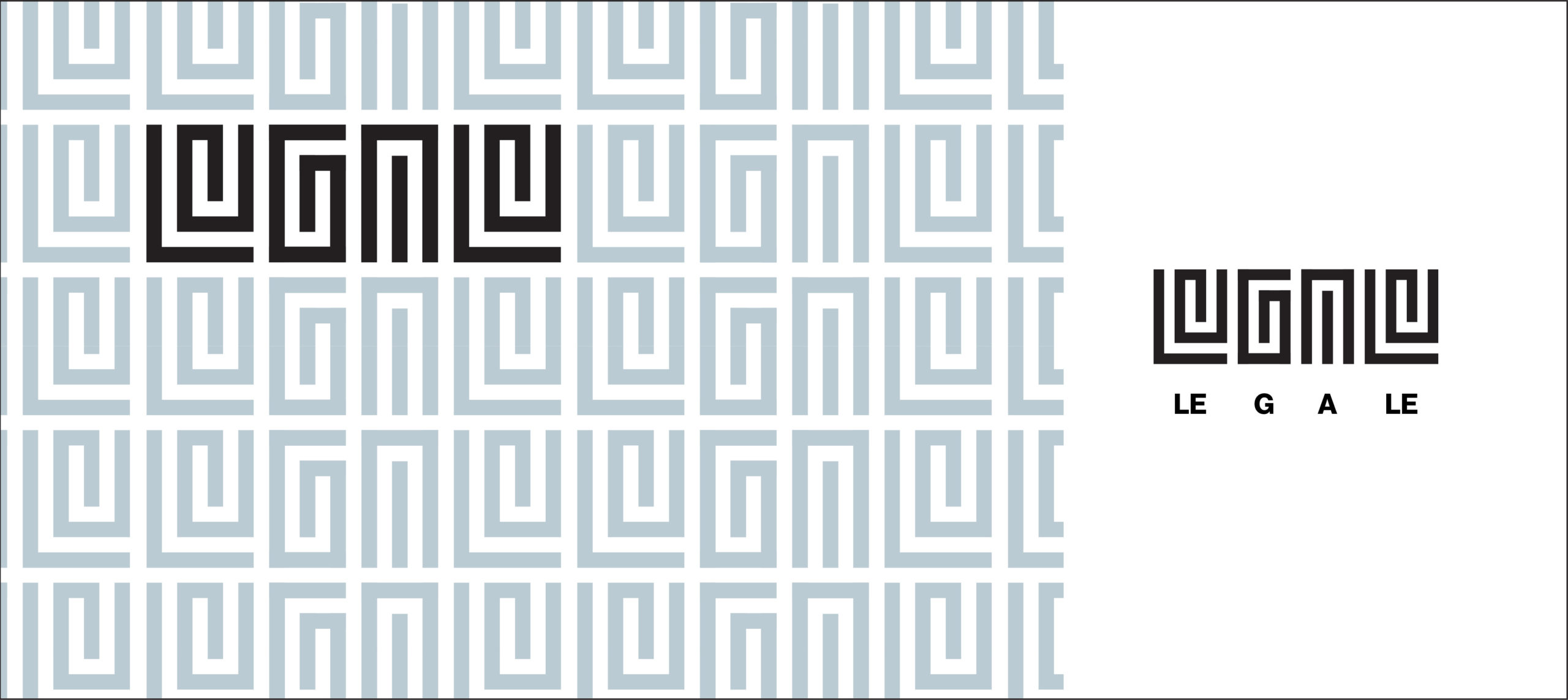
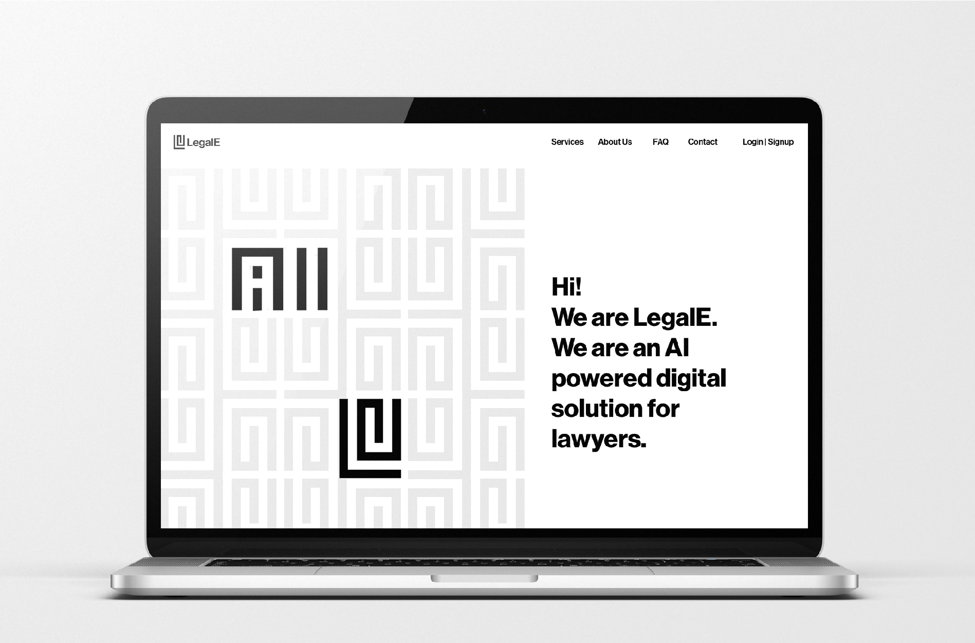
Using ligatures to create a motif spelling ‘LegalE’.
Pattern in brand colours.

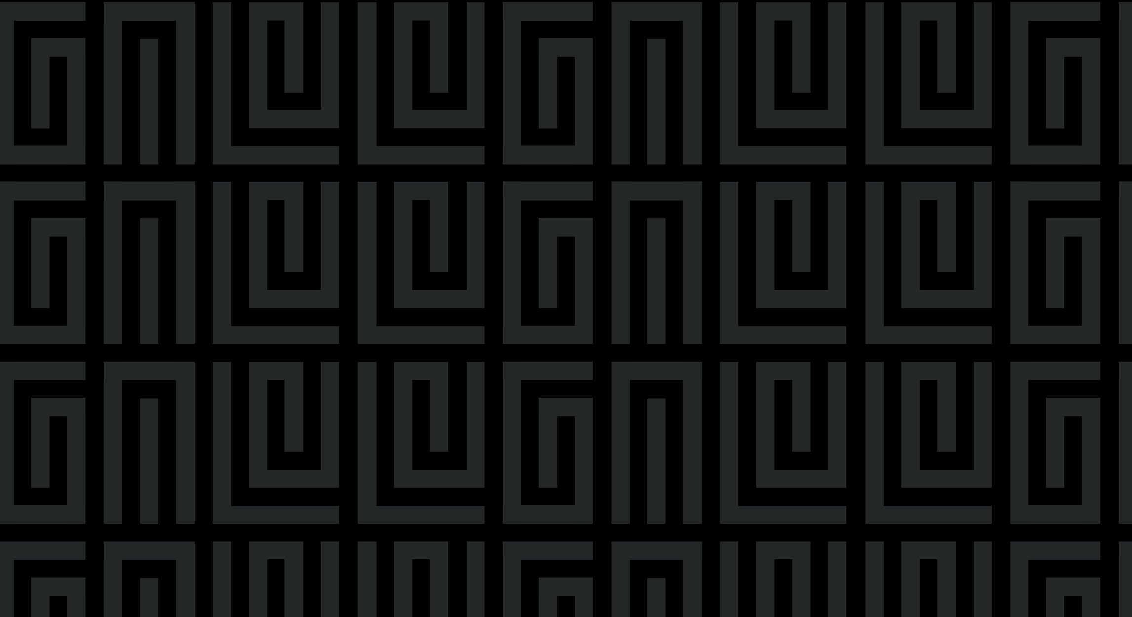
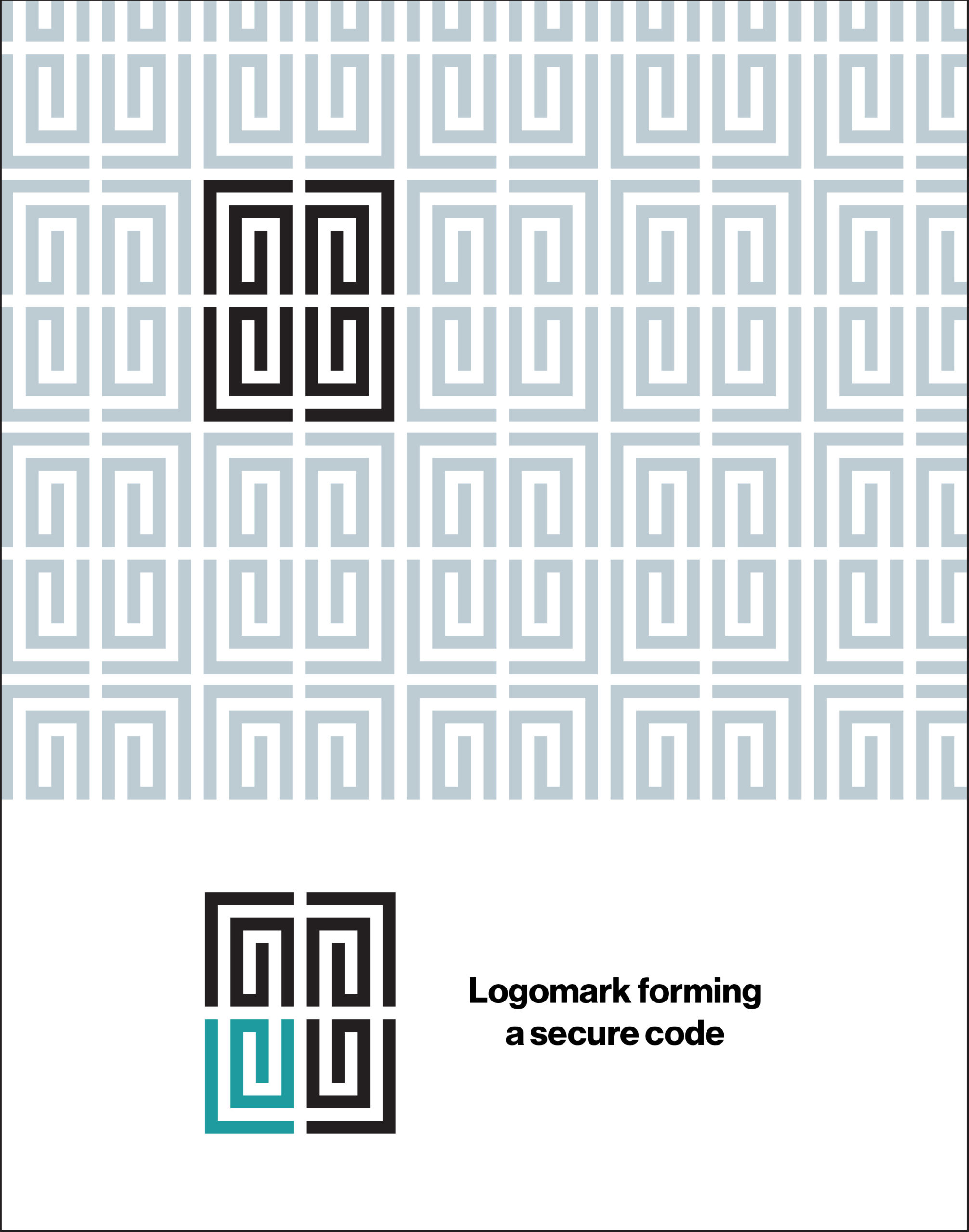
Using the logomark to create a secure QR code.
Pattern in brand colours.

Iconography
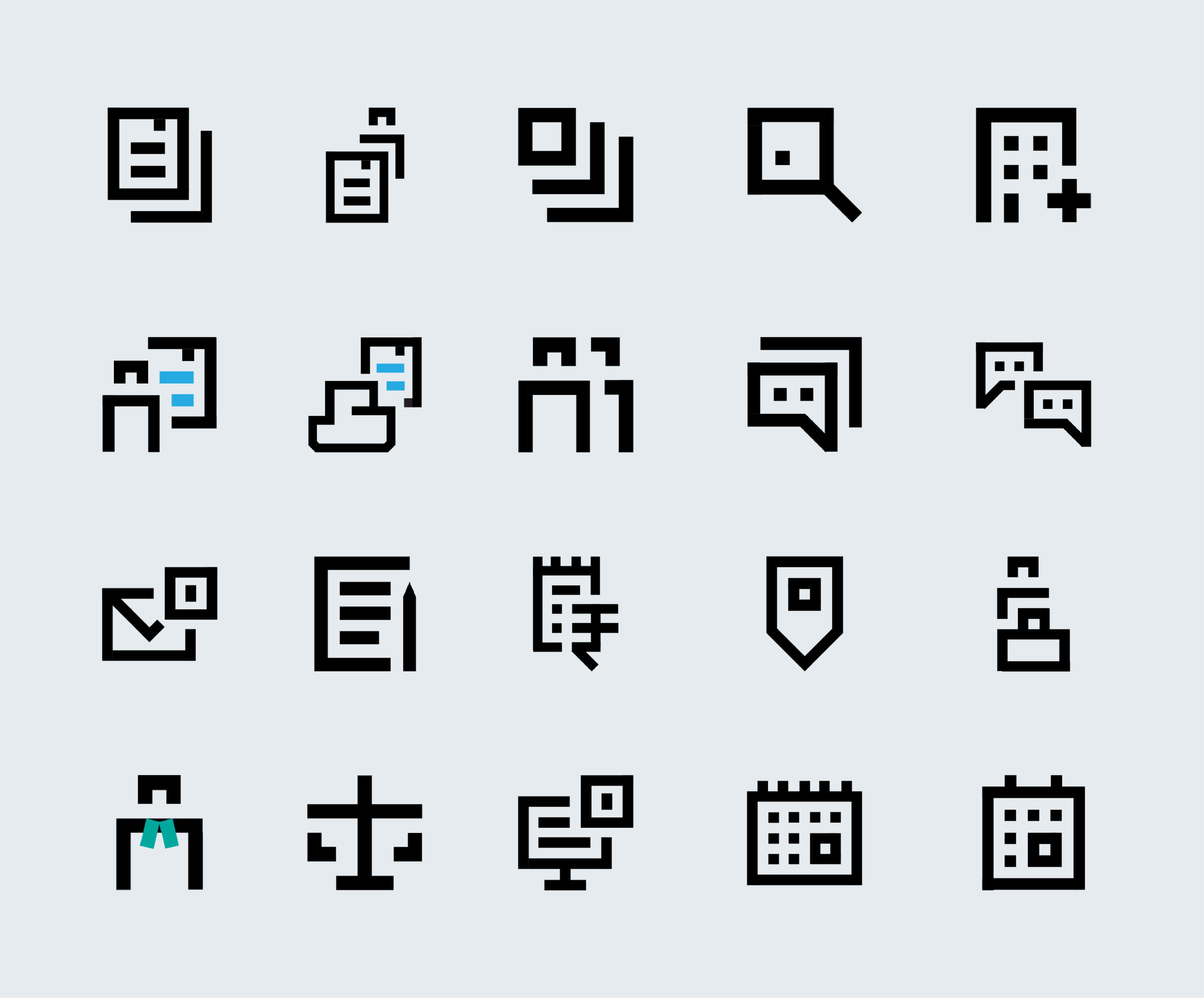
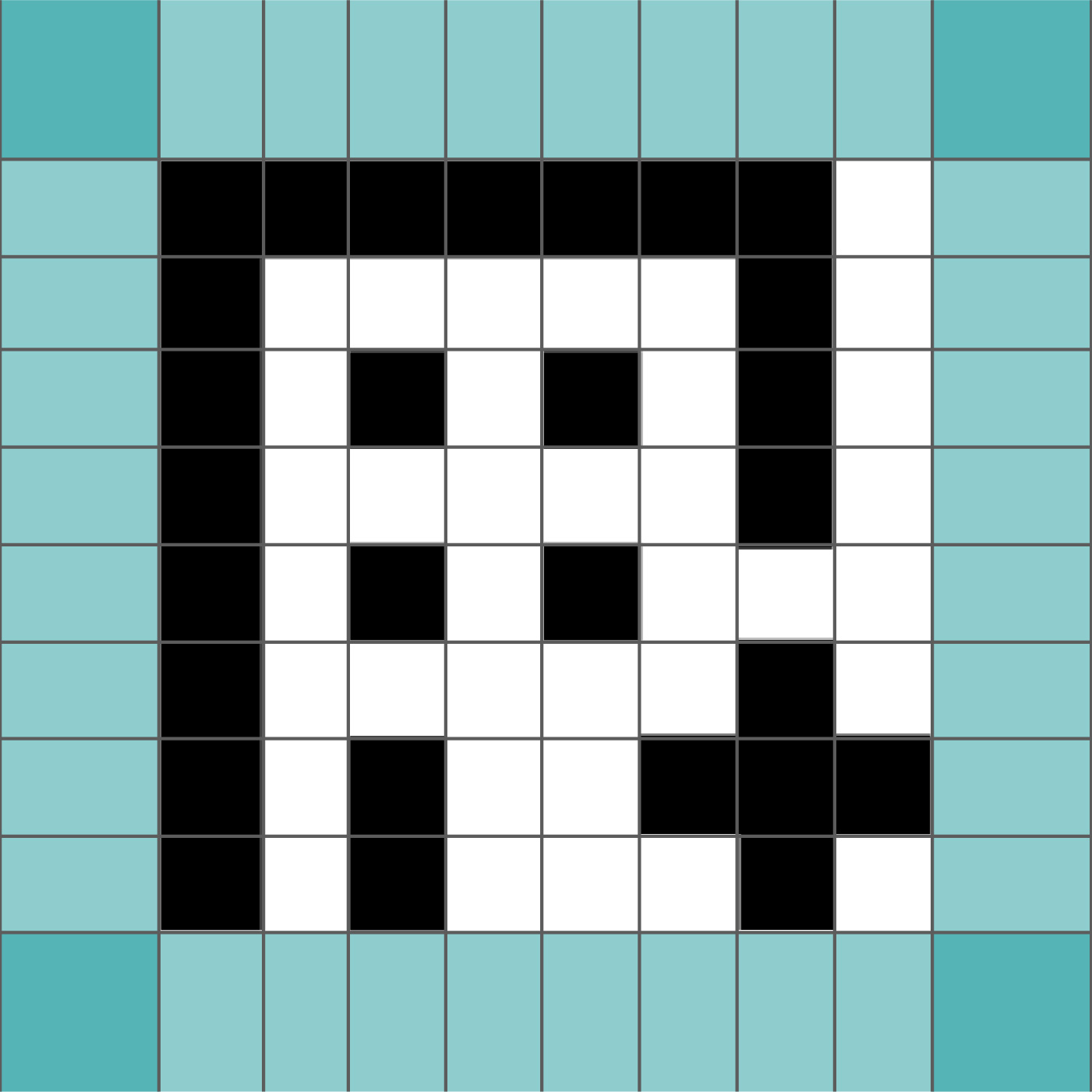
A custom icon set in the exclusive LegalE format was designed to further scale the brand identity. Using bold forms and sharp corners, these icons resonate with the logomark and are unique to LegalE. They have been widely used across the platform as well as the website.
Custom icons help reinforce the brand through their communication. While these icons are exclusive to LegalE, they are simple and unambiguous.
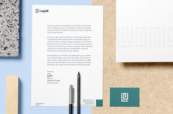
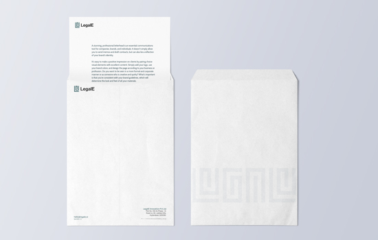
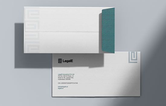
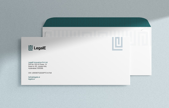
Stationery
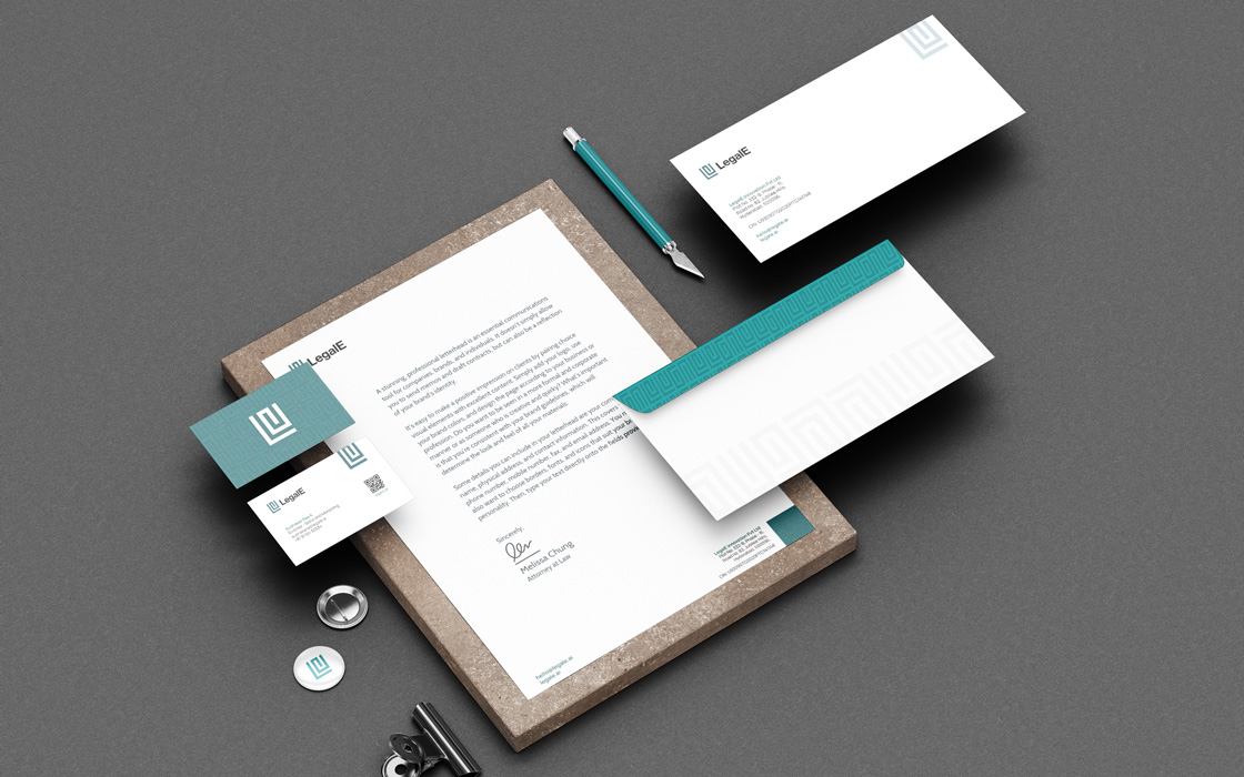
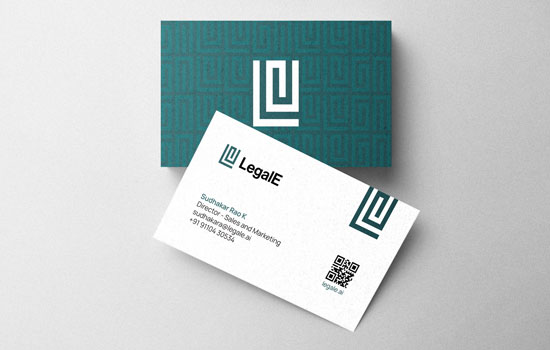
Impact
The name and brand identity caught on well as they were well-suited for the platform. The identity was widely scaled and used across various materials.
