Let’s start a new design project together!
Challenge
To build the employer branding for a $6.6 billion Japanese pharma giant. Eisai is a revolutionary, research intensive company with over 10,000 employees. We helped them in their journey in India by designing the graphics and signage for their sprawling 50-acre Vishakapatnam campus.
Research
Everything had the stamp of the brand, even the wayfinding. We adopted a subtle approach towards the graphics and celebrated the company through its inspiring work. We began the story with the basics of chemistry, the humble periodic table.


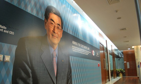
The project brand experience begins at the ‘headquarters’ block, or the main admin block. Two key messages were deployed here – the company values and the CEO’s vision. It helped set the right tone at the beginning of the experience.
“Research into Eisai’s processes was the cornerstone of our strategy”
Design
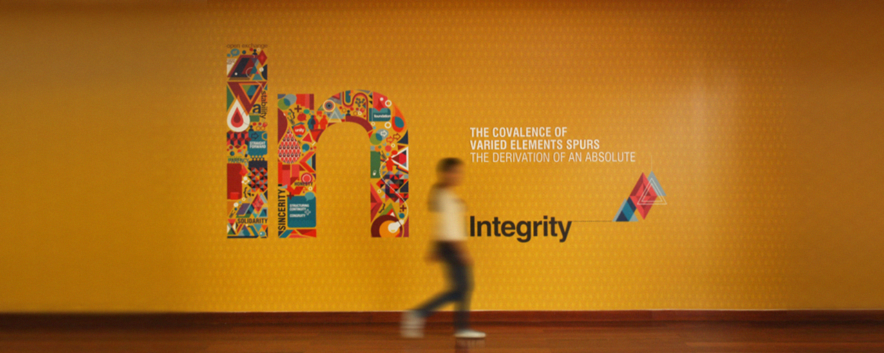
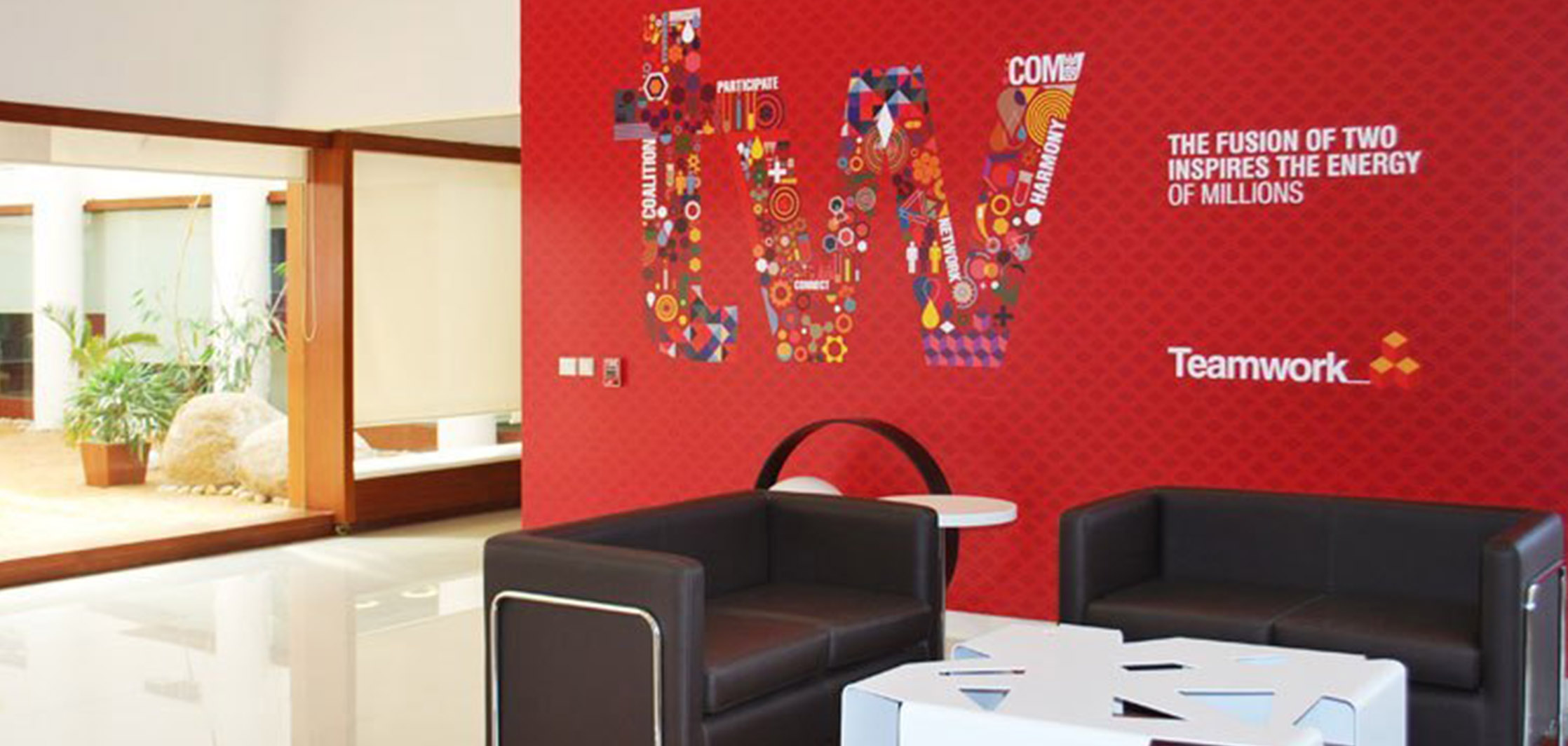
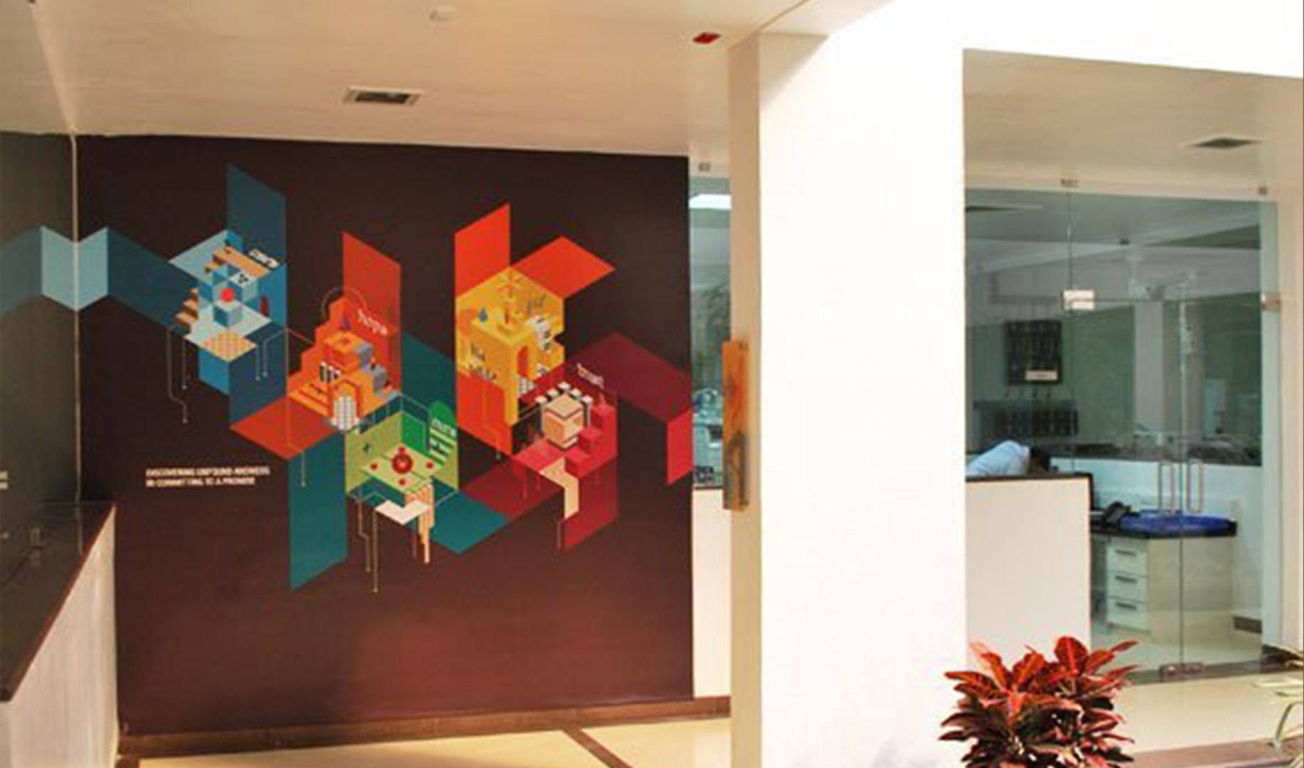
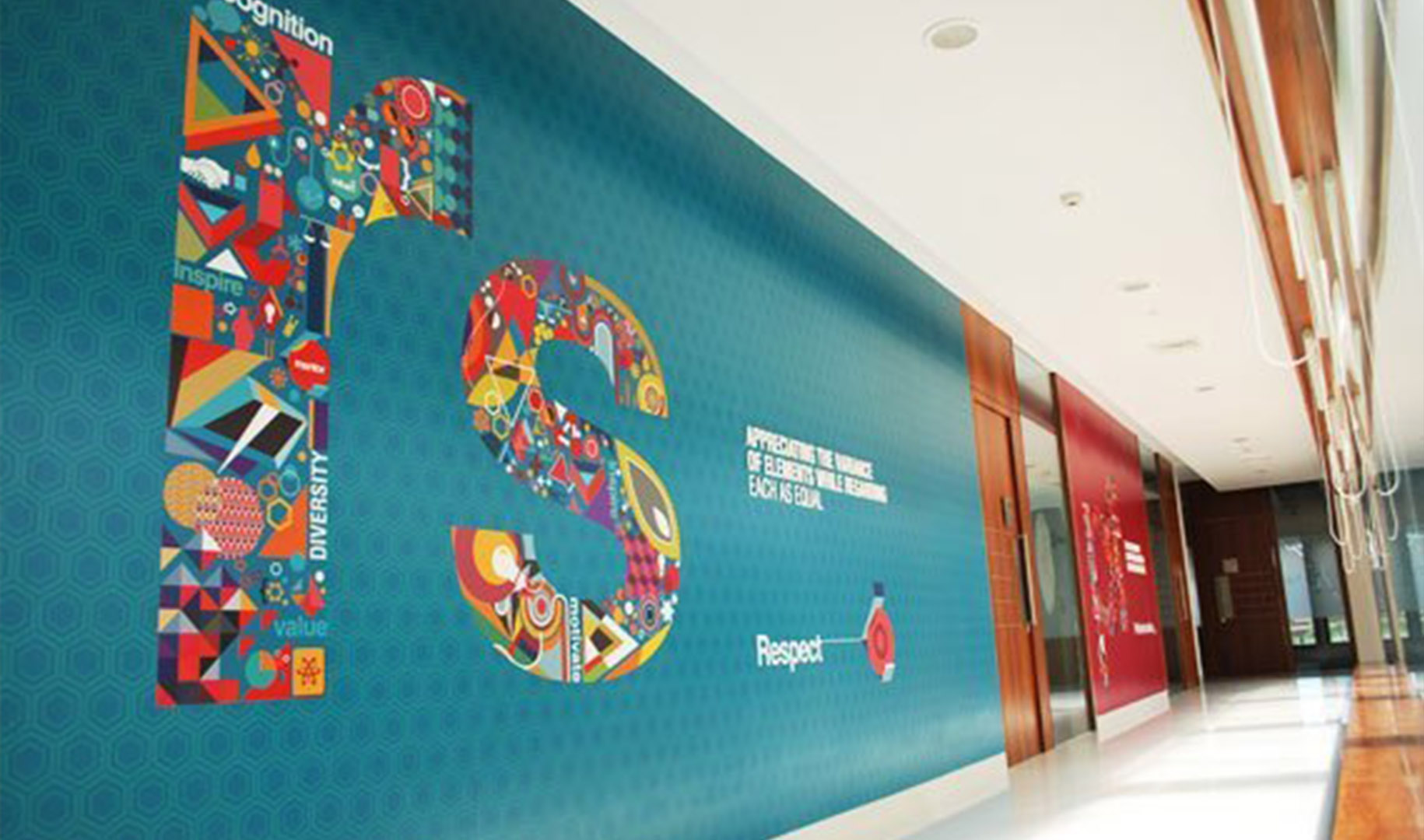
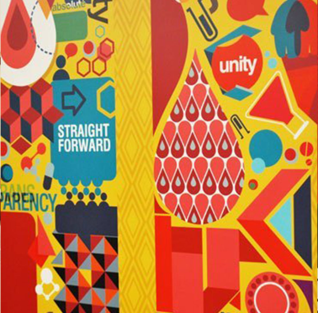
Eisai employees personify their values of integrity, respect, professionalism, quality and teamwork. These values were represented as large wall graphics in the ‘Periodic table’ style – In, Rs, Pr, Qu, Tw. This became the core visual concept for the employer branding exercise.
Values help in employer branding
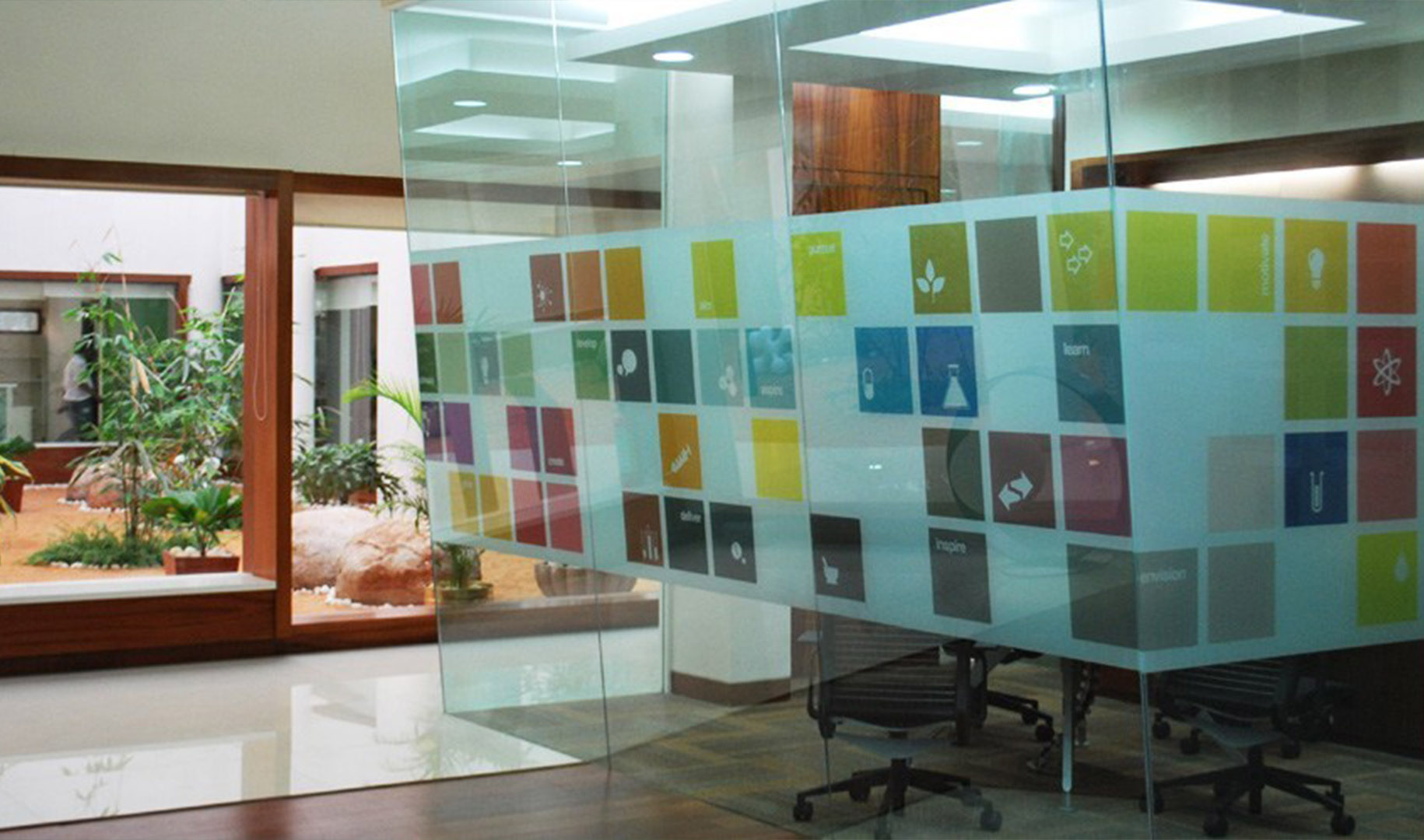
This was Eisai’s first large integrated campus in India. A statement had to be made, and it had to stand the test of time. Mendeleev’s periodic table gave us a delightful palette to experiment with, in this case as graphics on glass surfaces.
“Mendeleev’s Periodic Table inspired the visual design”
History Walk
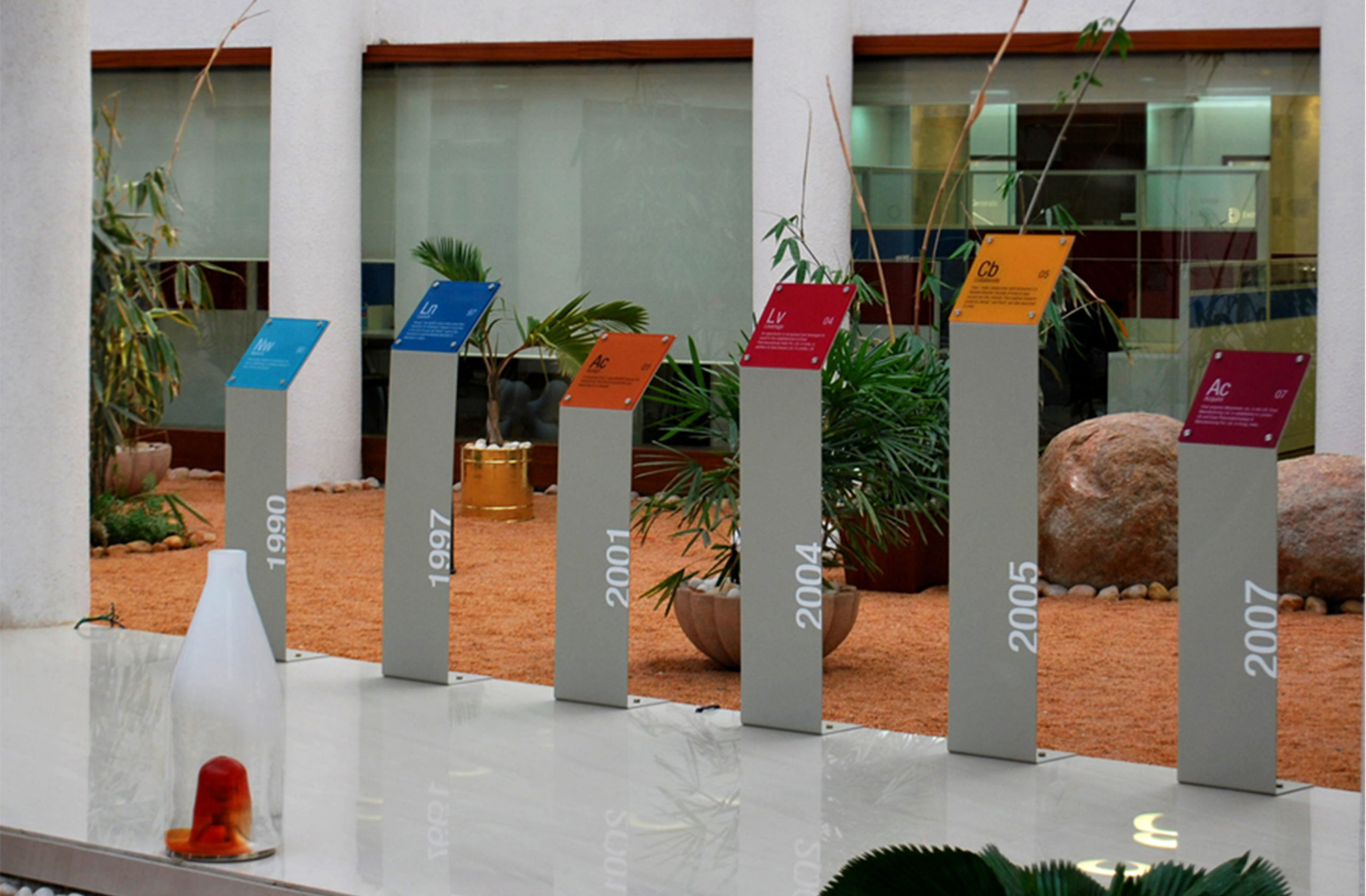
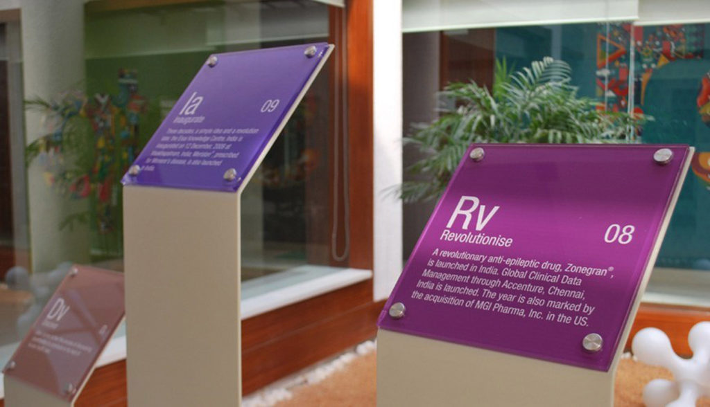
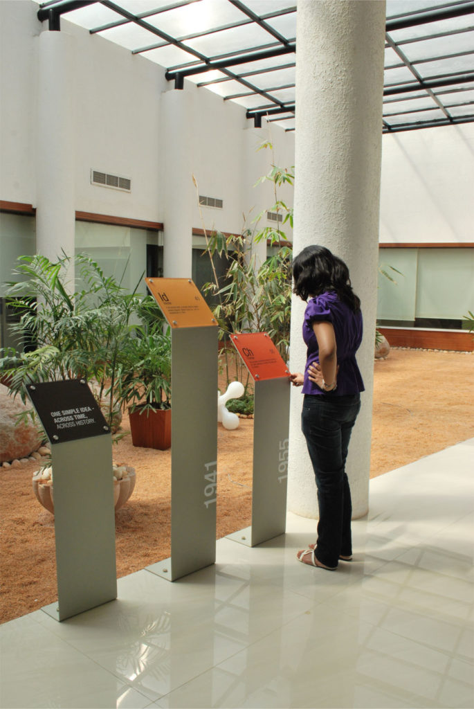
Eisai has a rich history. The main block had a beautiful walkway. A ‘history walk’ had to be created, which enhanced the employer branding.
“Milestones were celebrated in the form of a gentle walk, which visitors and employees alike could enjoy leisurely.”
Reception Areas
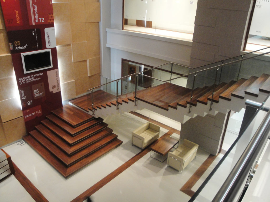
In the R&D block, we took inspiration from drug packaging to design the graphics.
Pharma = chemistry = Periodic table
Wayfinding Signage
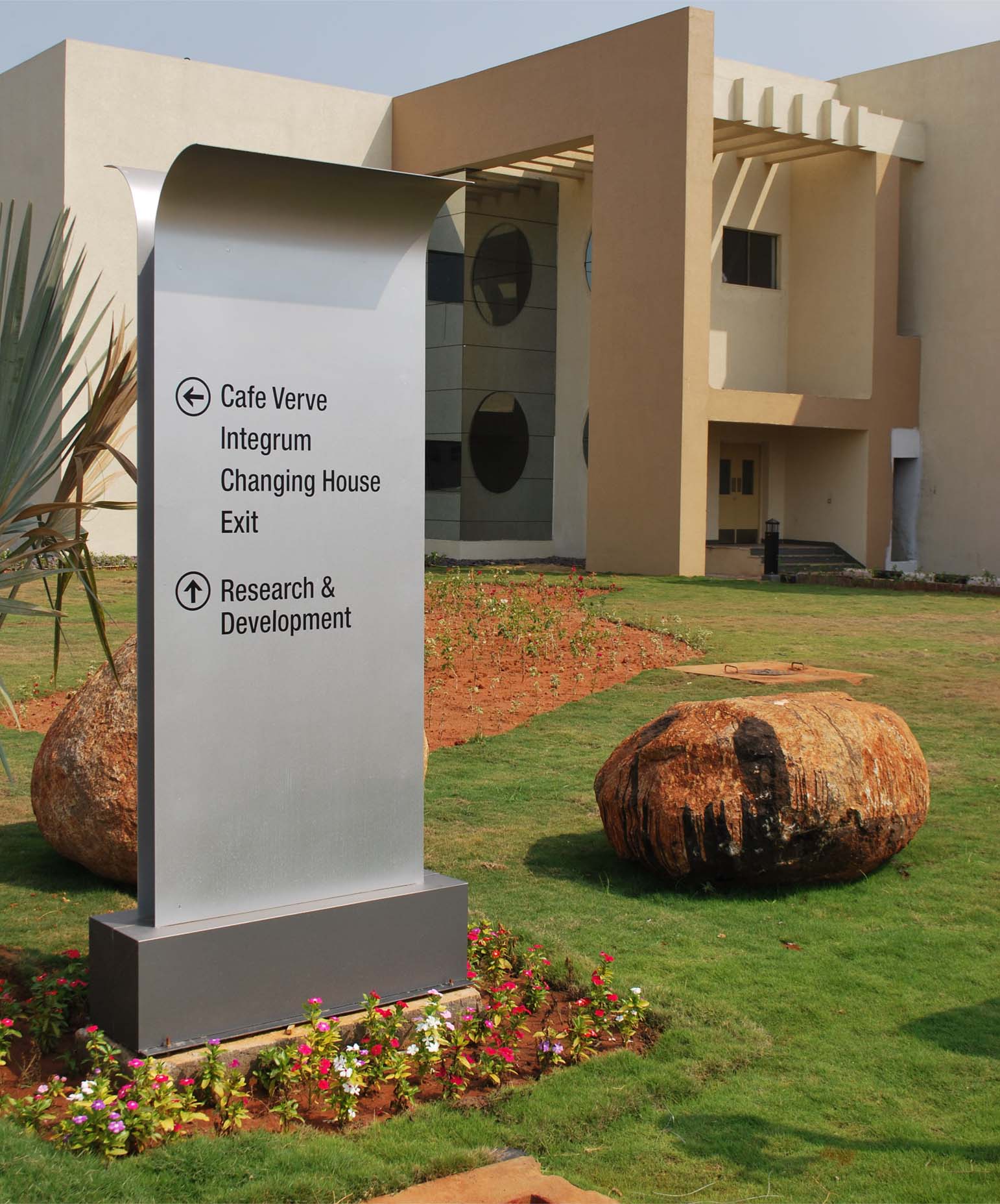
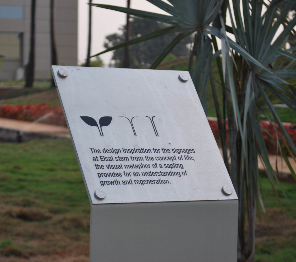
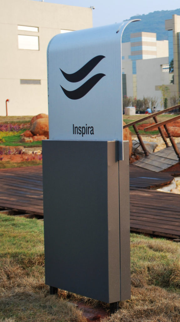
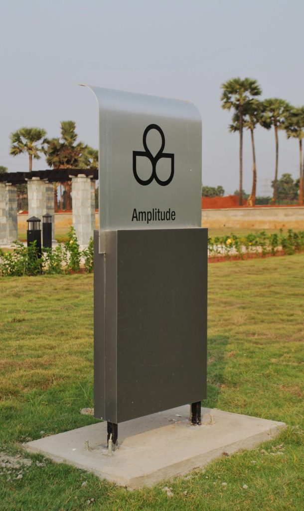
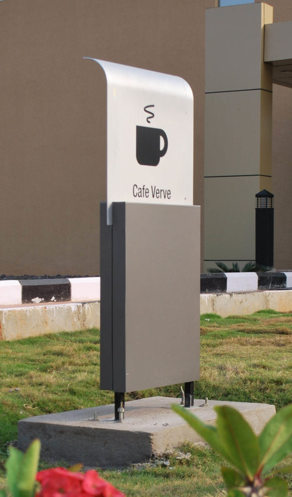
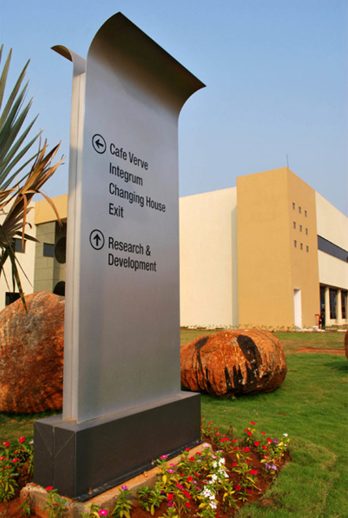
The signage and wayfinding was custom-designed in machine cut aluminium. The visual design follows Eisai’s philosophy of nurturing, and is inspired by a sapling (the cornerstone of the employer branding). The construction detailing provides for robust performance in inclement weather to provide a long life.
“The visual design follows Eisai’s philosophy of nurturing, and is inspired by a sapling.”
Cafe
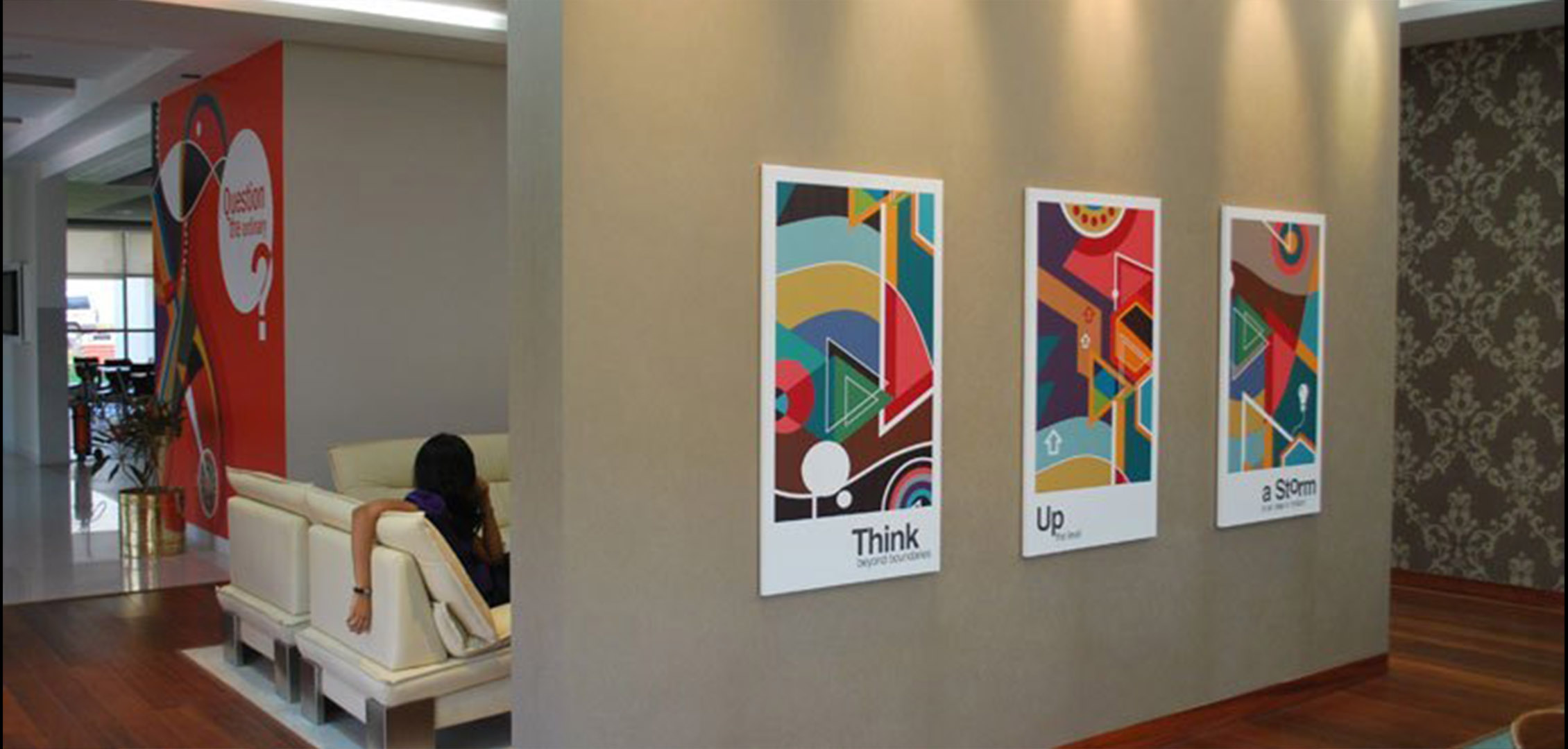
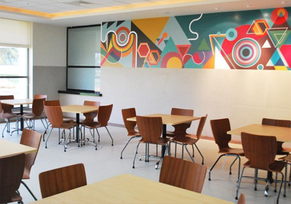
The cafeteria is a compact standalone building that houses two dining areas; the general dining area and an executive dining area. Treatments for both these were chosen based on the space available. For functional purposes, graphics were used on corridor areas to provide better protection to walls against smudging.
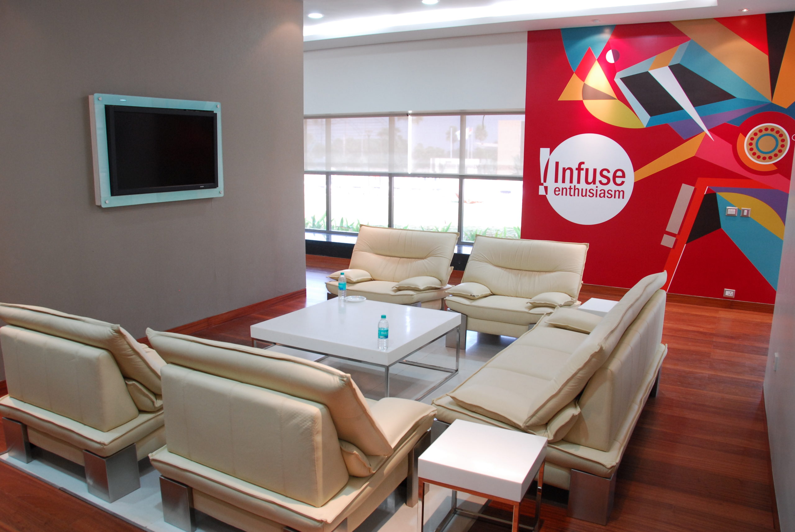
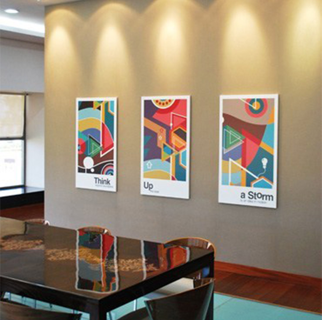
Abstract graphics with inspirational messages contributed to most of the design strategy in this space.
R&D Graphics
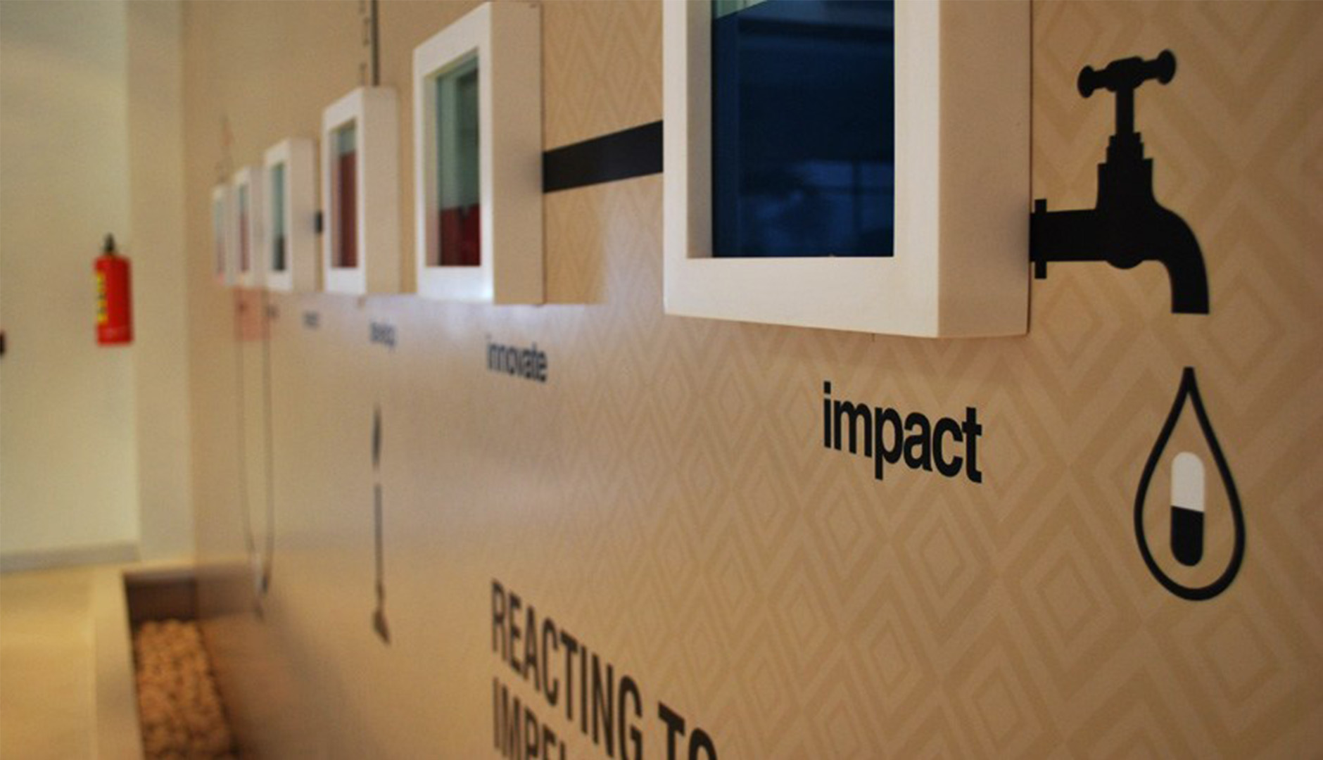
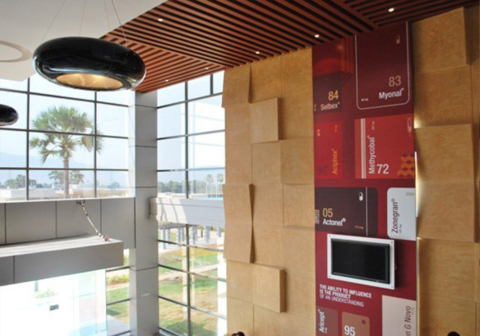
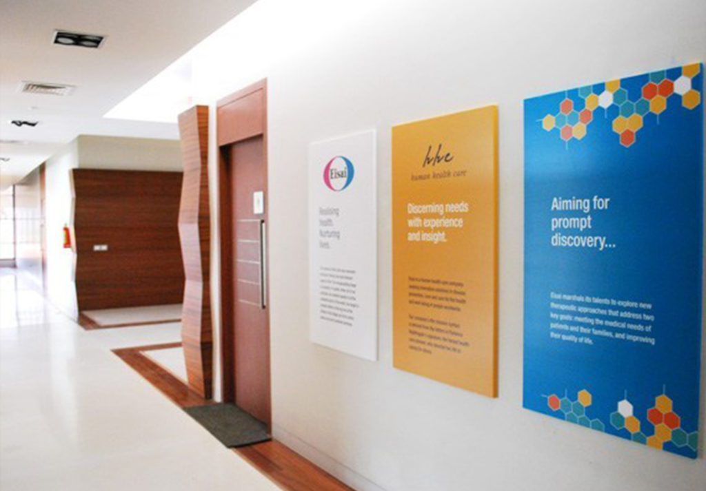
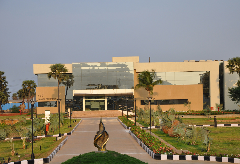
Eisai’s Vizag facility is unique. It is the only facility of Eisai in the world that houses three main functions in the pharma industry in one campus – R&D, API and formulation. In the R&D block, we created messaging that showcased Eisai’s vibrant research culture and outstanding products, and enhanced the employer branding.
“The graphics and wayfinding design captures our ethos in an apt manner that is subtle and sophisticated at the same time.”


Impact
The employer branding generated by the graphics and signage scheme in this campus received rave reviews from the community of pharma and industry. Our journey with Eisai has continued for several years.
