Let’s start a new design project together!
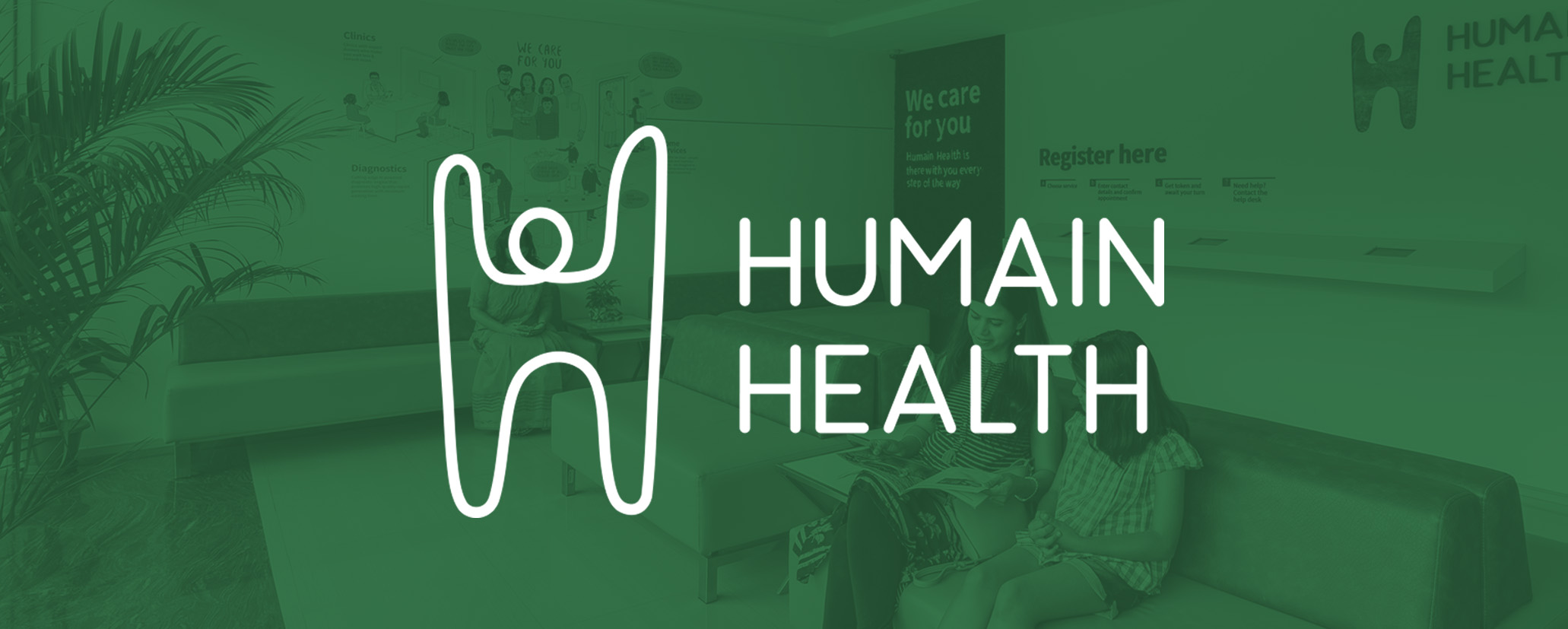
Brand Identity for Humain Health, an innovative healthcare startup
When the founders of Sigtuple wanted to create a new brand that leveraged their AI technologies, they worked with Rezonant to create a new brand system that would inspire patients.
Challenge
Sigtuple was launching its retail healthcare venture. The challenge was to create a unique and memorable visual identity that would scale well for applications in the retail healthcare sector.


Research
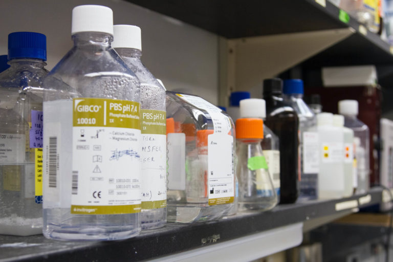
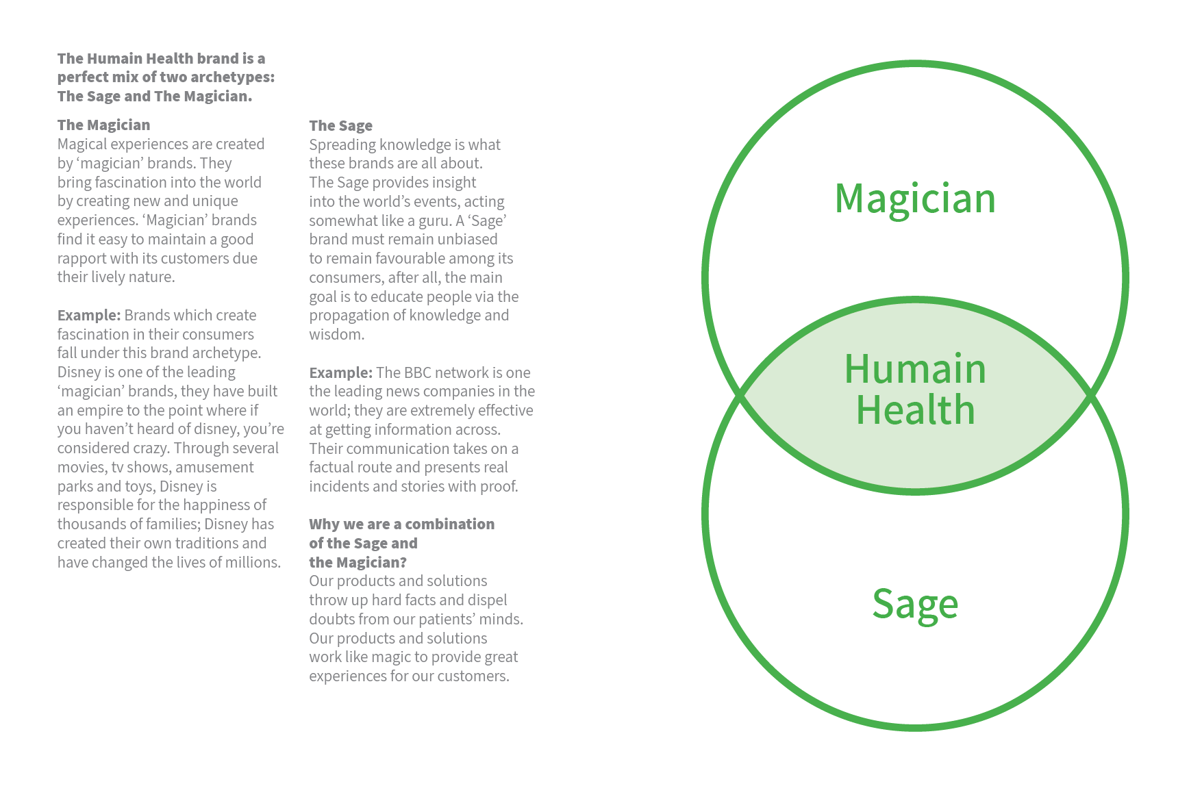
Rezonant undertook a detailed benchmarking study to understand patient experience in current diagnostic centres. Along with this, we ran a Brand archetype analysis to create the right persona for the new brand. We follow our Brand Archetype Experience framework to get to this.
Humain Health’s new name
The name ‘Humain’ = Human + AI. This name belongs to the coined name category. As a result, domains were easily available. Humain Health brought together all the offerings under one roof and promised an integrated healthcare offering to patients.
“In India’s fragmented healthcare market, it’s getting increasingly difficult for new brands to build traction”
Design
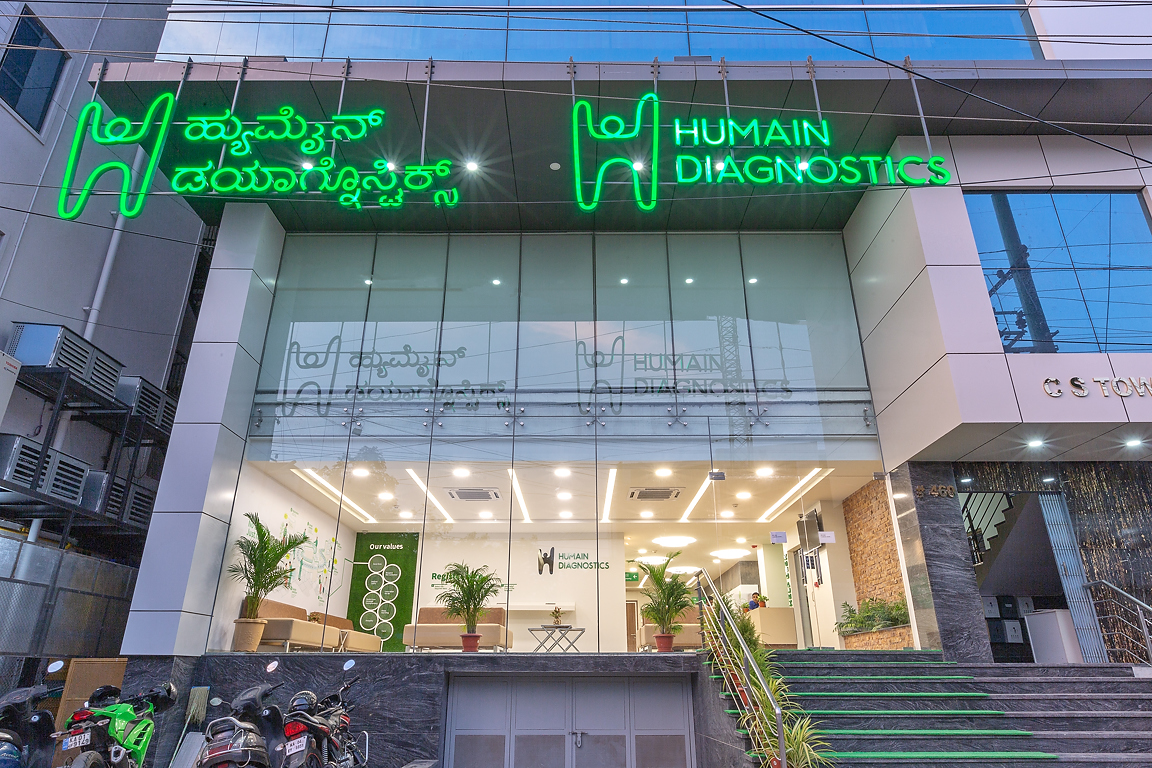
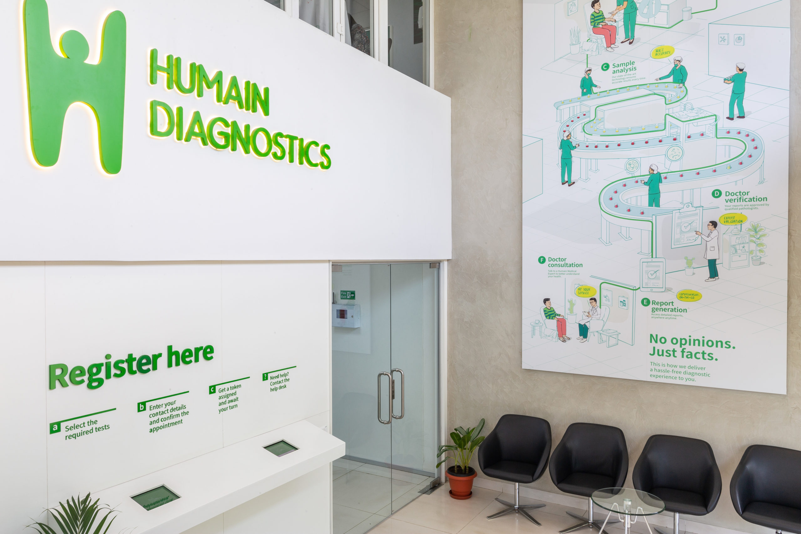
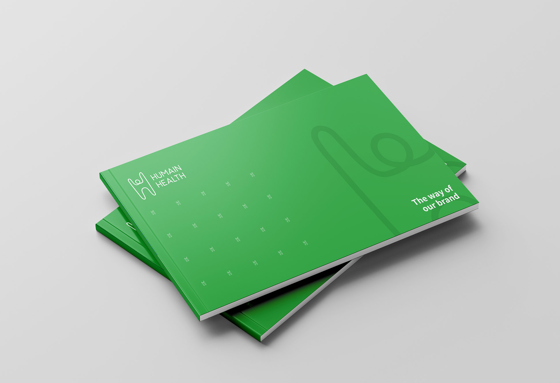
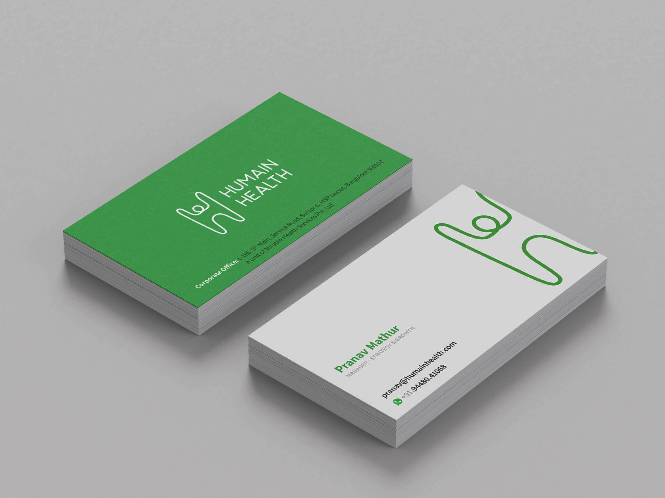
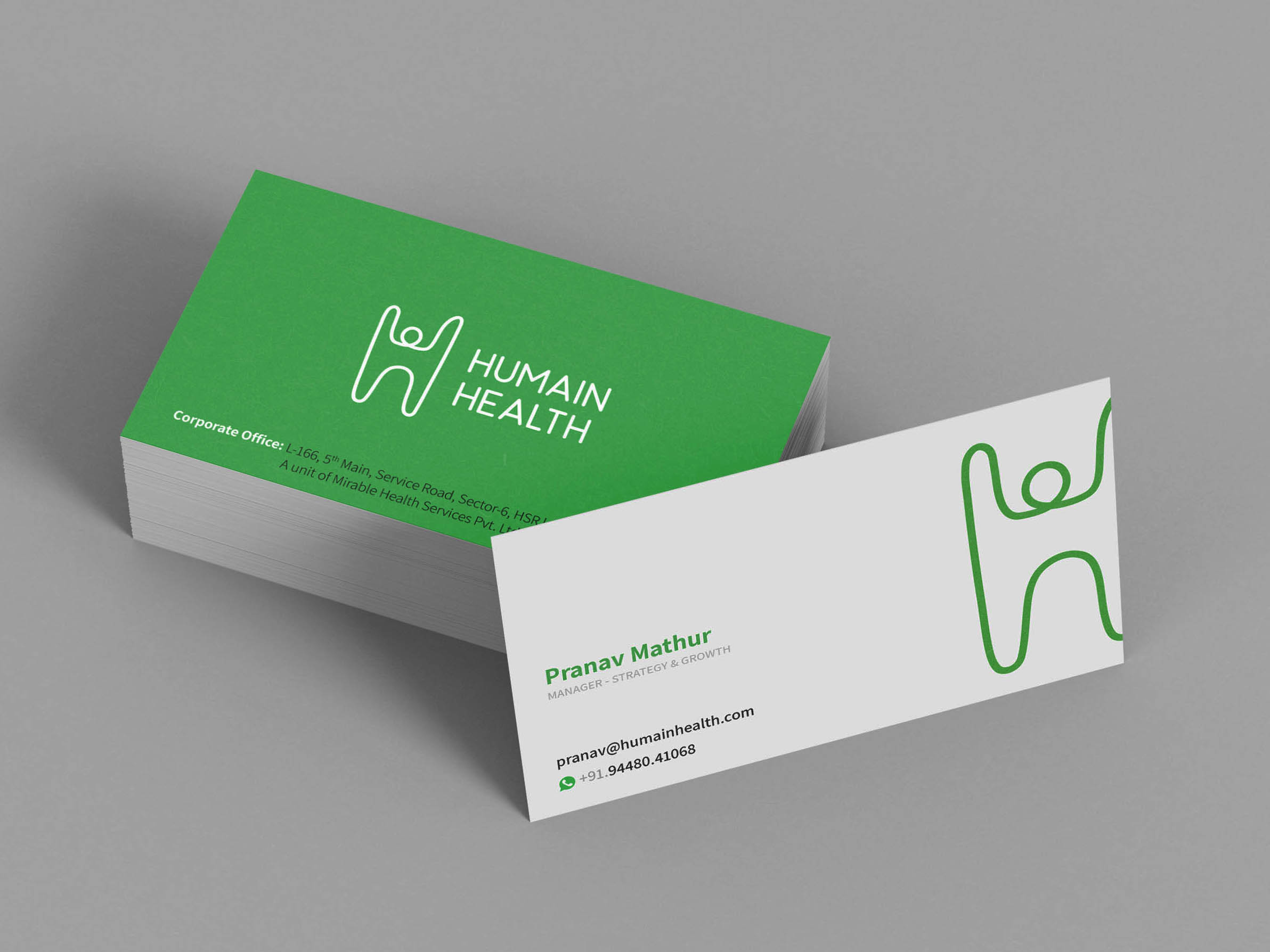
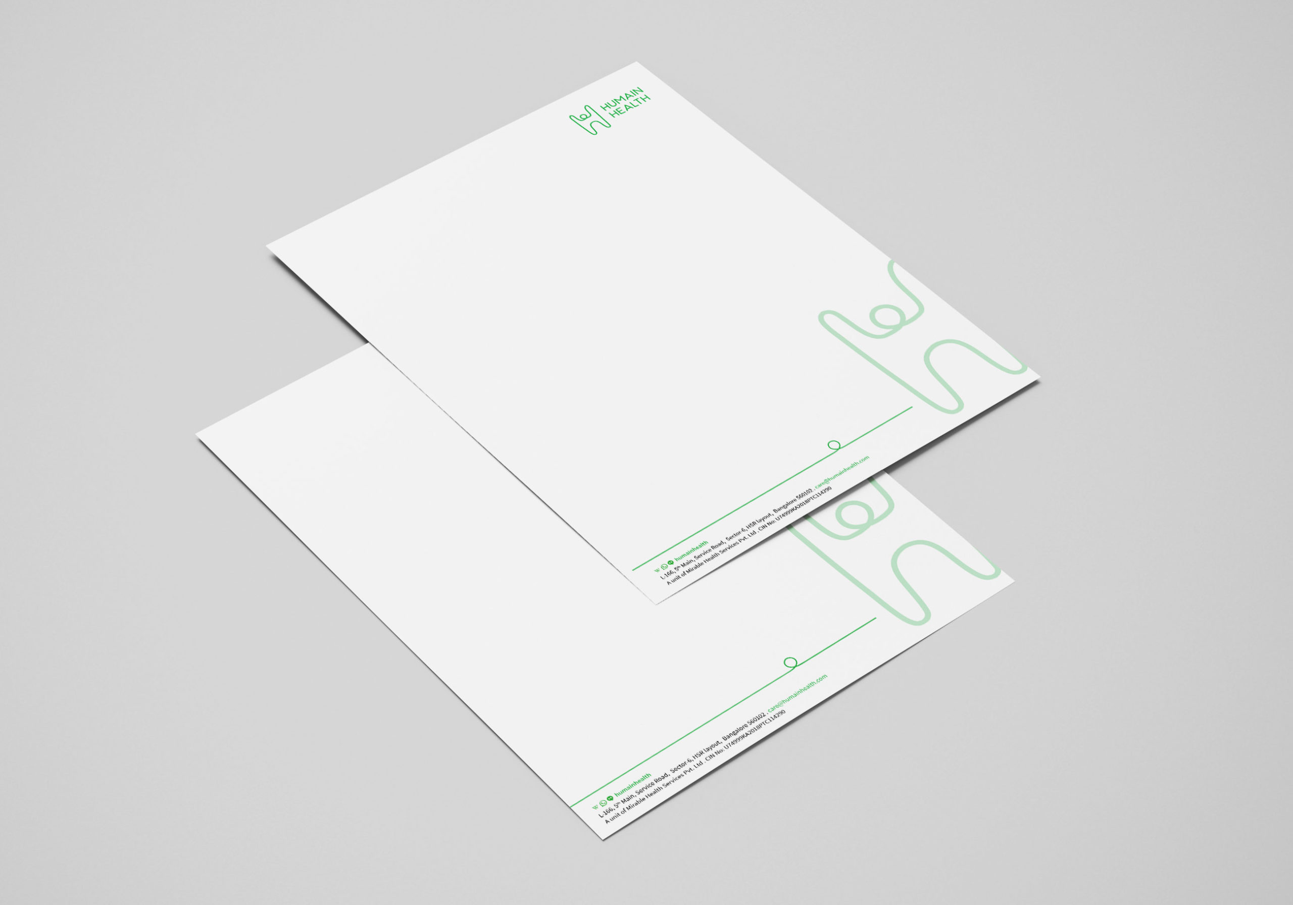
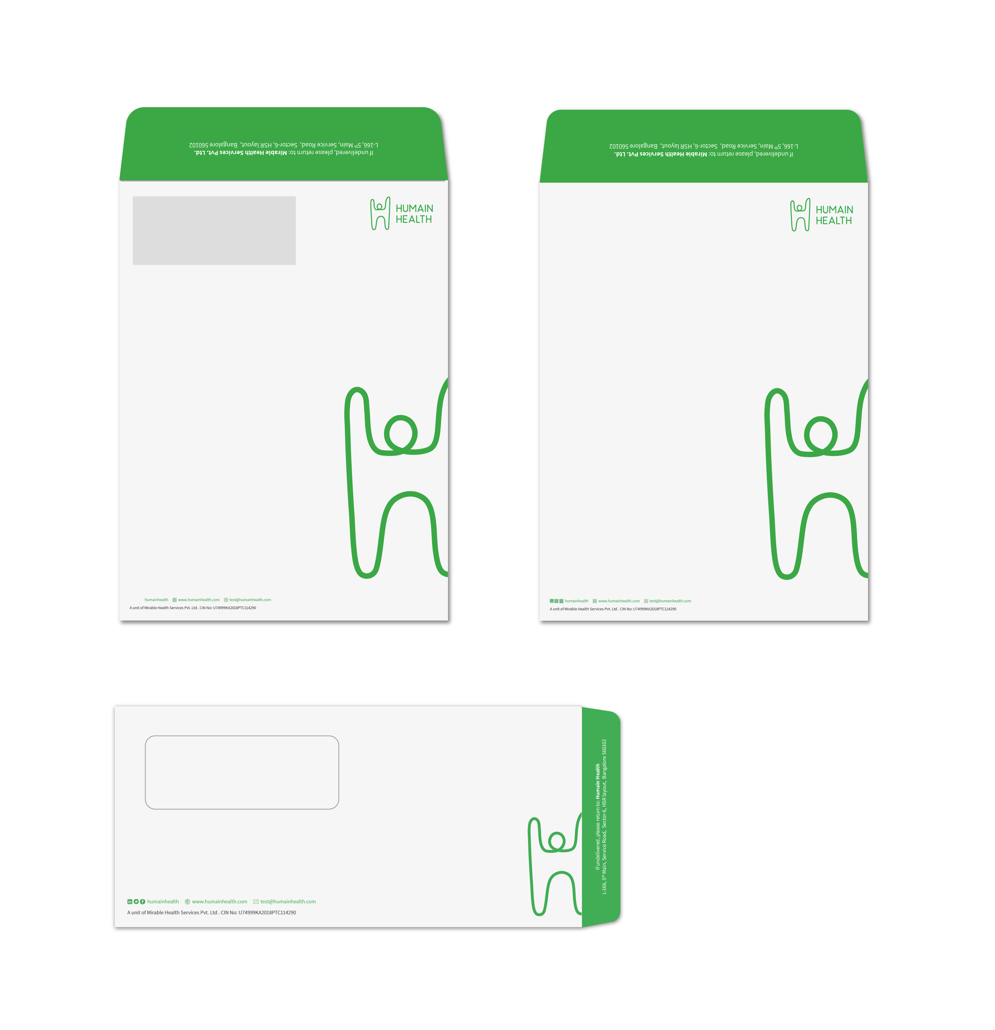
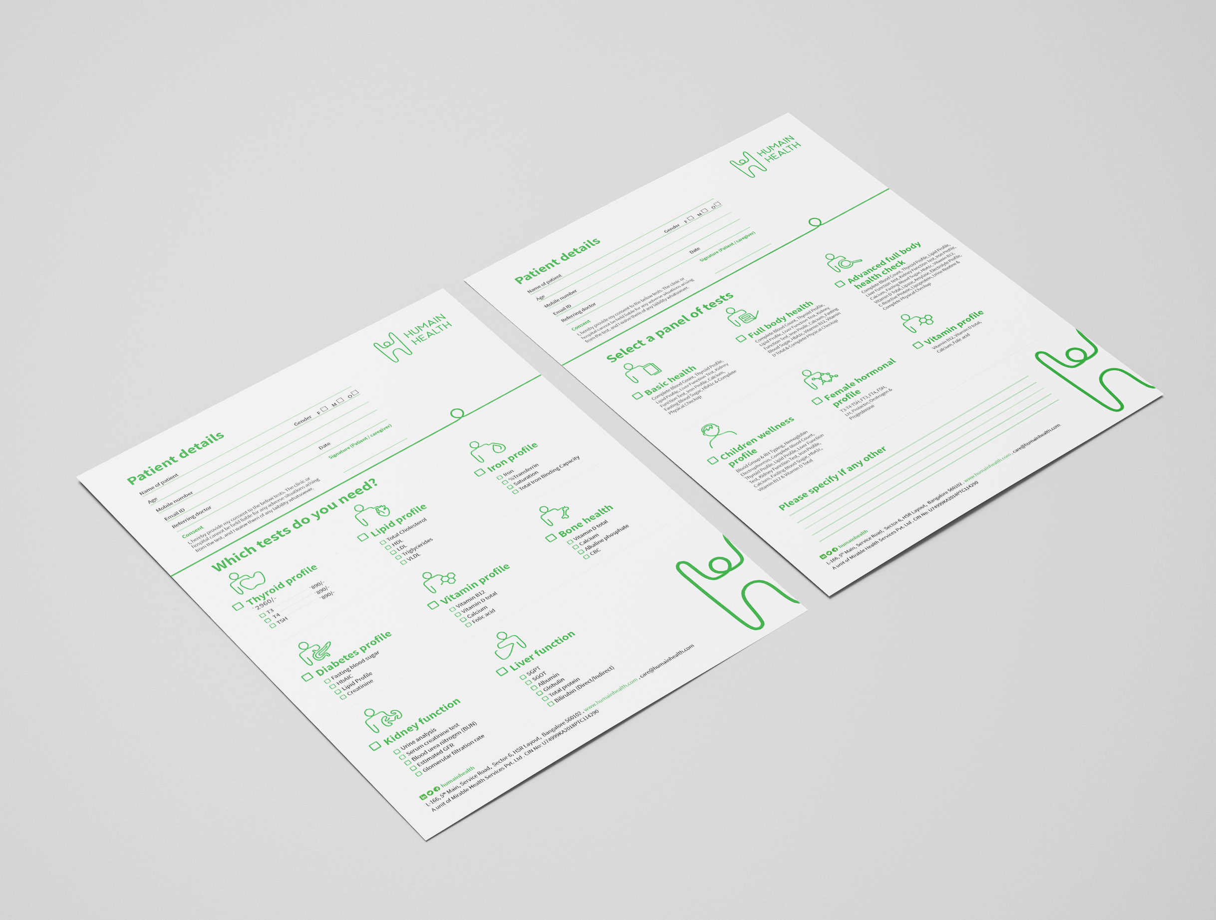
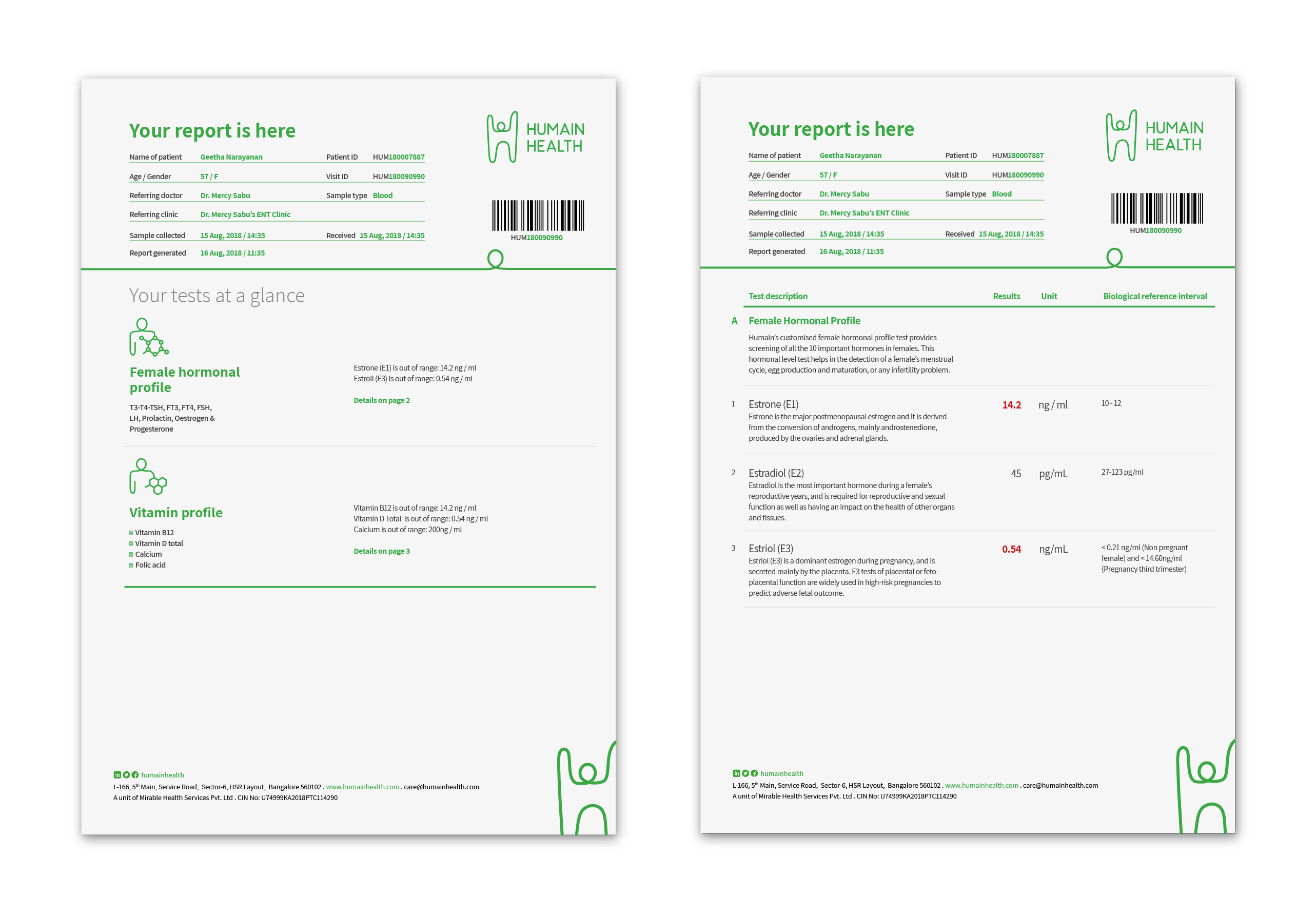
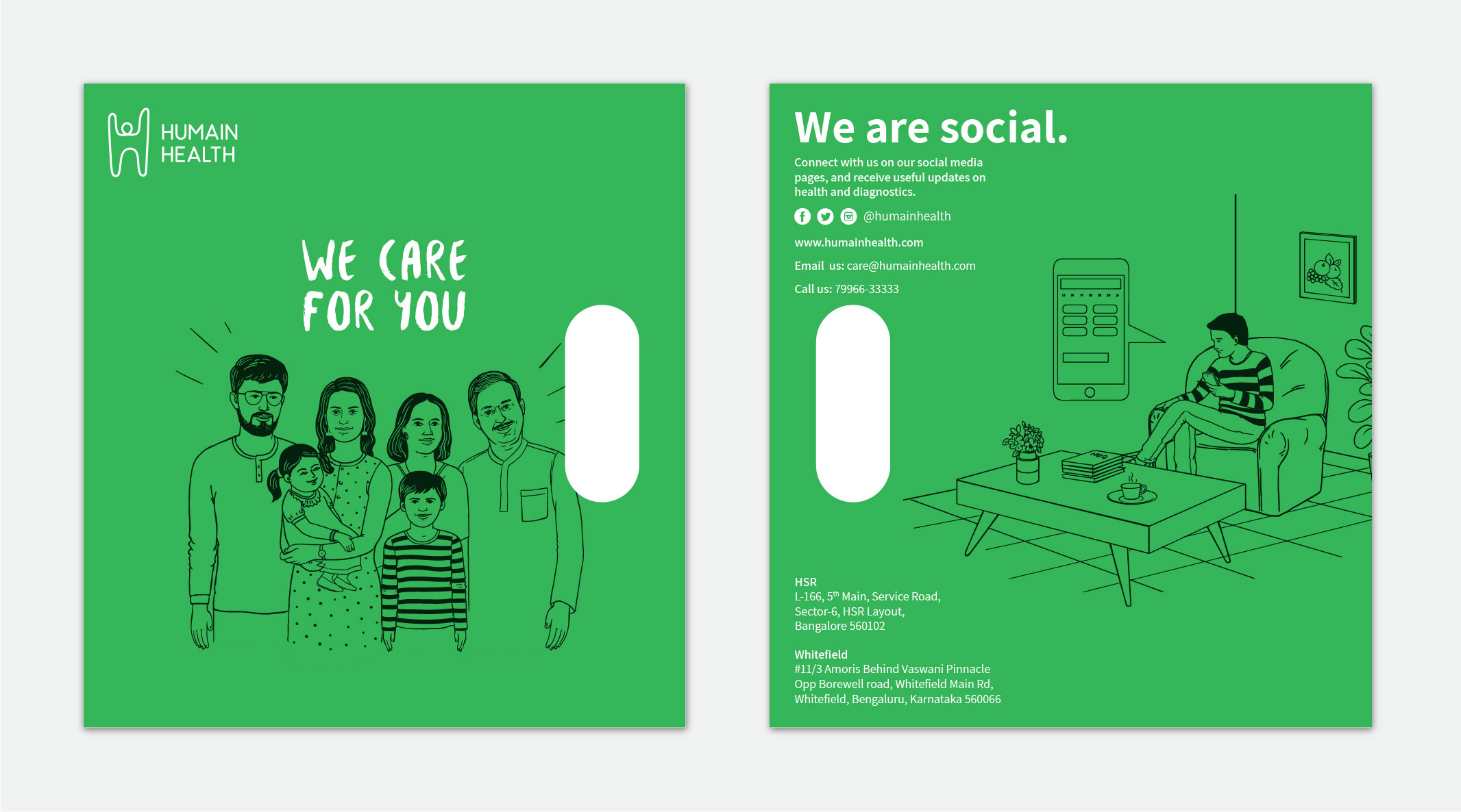
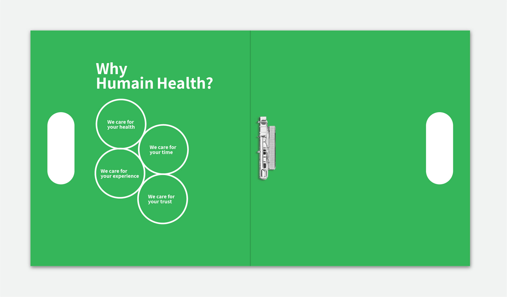
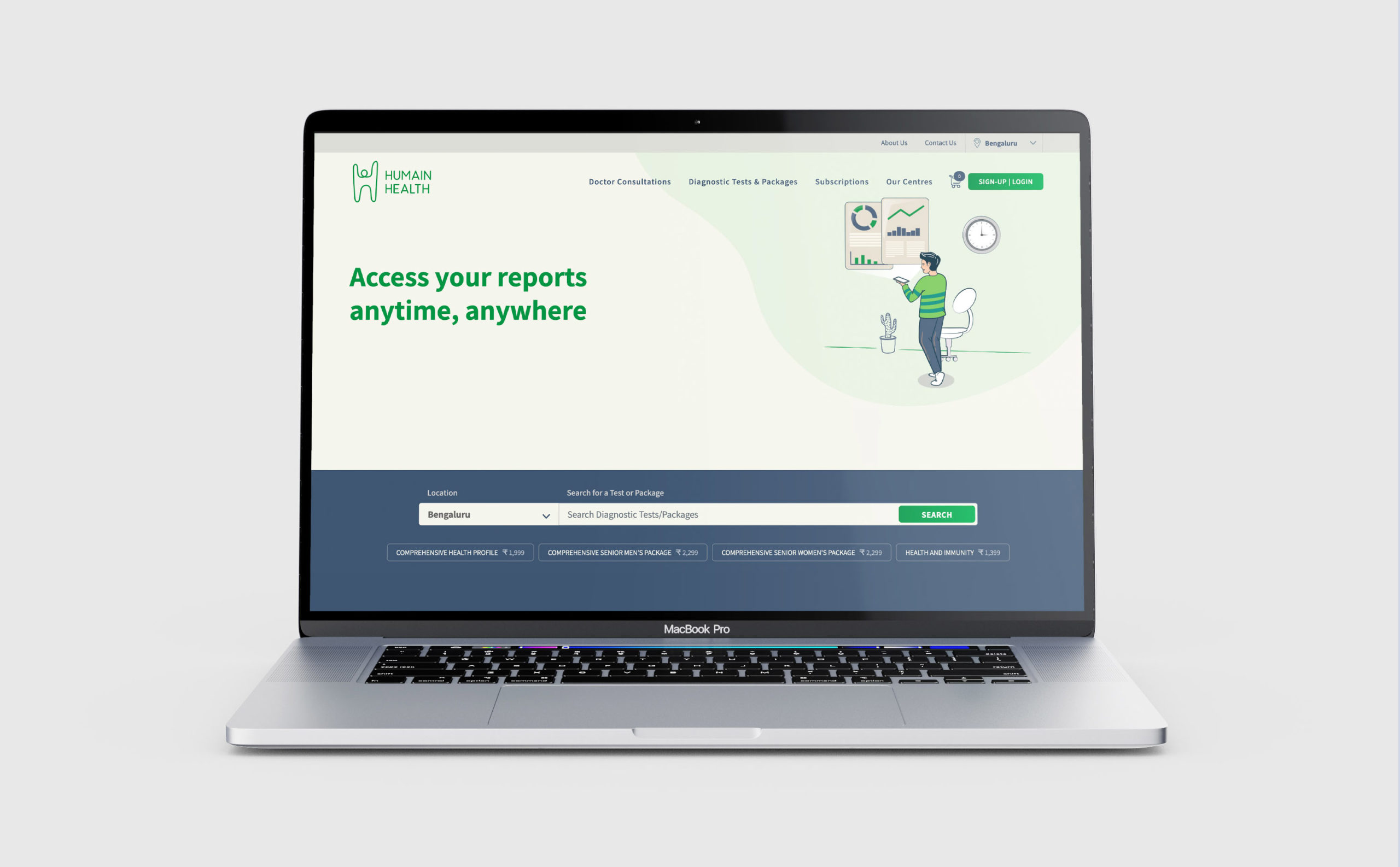
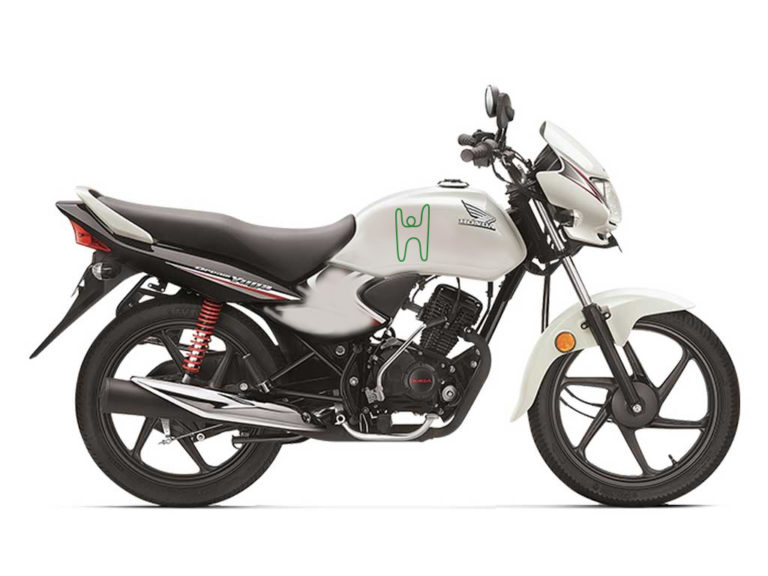
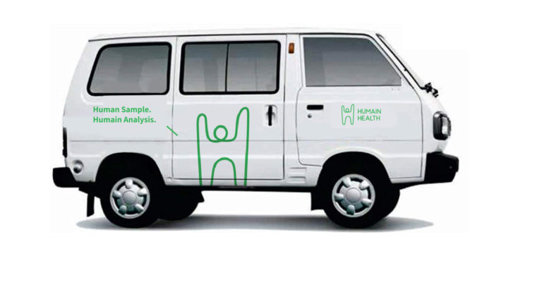
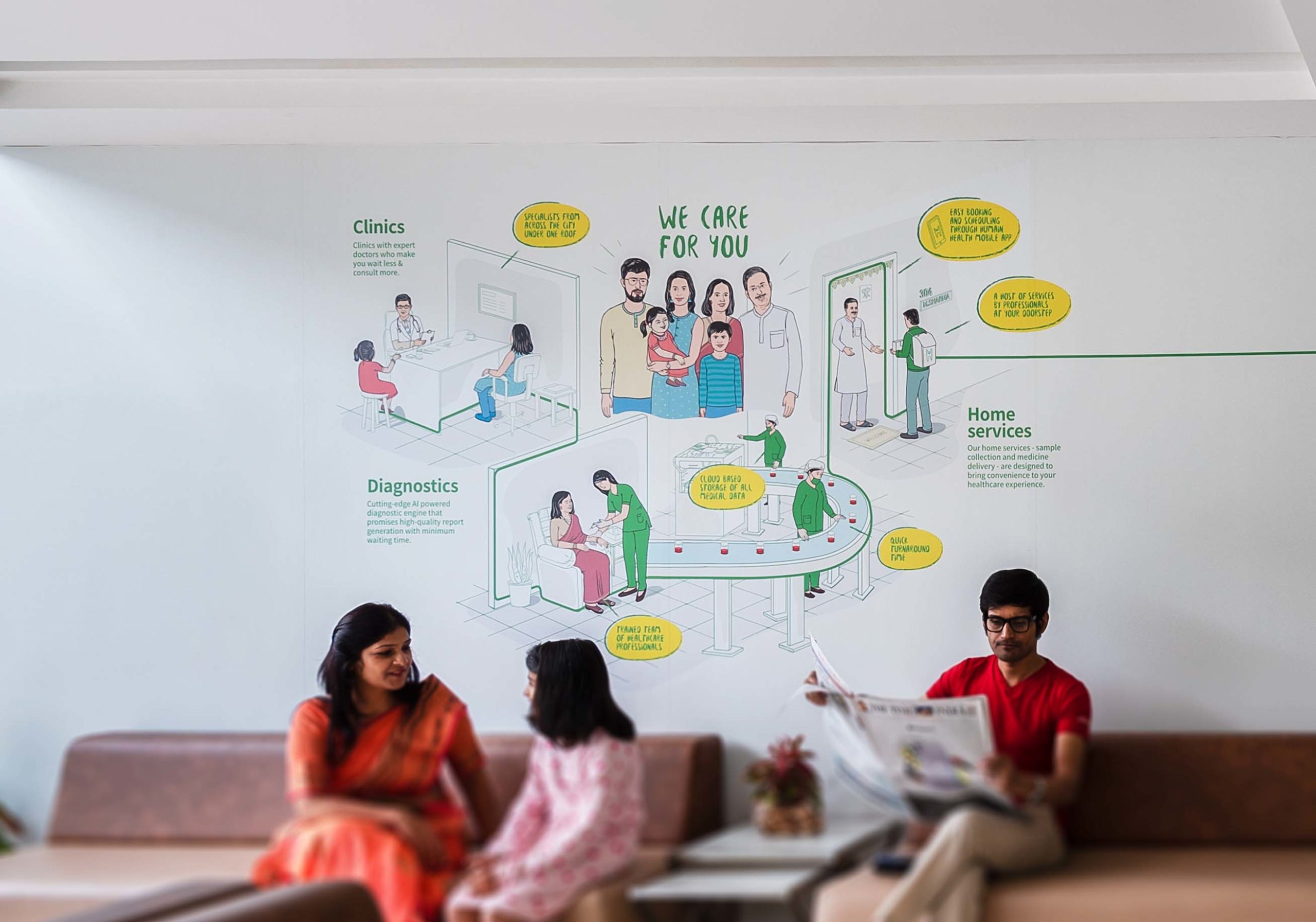
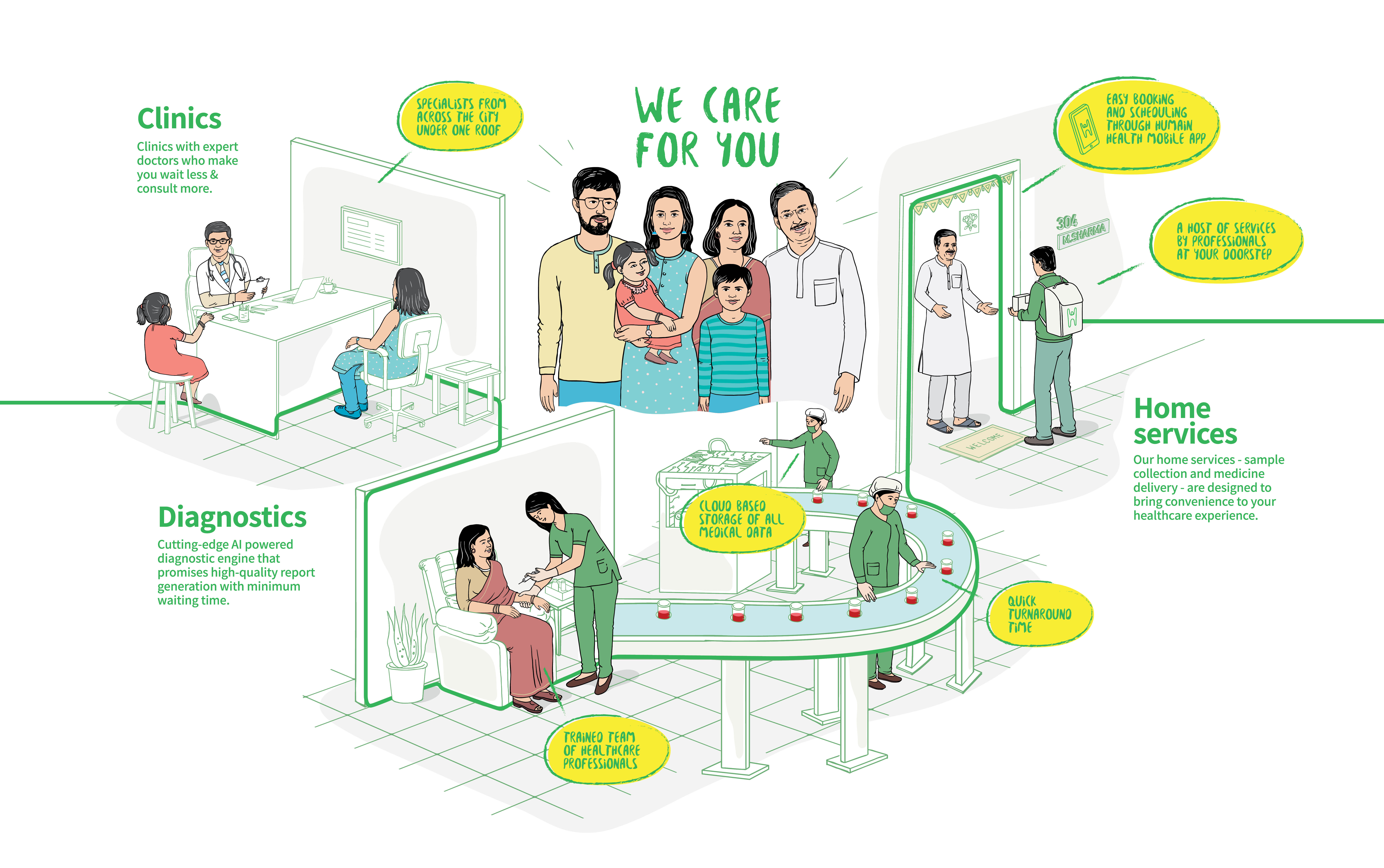
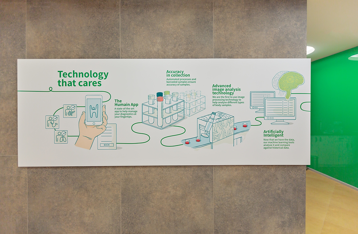
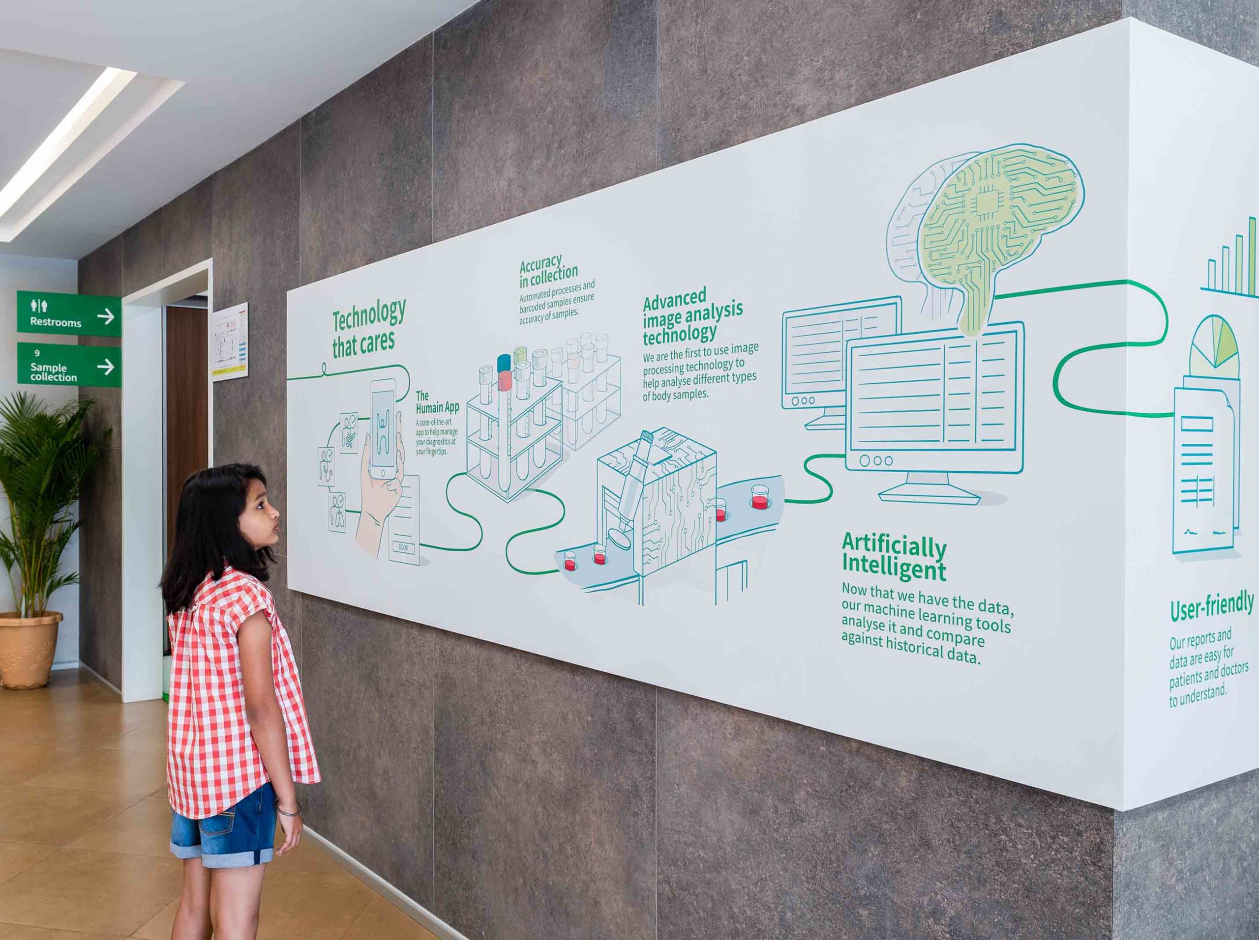
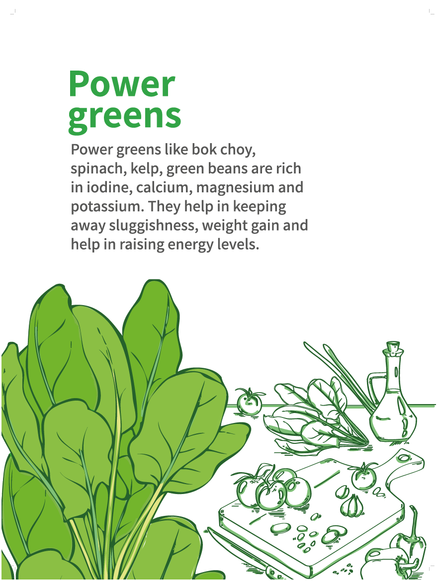
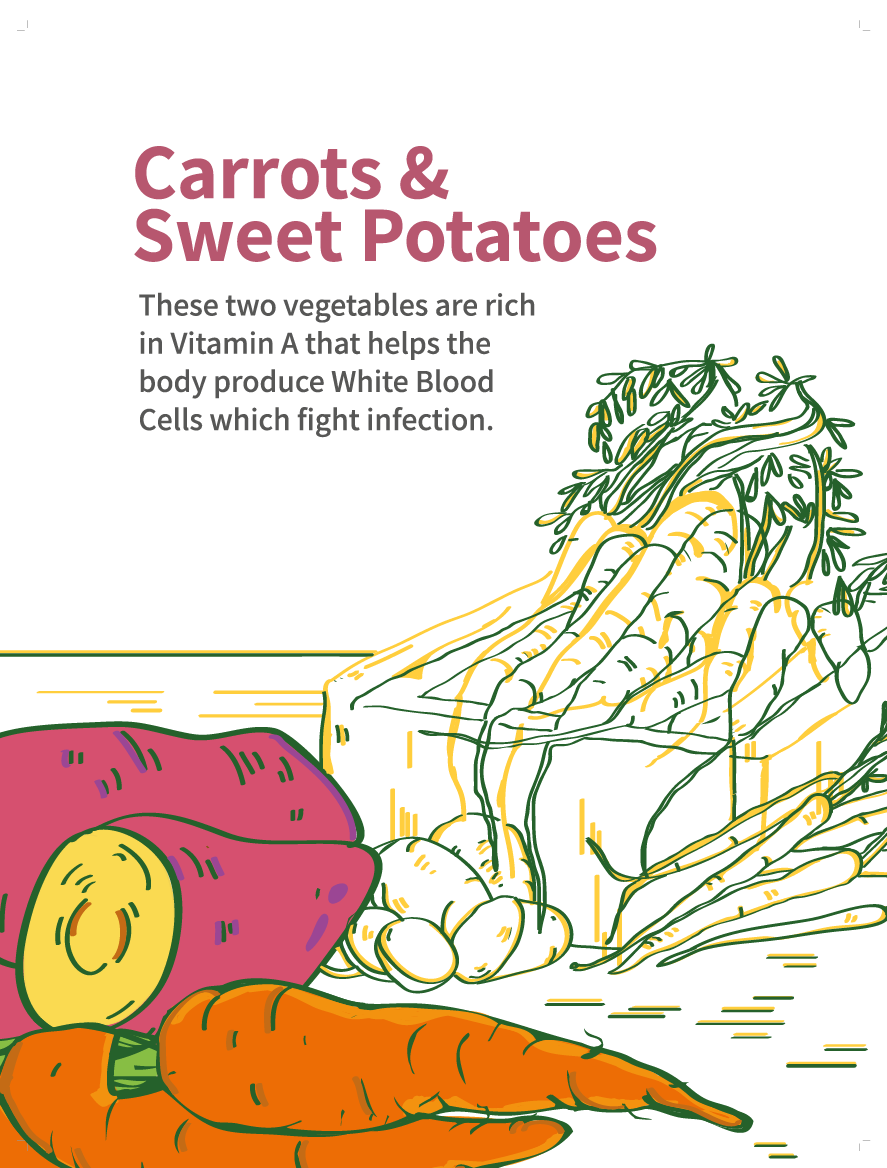
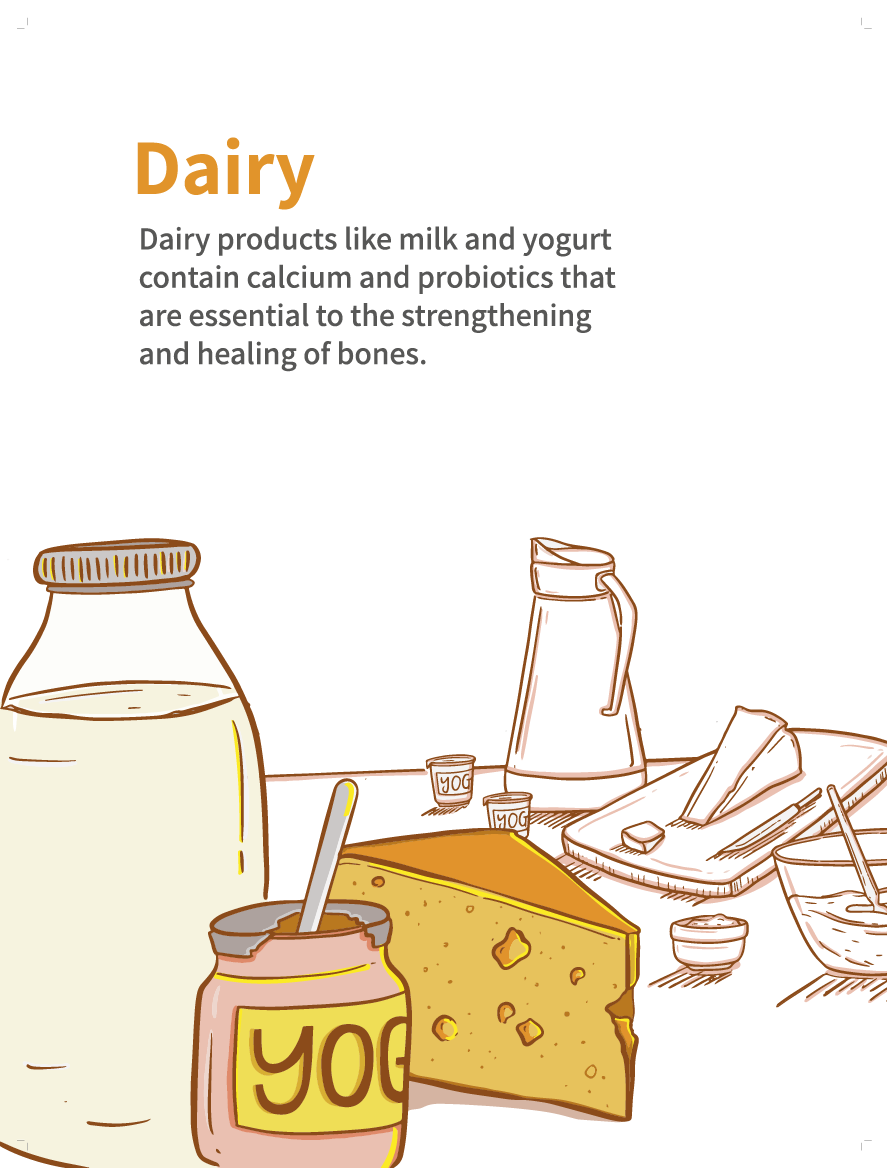
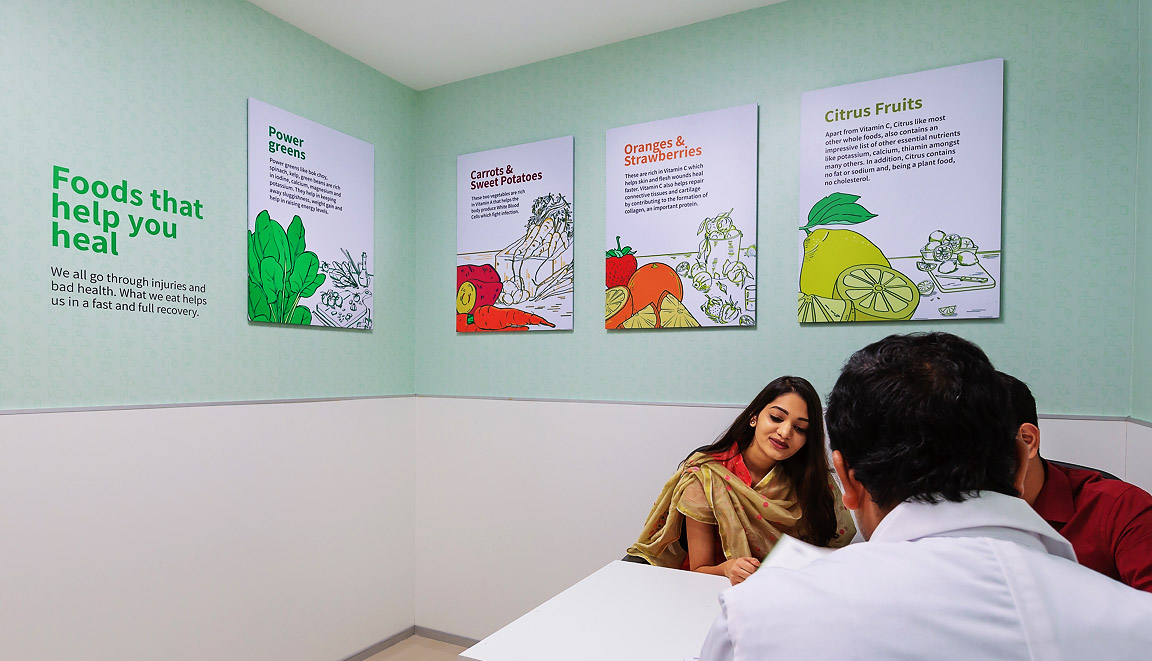
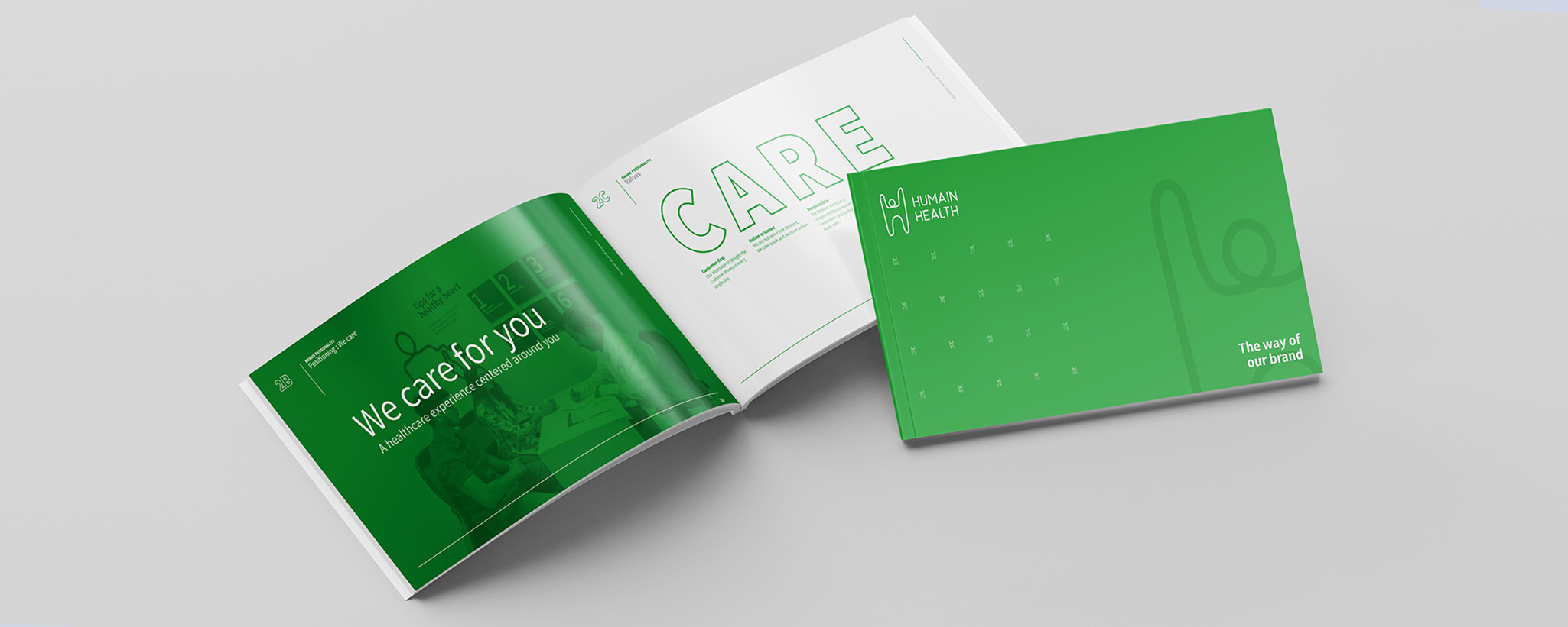
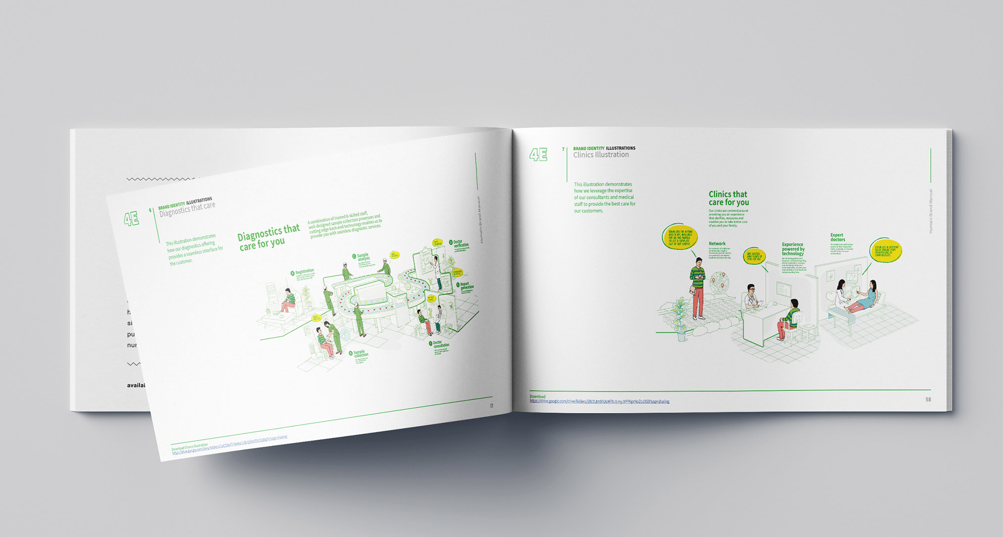
The design exercise covered over 40 unique applications and resulted in a detailed brand playbook, which was used to scale the presence of the brand in centres across India.
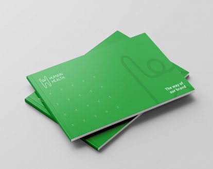
The Human in Humain
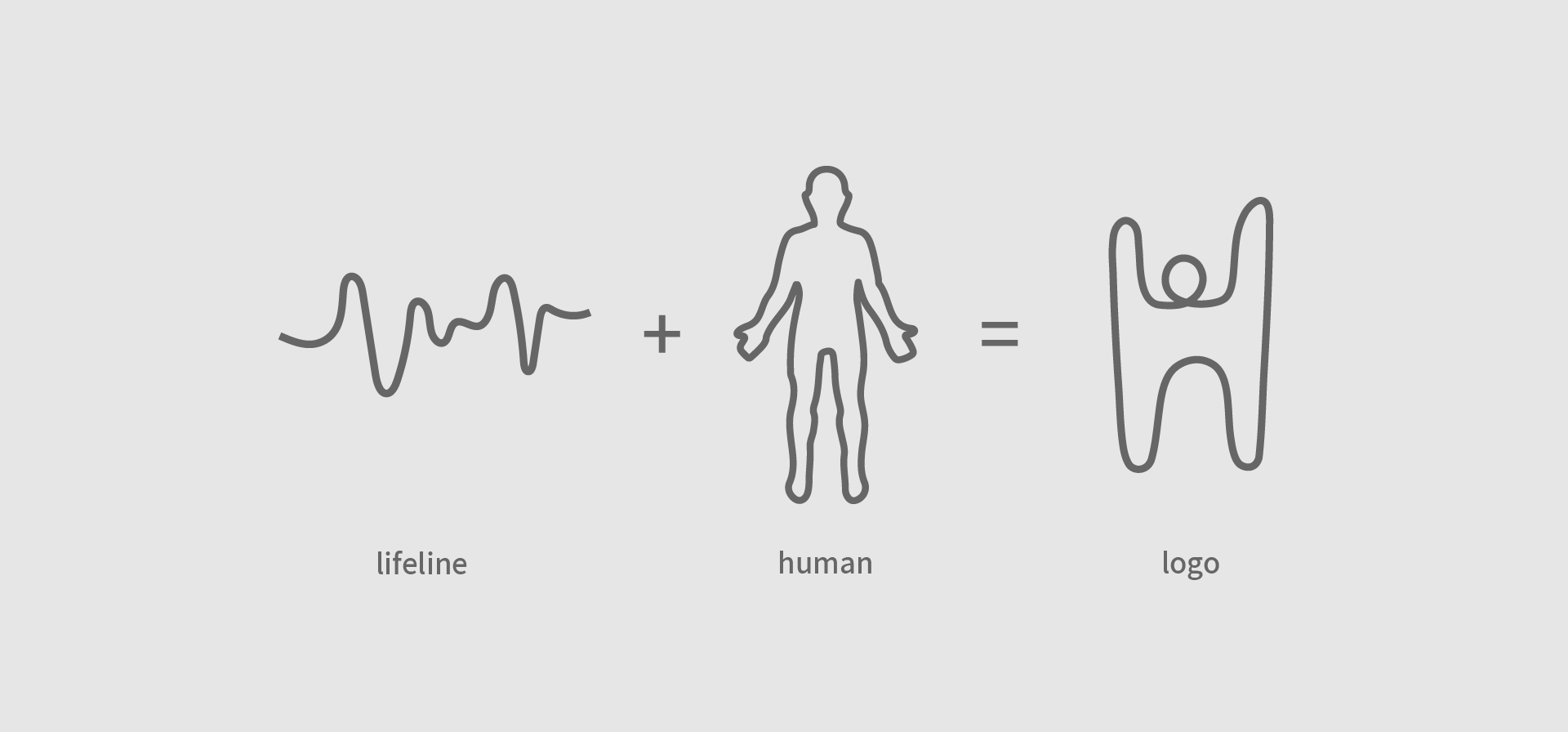
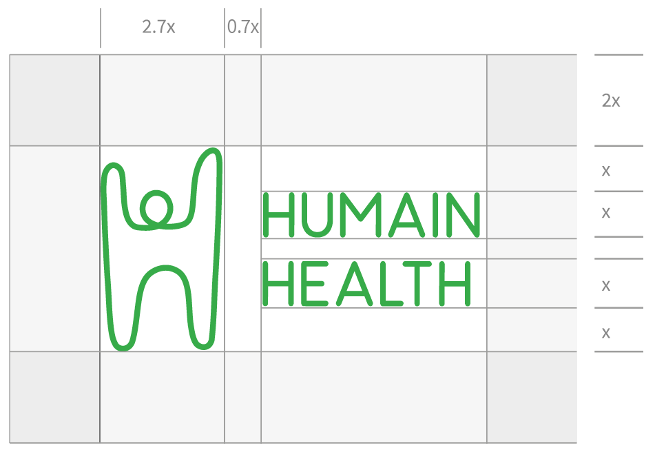
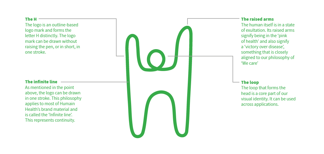
The brand identity design has a mascot drawn with a single line. This represents the green line of life. This mascot is seen celebrating good health with raised arms. It also represents the letter ‘H’
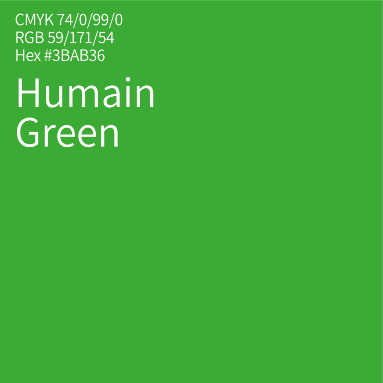
The logotype uses a simple sans-serif font with rounded edges – symbolising warmth. The green brings the most pleasant color of nature to patients’ healthcare.
Icons
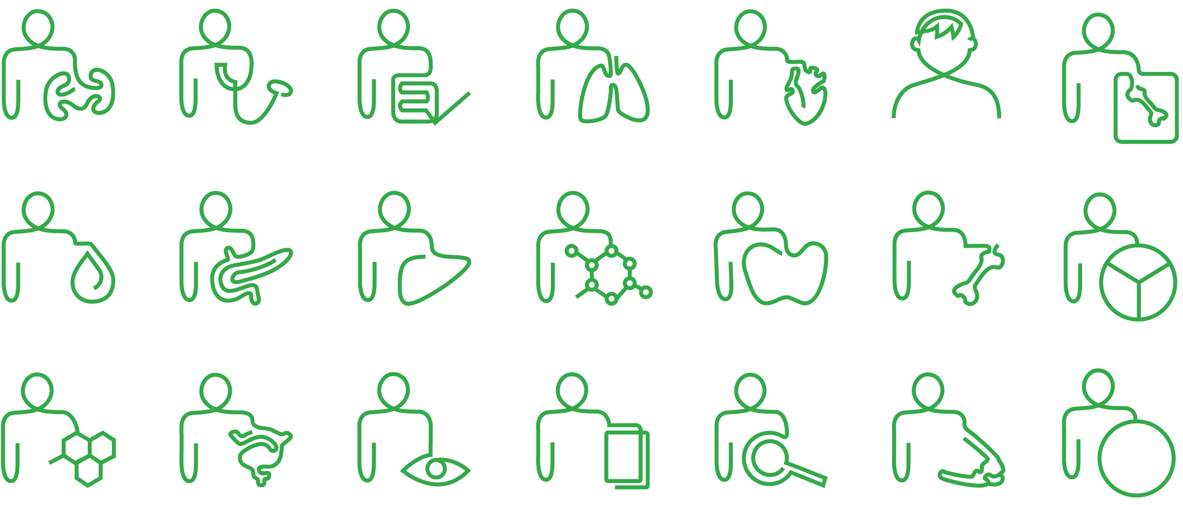
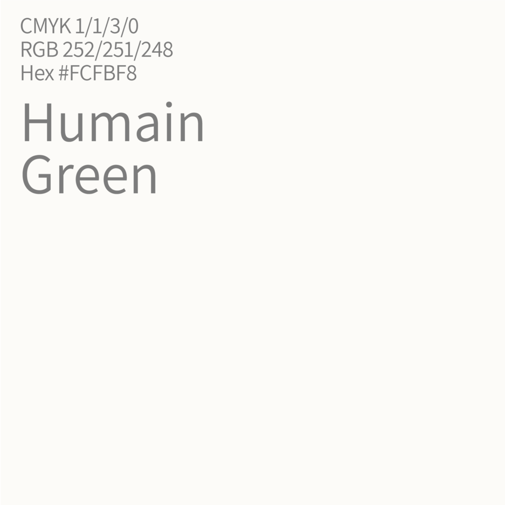
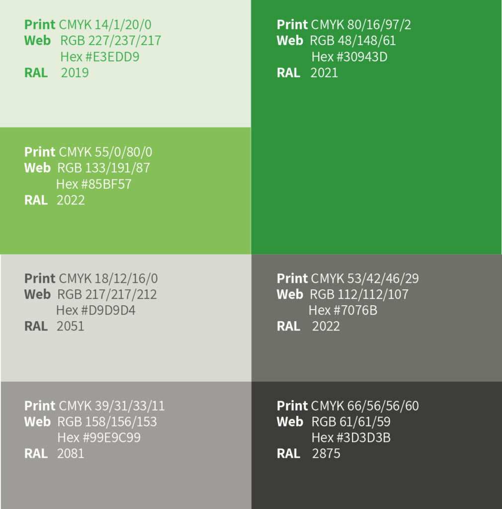
Green, the color of life. The color of Humain Health.
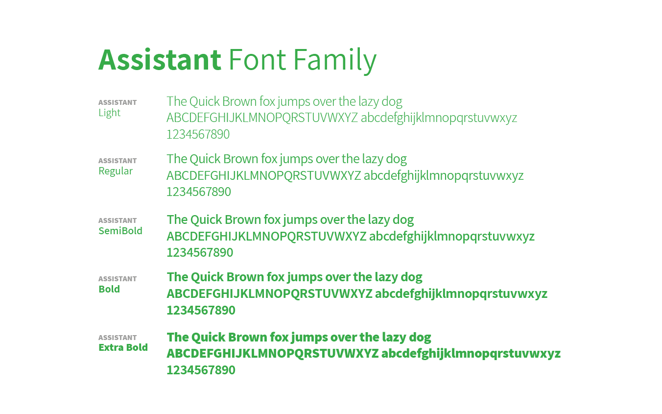
Typography
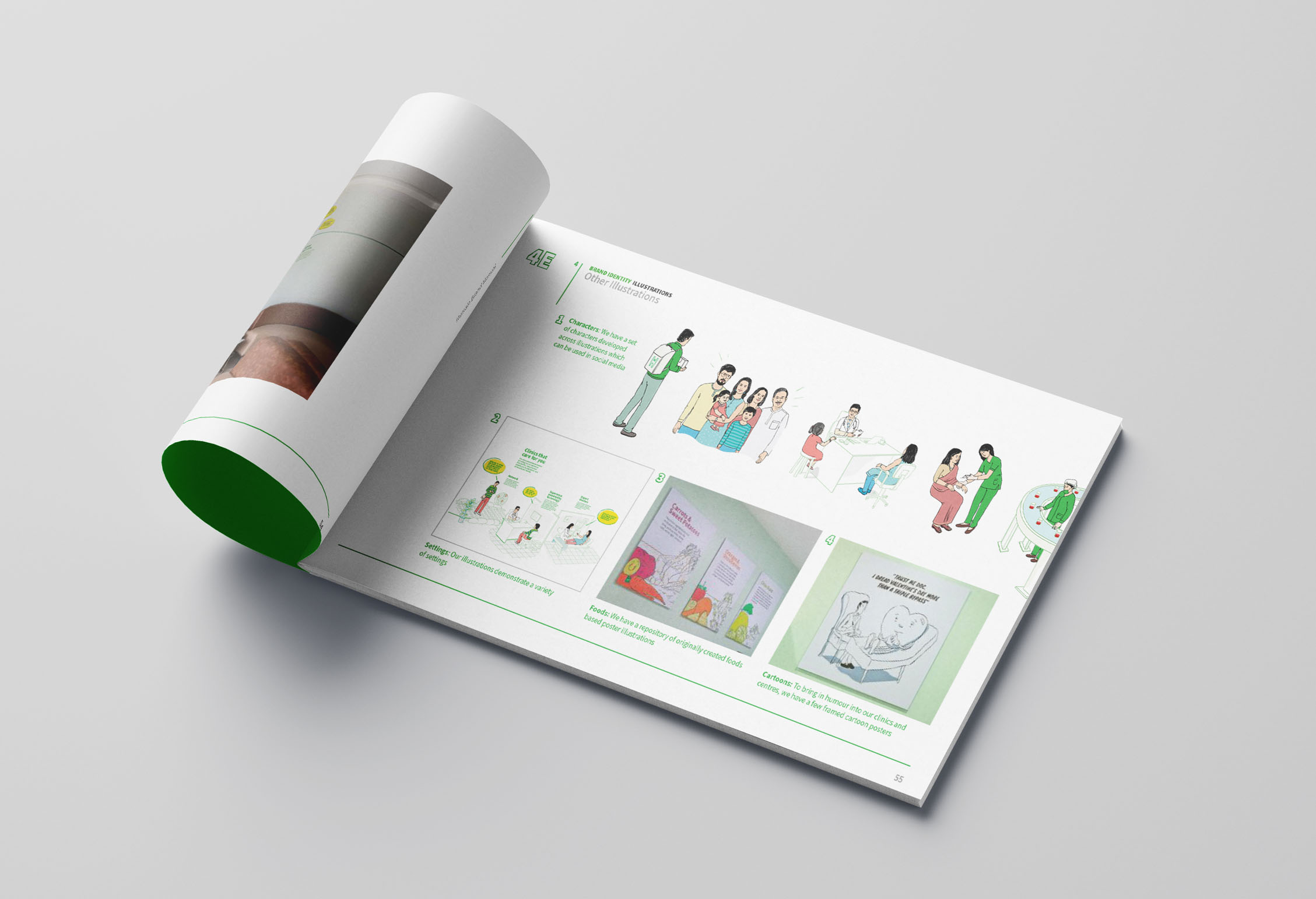
Illustration
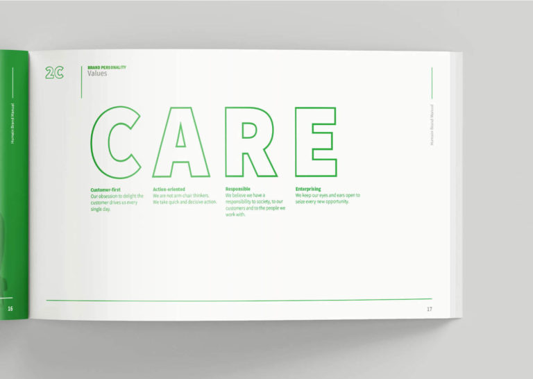
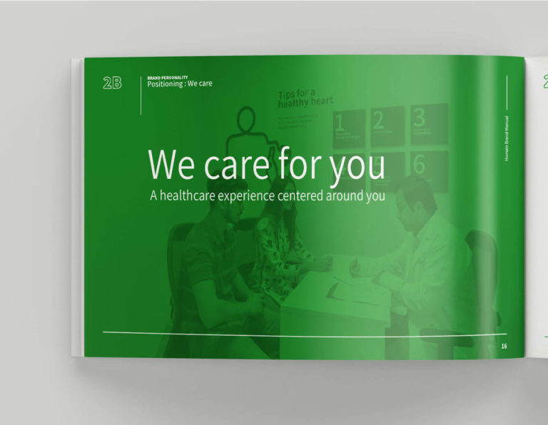
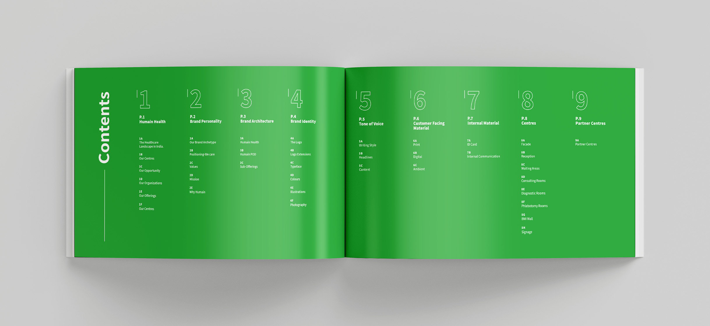
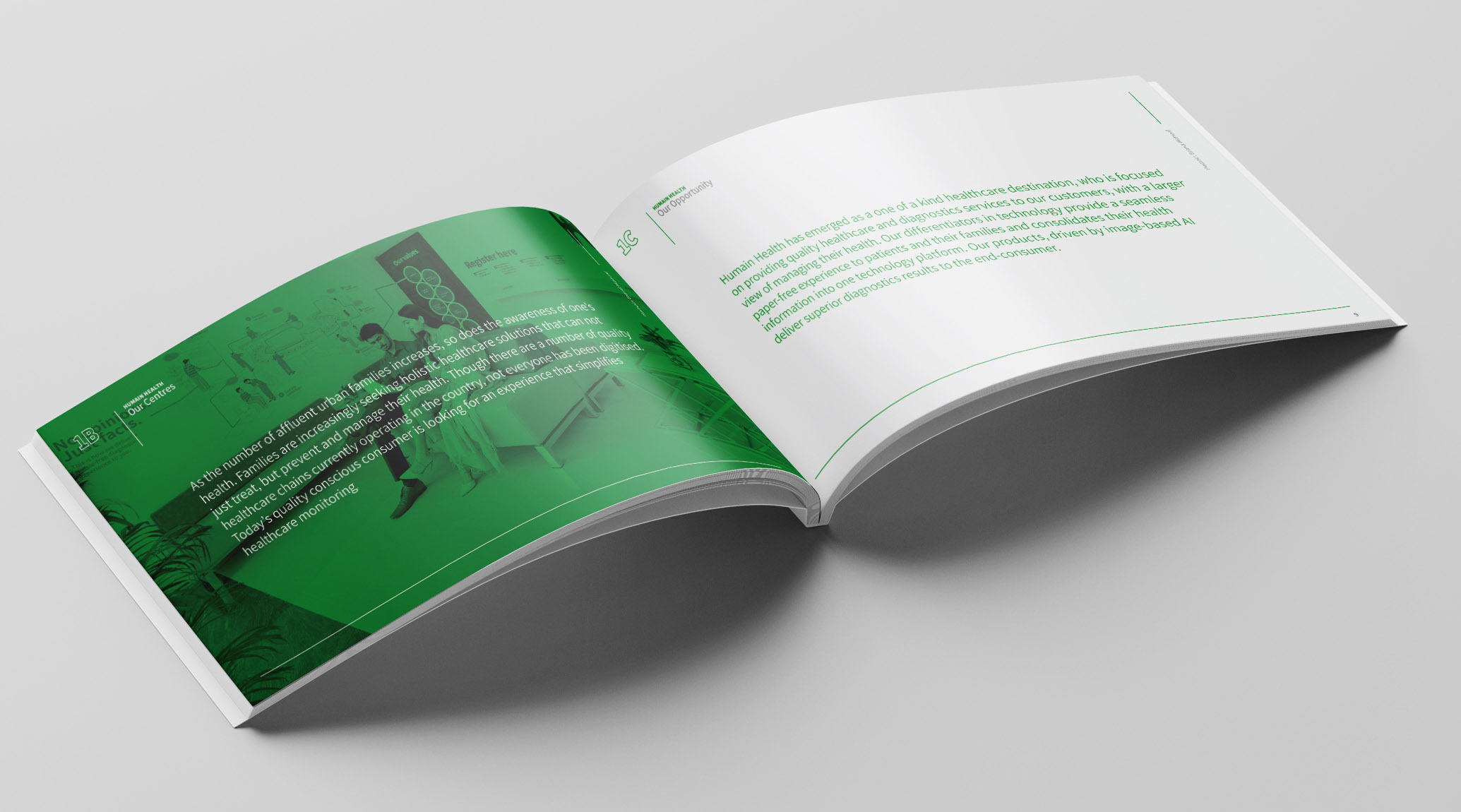
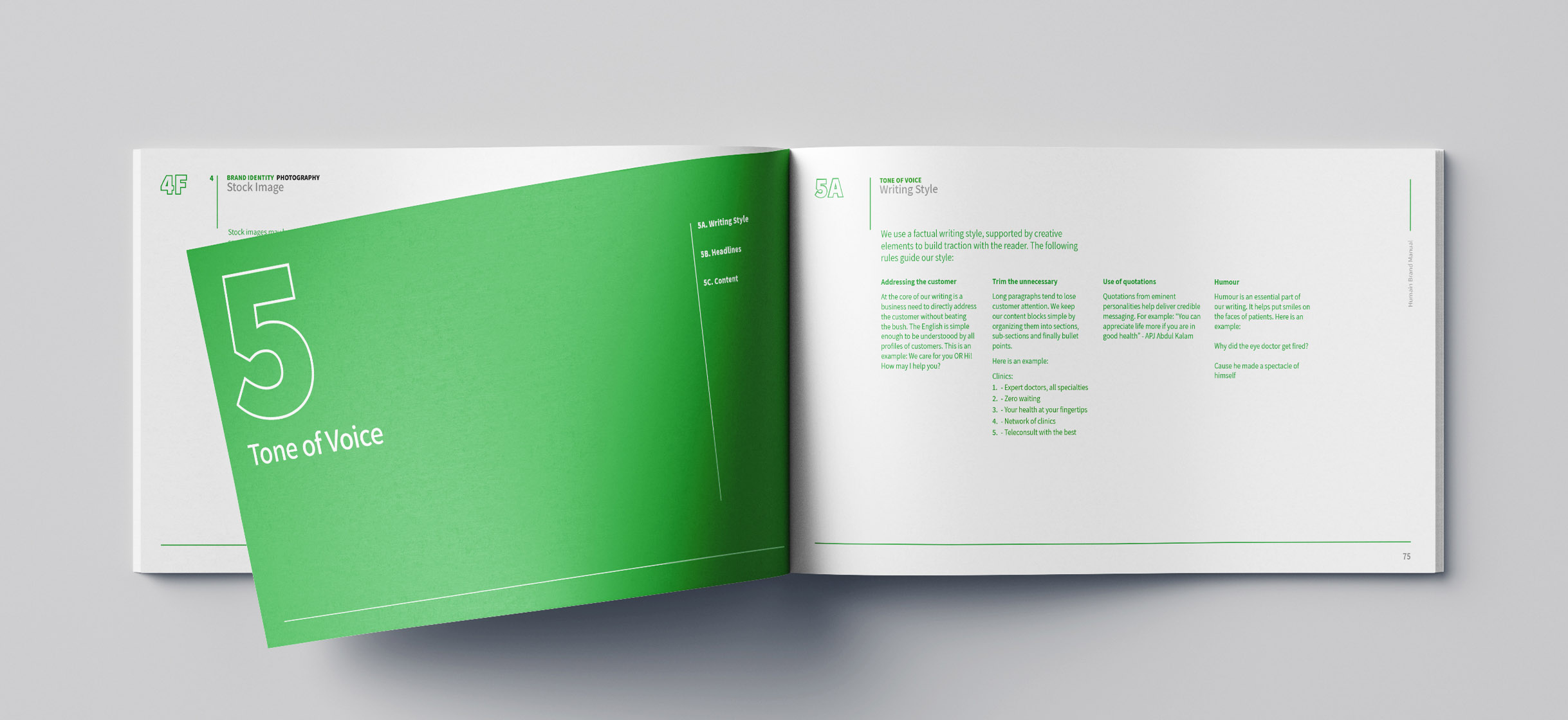
Brand Identity Manual
Impact
The Humain Health identity is now a well-recognised logomark used in all their centres
