Let’s start a new design project together!
Re-imagining QSR graphics for the physical launch of a popular cloud kitchen
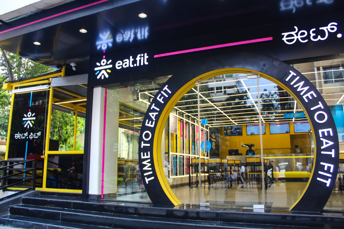
Eat.fit, a brand housed under the Cure.fit group is a health-focused chain of new age restaurants all across the country. The brand focuses on taste as well as health and until our engagement had been primarily a cloud kitchen. Now, they were looking at entering the realm of physical stores and restaurants where patrons could visit and eat at.
From cloud to street
Some of the questions that we asked ourselves:
- How to take a brand from virtual to physical?
- How to make a brand’s philosophy the hero of the space?
- How to creatively differentiate the brand and the space in a highly competitive market?

An exercise in storytelling
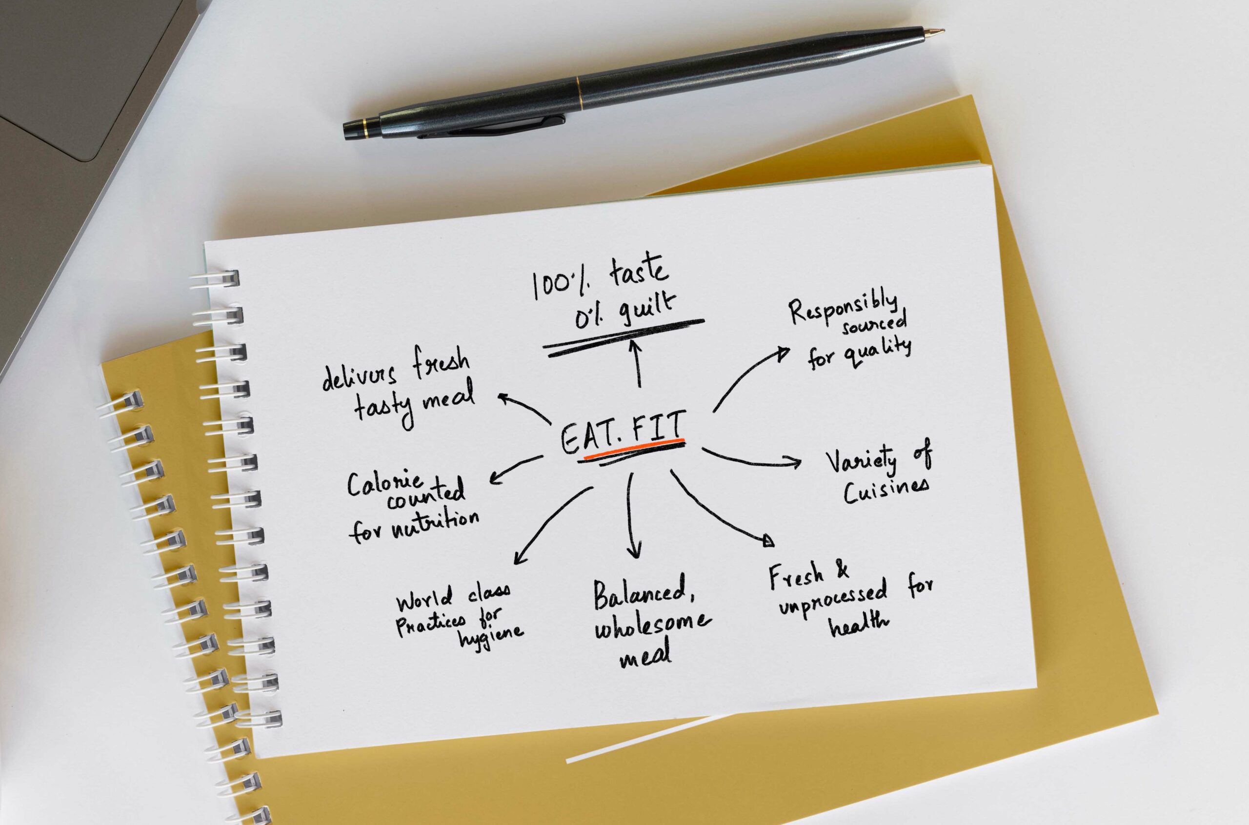
After talking to a number of members of the eat.fit team, understanding their user research and data and talking to a sample set of users, we decided to create a strategy based on the following pillars:
- Brand philosophy and USP
- Customer Stories
- Humour

Brand Philosophy and USP
The brand focused on tasty food that was also healthy. A series of interviews with the team, multiple conversations with the chefs and visits to the kitchen gave us a clear idea of the pillars of health that the brand focused on.
“We wanted to make customers aware of these pillars in a non-preachy and fun manner.”
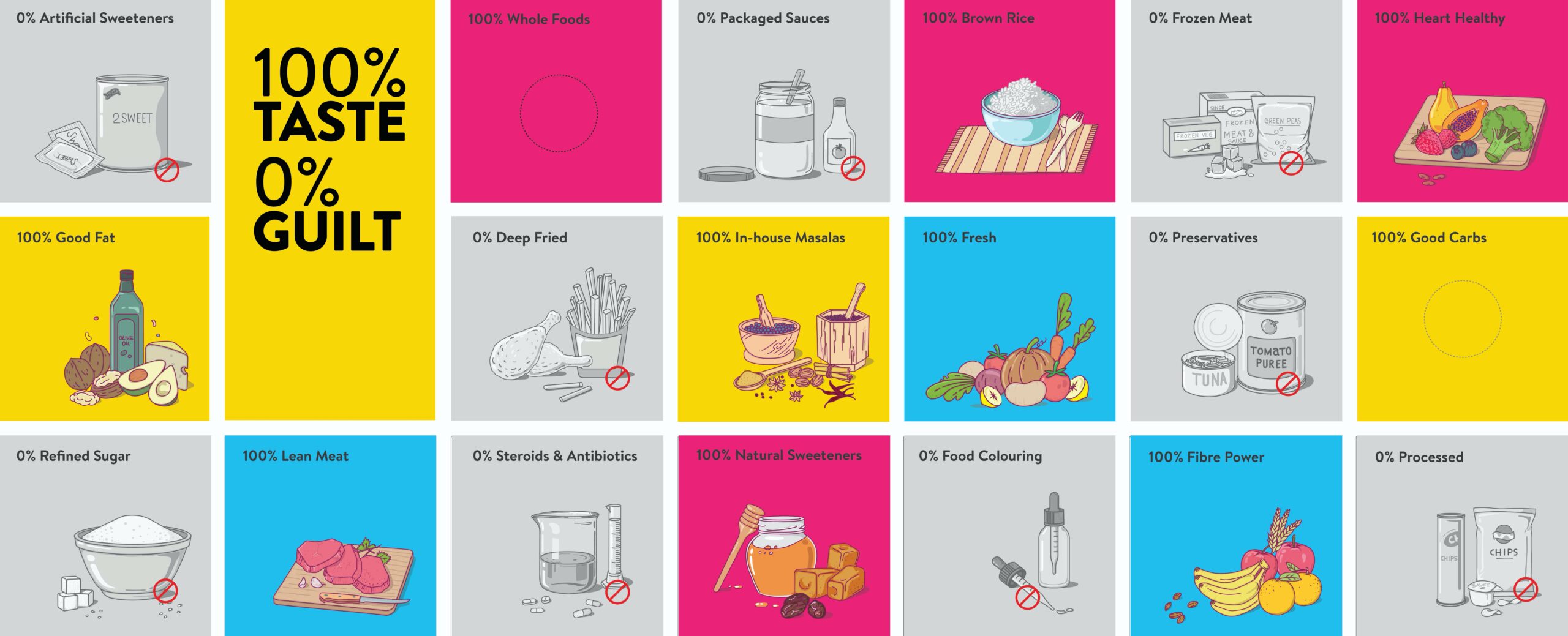
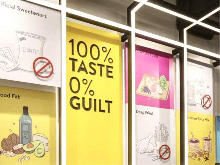
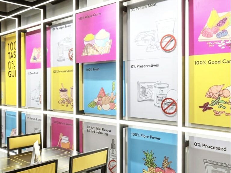
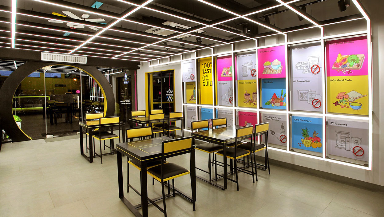
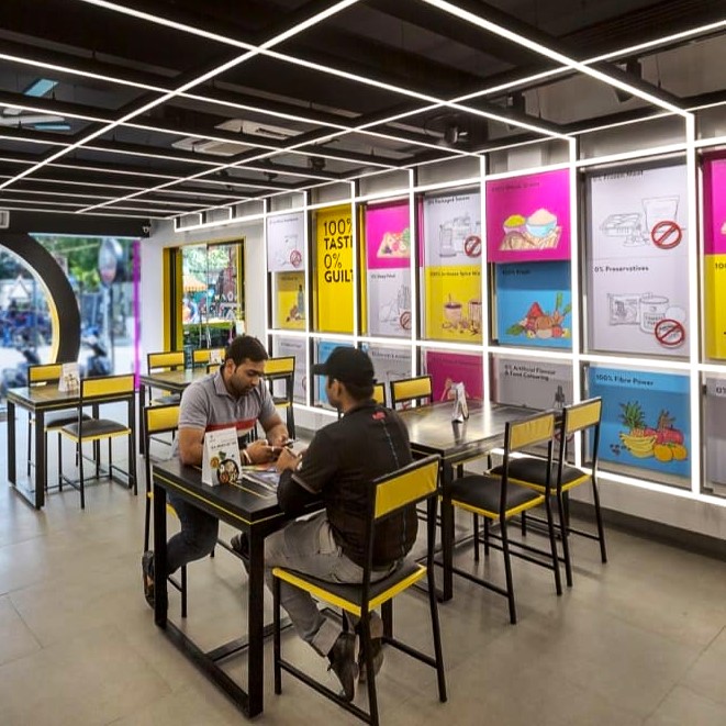
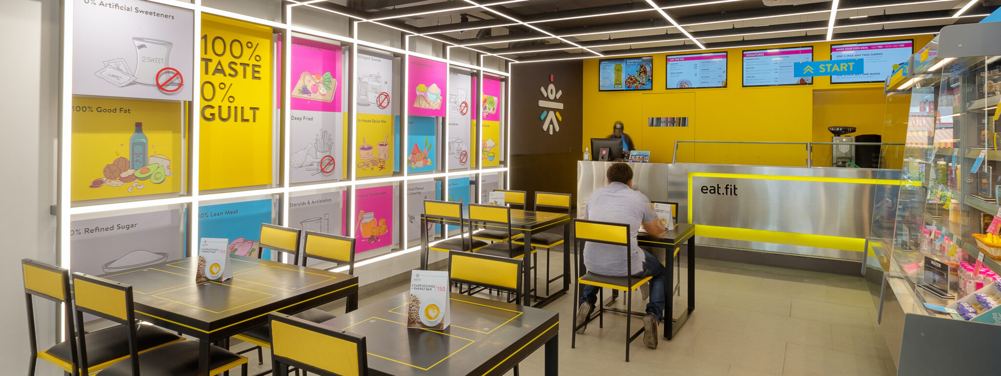
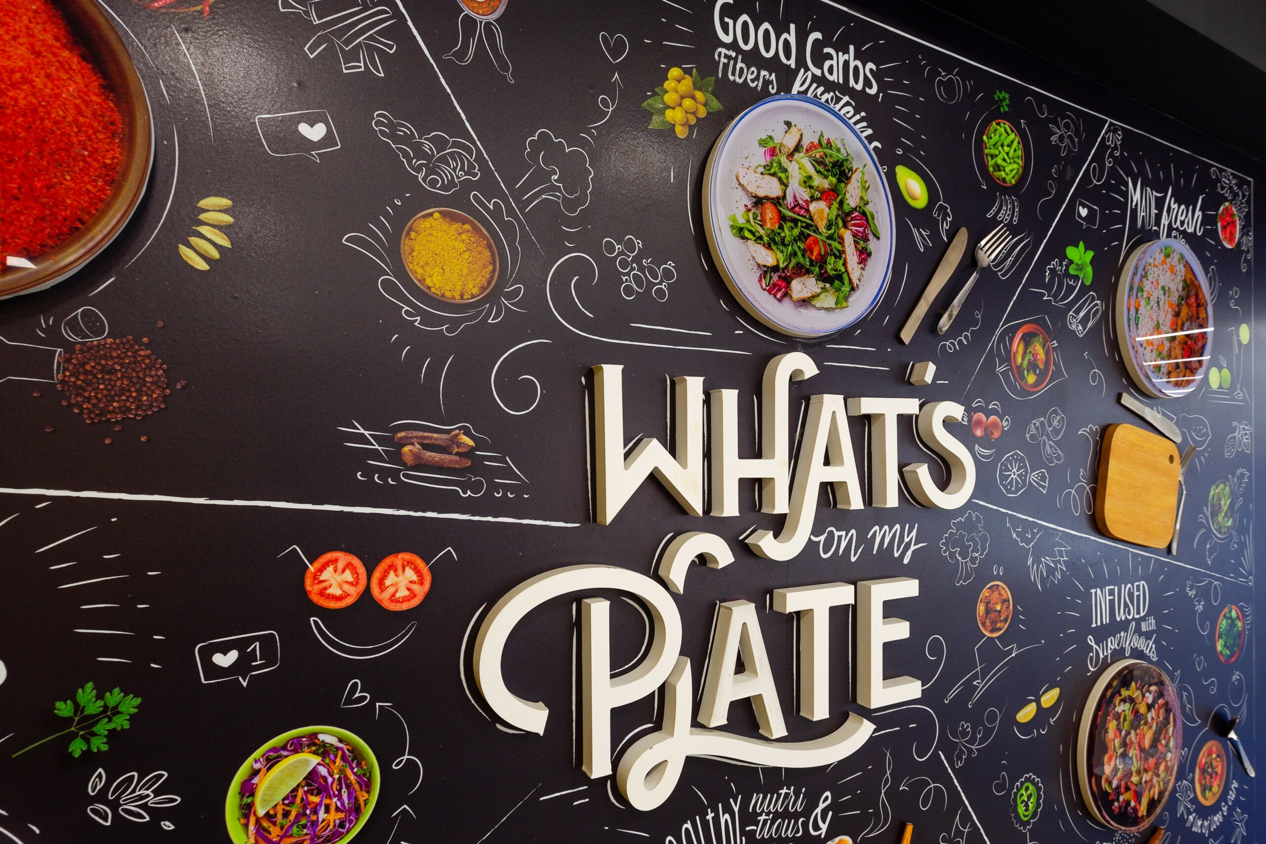
What’s on my plate?
Eat.fit aims to prepare the most nutritious and fresh meals possible. A wall dedicated to this philosophy was placed right behind the food counter.

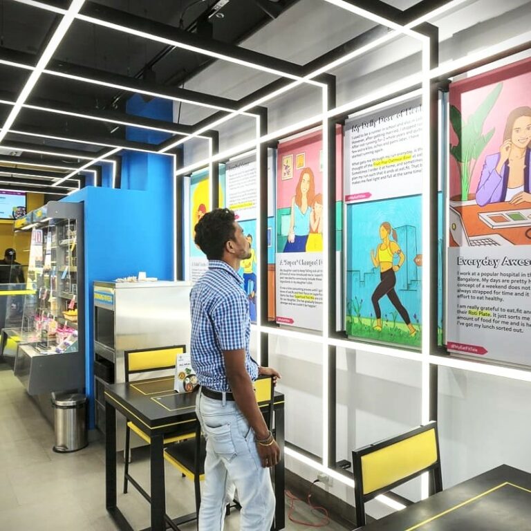
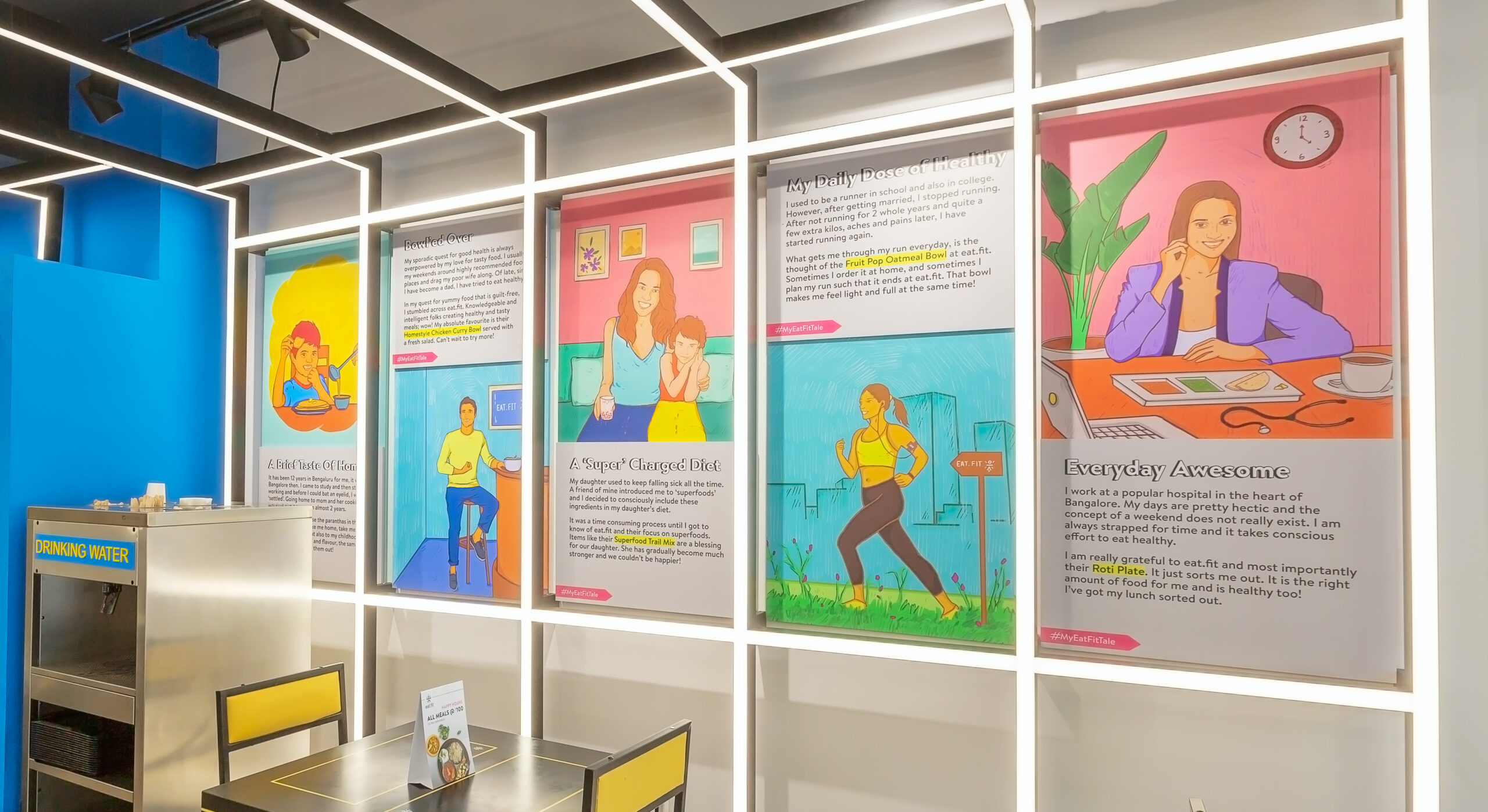
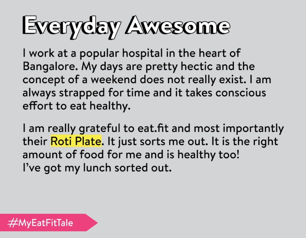
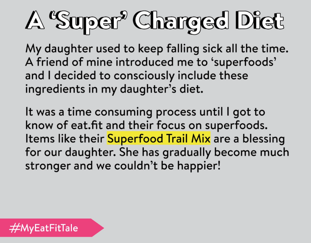
Customer Stories
The brand catered to modern Indians who are health conscious, take good care of themselves with a good diet and exercise and like to be fully aware about what they eat. The way to connect to this TA was to celebrate stories of people who they could connect with.
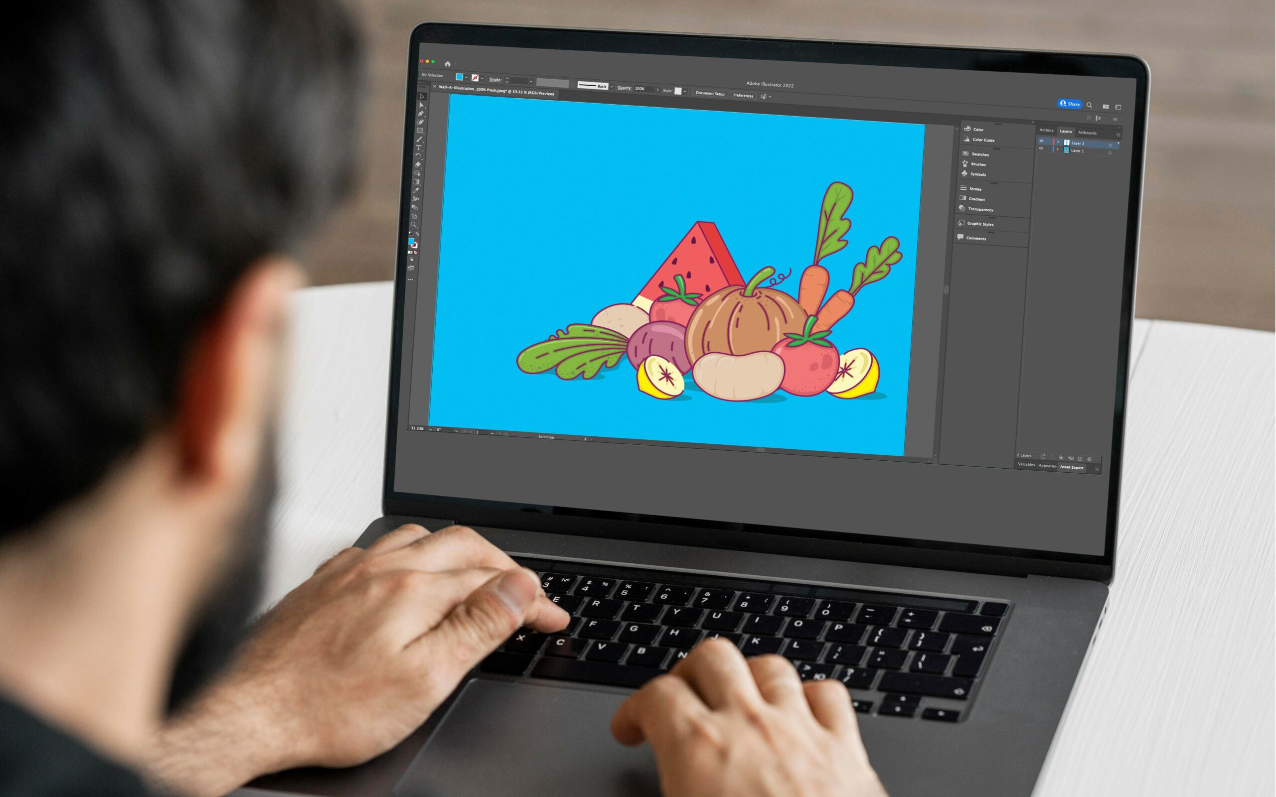
We created persona based stories with specific products and use cases as the hero. Each character was also drawn keeping the brand palette and target audience in mind. The people drawn had to feel real and establish a genuine connect in the minds of the visitors.


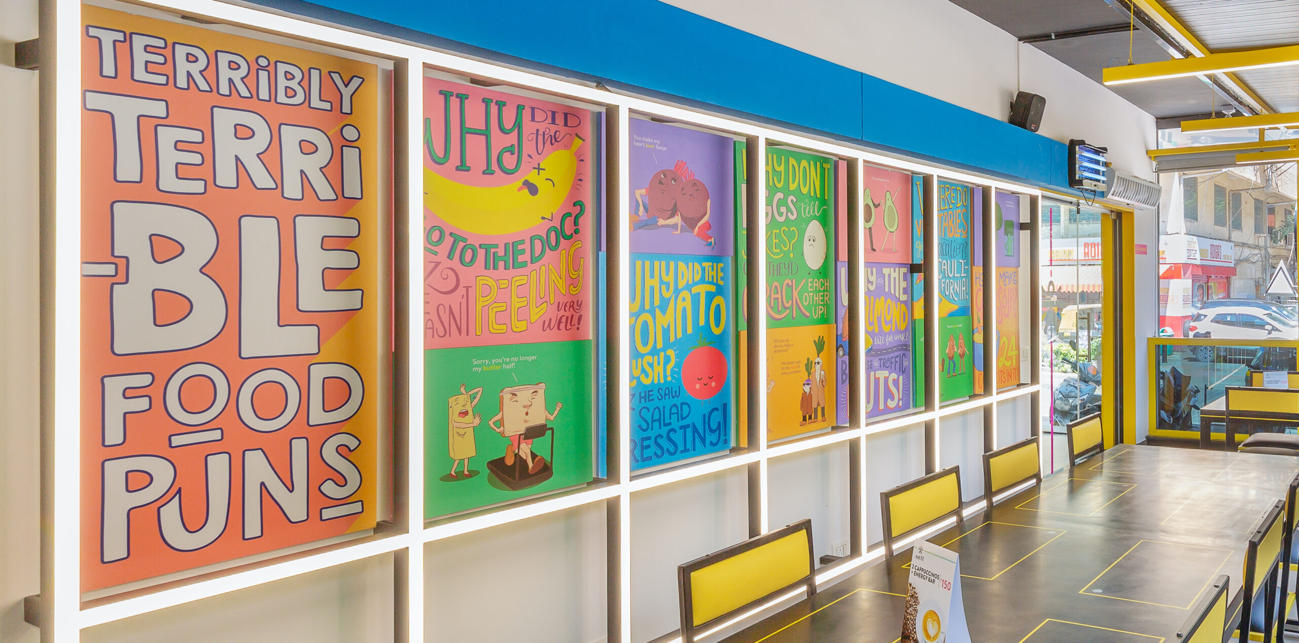
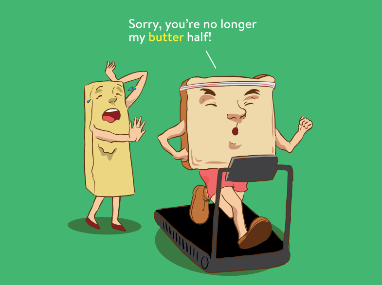
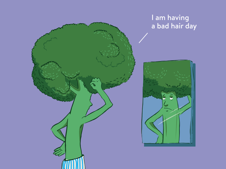
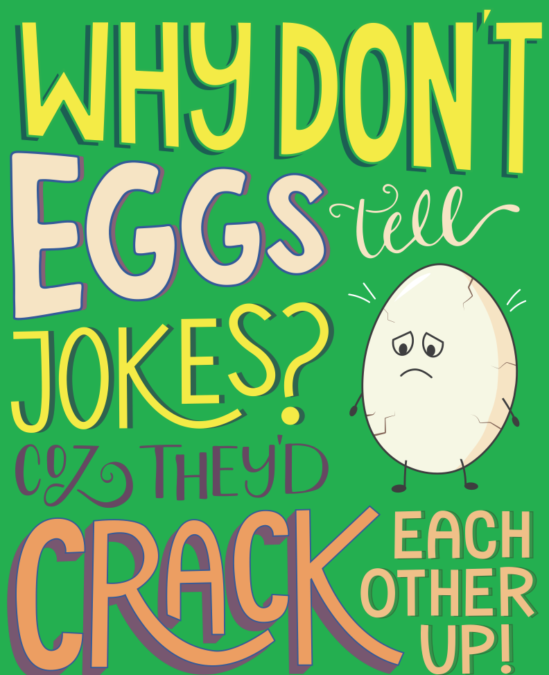
Humour
Humour is a great tool for a brand to be immediately like-able. We wanted people to feel comfortable and happy purchasing and eating the food.
We did not want it to feel like a chore or a task to eat healthy. A healthy dose of puns (no pun intended), food based humour teamed with custom illustrations helped us achieve the above objective.
And the outcome
The Eat.fit chain of restaurants first launched its flagship store in Bengaluru’s Church Street and then proceeded to scale rapidly. Our work received almost unanimous positive feedback from the brand and customers alike and was scaled to over 10 locations across Bangalore and 2 other cities.
“Team Rezonant understood exactly what we were going for. They understood what a brand like Eat.fit needs and delivered delight. There was unanimous love and excitement for what was created by all of us in the team.” – Gokul Kandhi, Head of Business, Eat.fit