Let’s start a new design project together!
UX design for an innovative Bangalore-based health app
Rezonant created the UX Design of a SAAS platform for a digital healthcare management platform connecting the patient, smart healthcare devices, the healthcare provider, the family/care assistant & insurance all in one place.
Challenge
How do you create the UX Design for a target group that is not tech savvy?
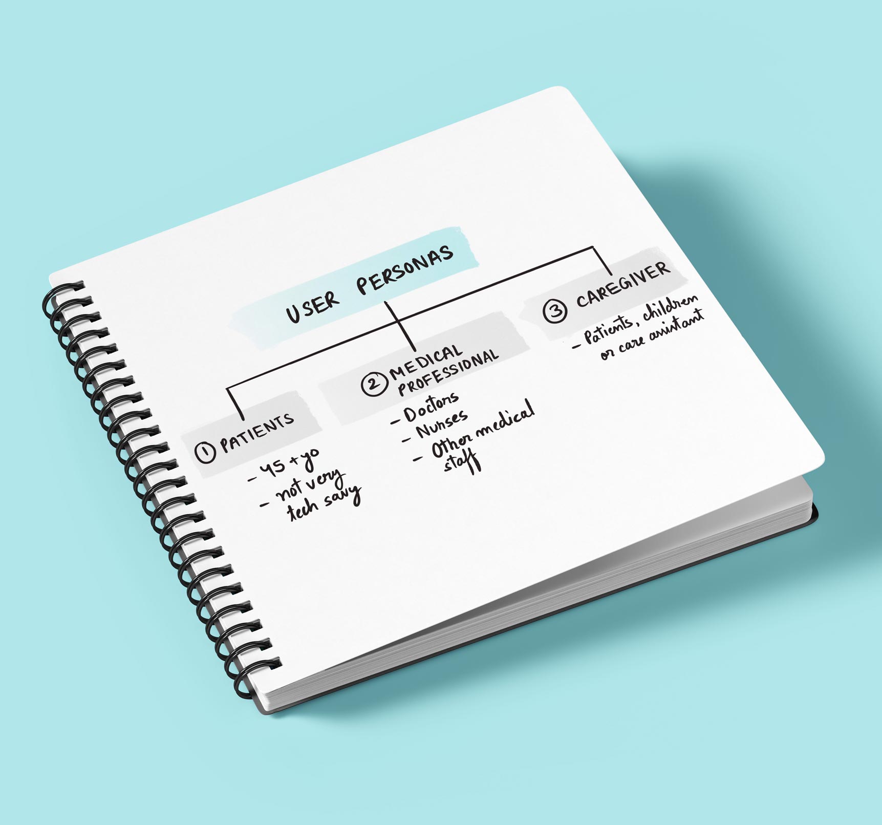
Amerald’s main target group consisted of two user personas, both of whom are not very tech savvy. The first group was 45+ year old patients who suffer from chronic endocrine disorders like diabetes and hyperthyroidism. The second group was doctors. A third, more minor target group was the patient’s family who would help monitor their health. We called this target group the ‘Caregiver”. The primary challenge for us was to create the UX Design for a platform that would be easy to use for a target group that was not tech savvy.

Strategy
Creating a user-friendly UX Design was a key strategy
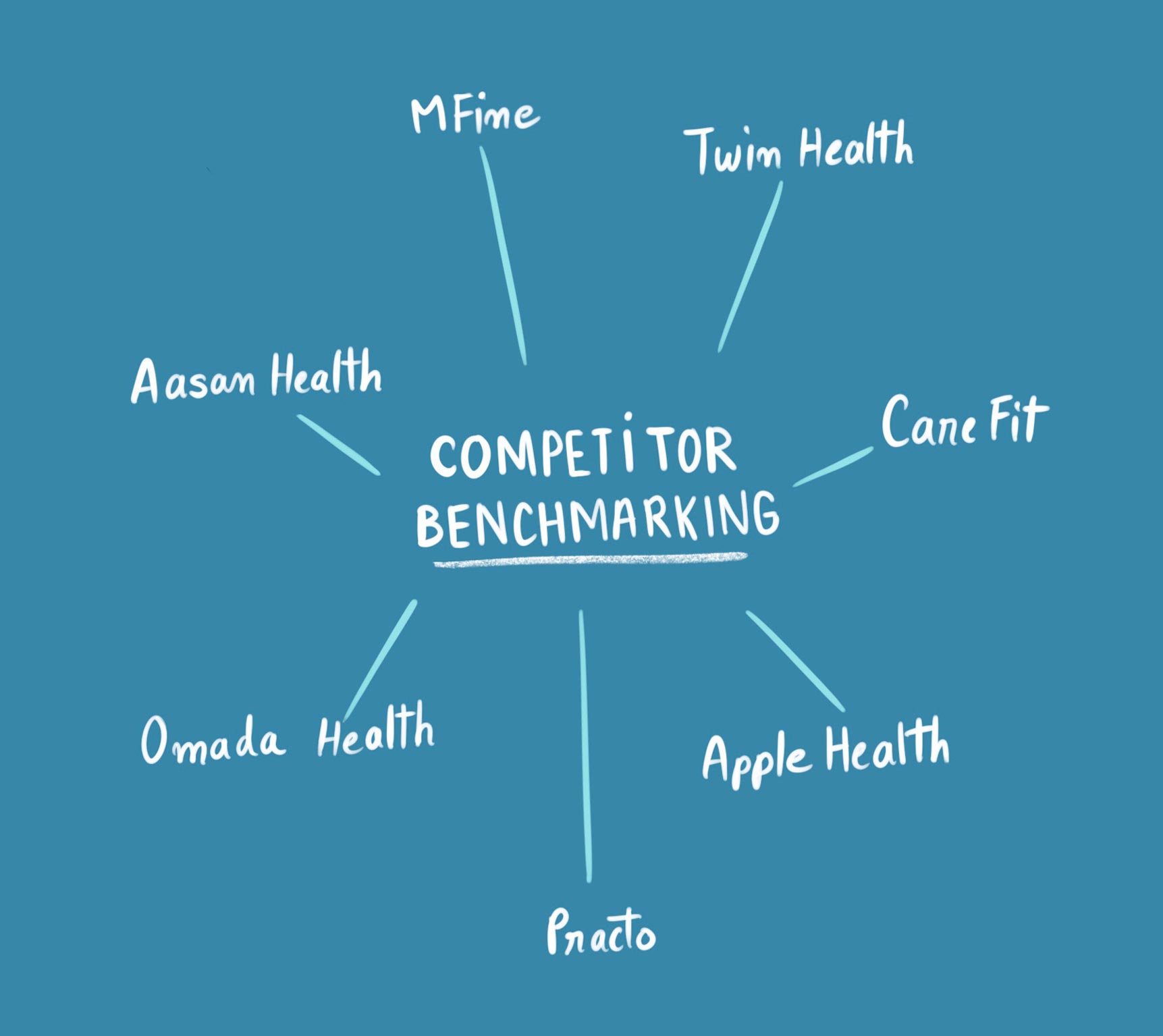
The team did an extensive benchmarking of different health apps to understand the range of features available, the information architecture and the different user flows. We then focused on understanding the 3 user personas that would be using the app. User flow journeys were made for each persona. We drew inspiration from the ‘Activity feed’ feature of social media platforms and brought that into the dashboard of the doctor portal to display patient updates.

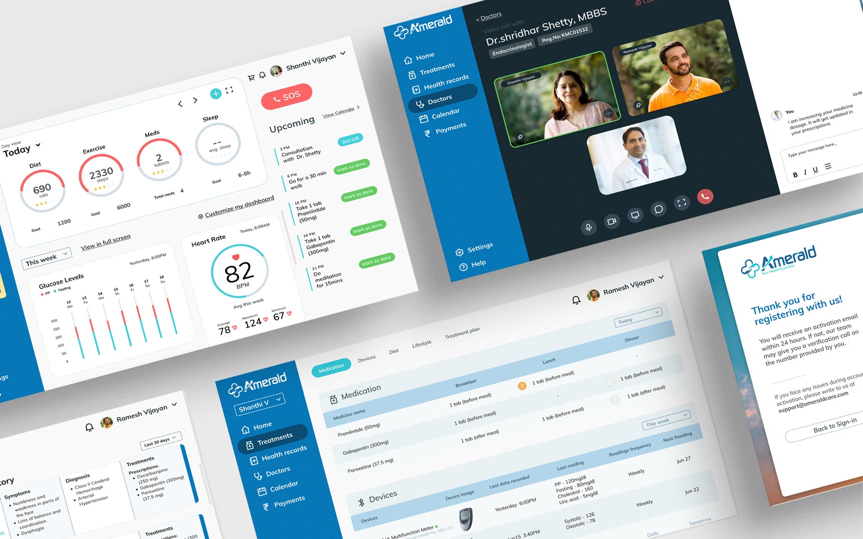
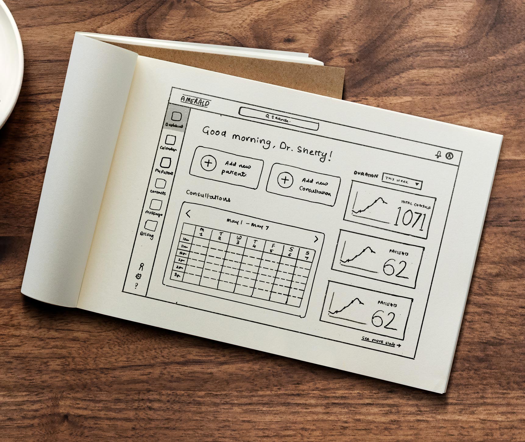
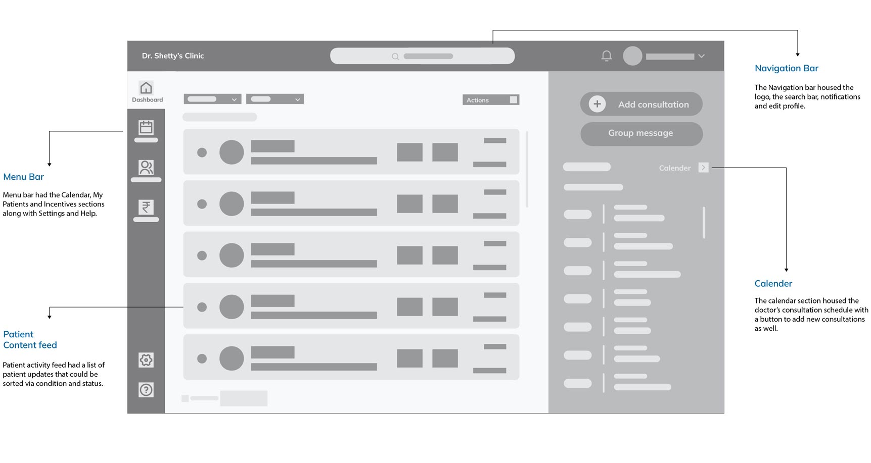
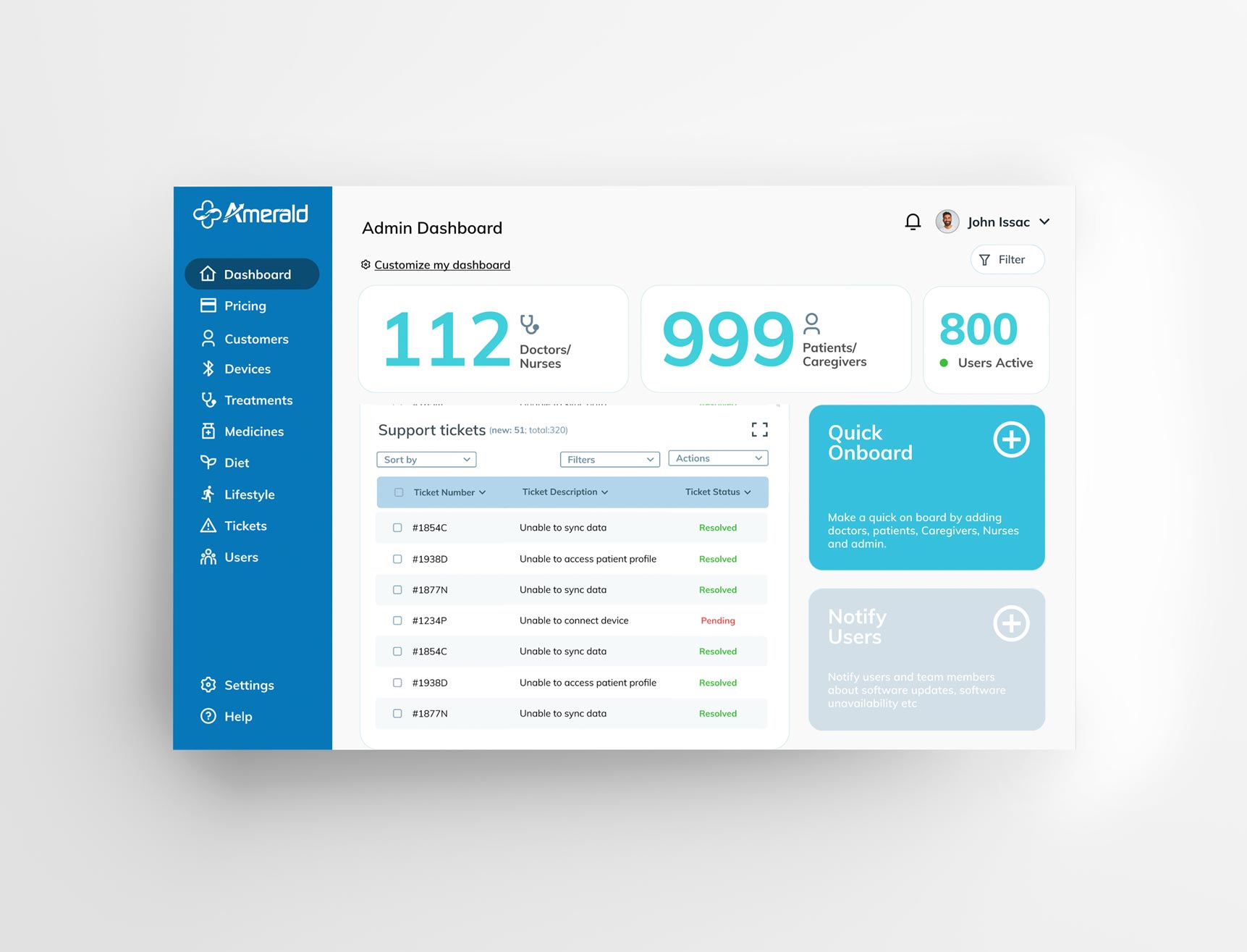
The doctor portal had a dashboard as the first screen. Only the most critical and actionable insights were shown on the dashboard to avoid overload of information.
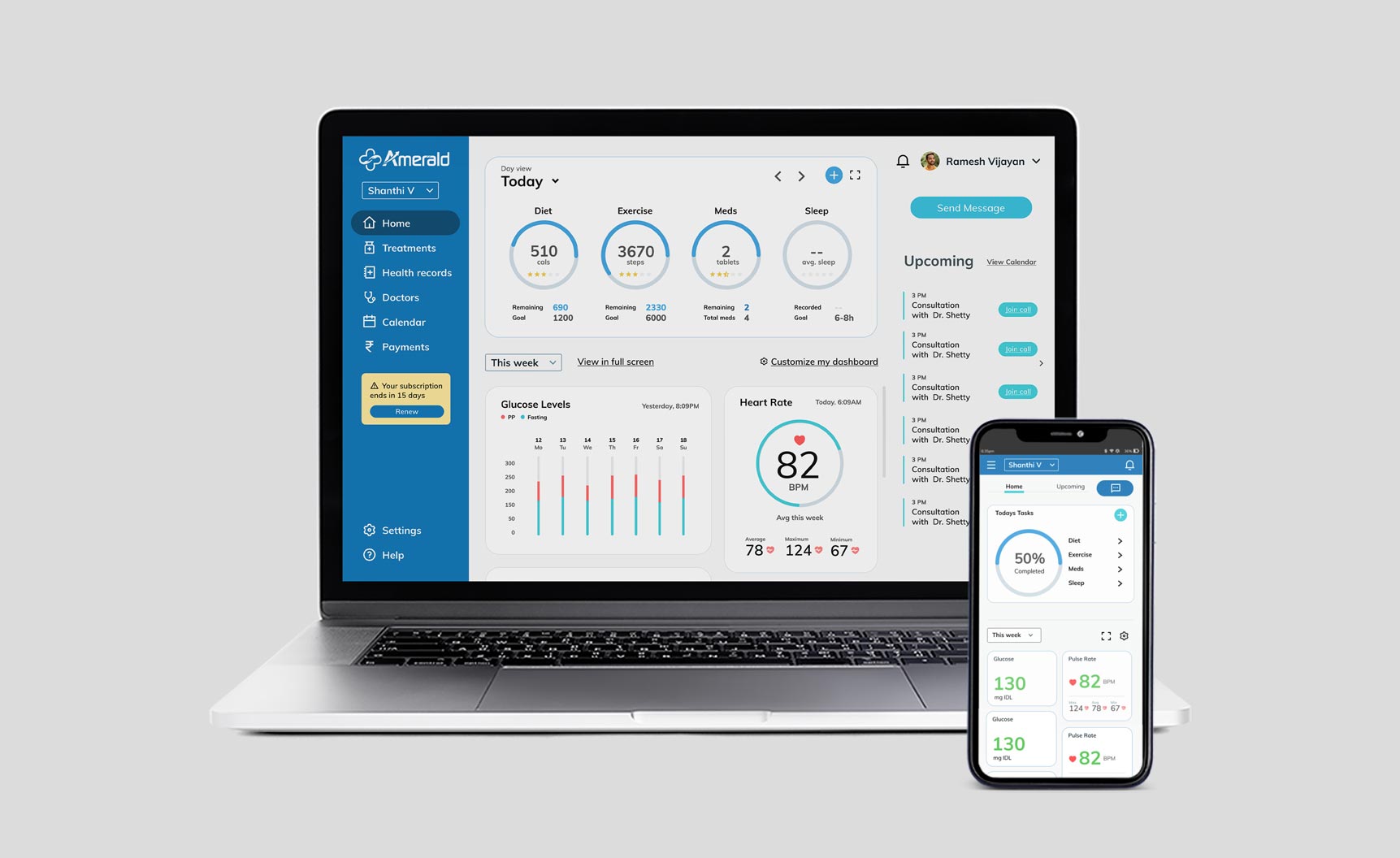
For the patient portal – as well as the caregiver portal, the dashboard showed easy-to-understand health data drawn from several portable healthcare devices like smart watch, glucose meter and BP monitor.
Design
The design followed a clean and minimal aesthetic
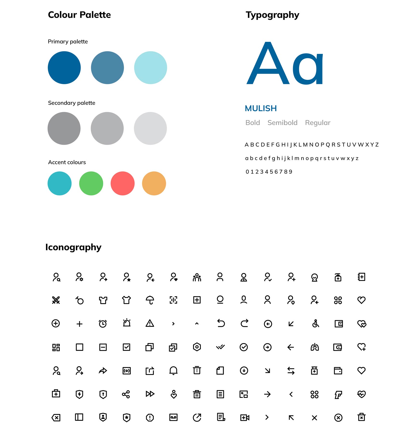
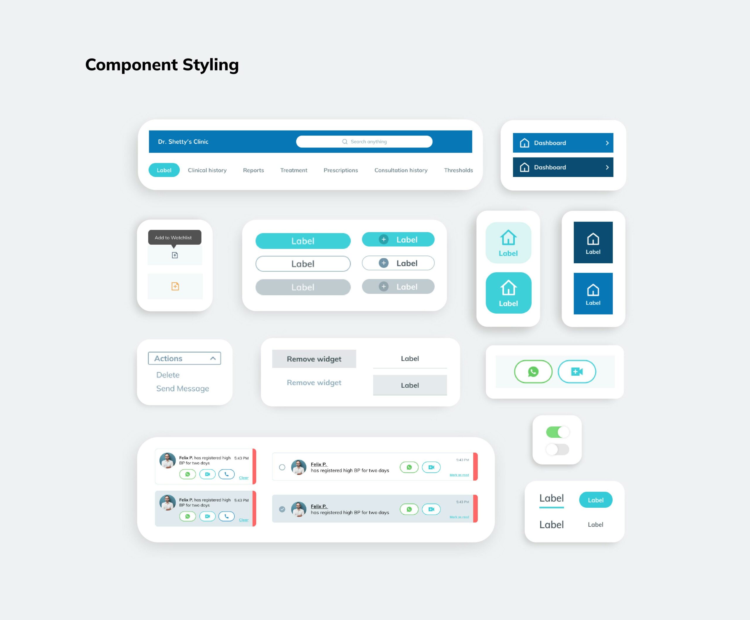
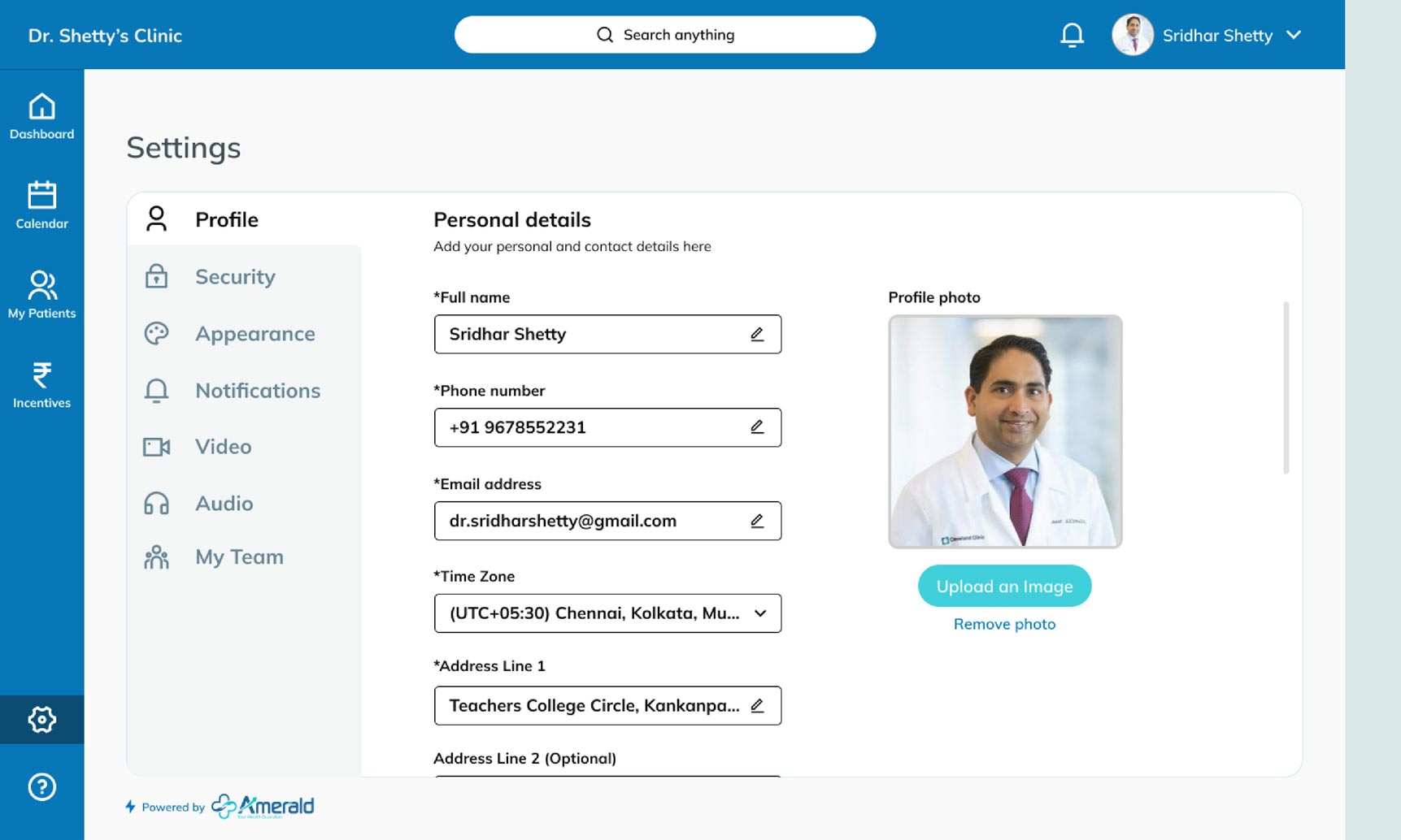
Mulish, a minimalist sans serif type family was used across the platform. The colour palette selected was a soothing blue along with a few additional accent colours. For iconography, we used clean and minimal line icons across the UX Design for the platform.

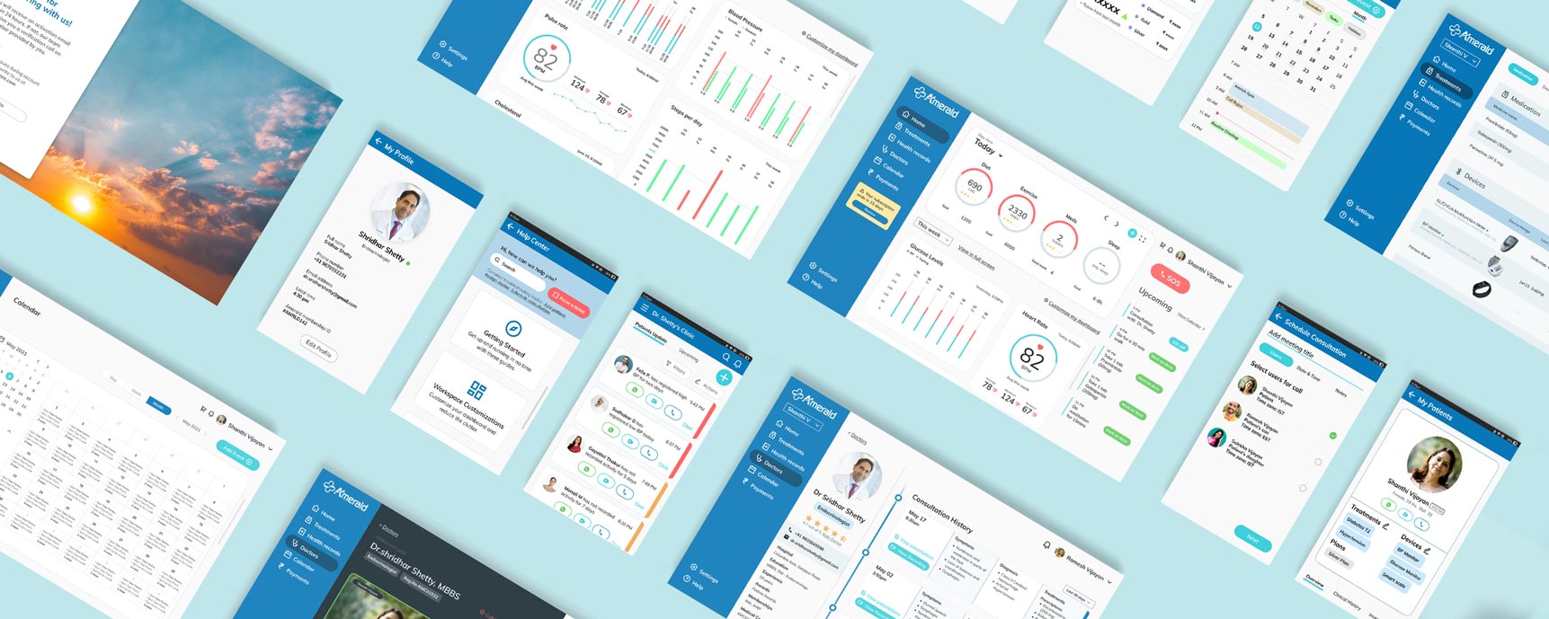
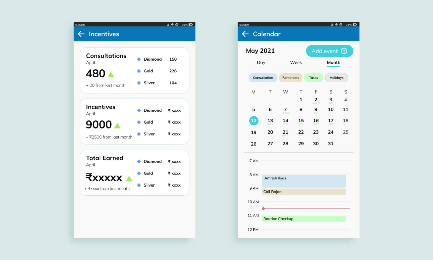
Doctor portal UX Design
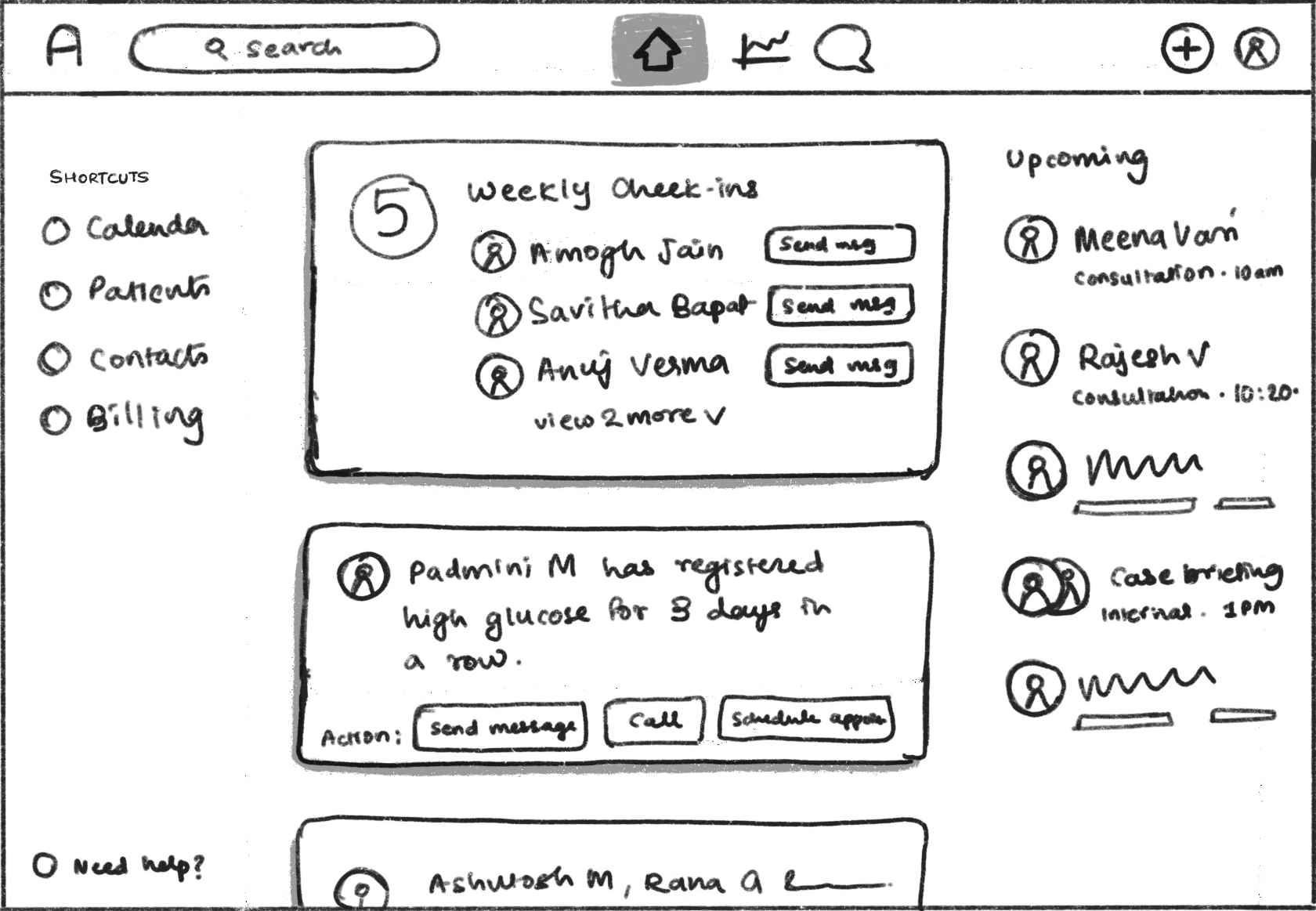
The dashboard for the doctor portal had 2 main sections – Patient updates and upcoming consultations. Patient updates were colour coded on 2 levels of priority – critical (red) and stable (green).
This section also had ‘action buttons’ which allowed the doctor to either communicate with the patient via WhatsApp or set up a video call.
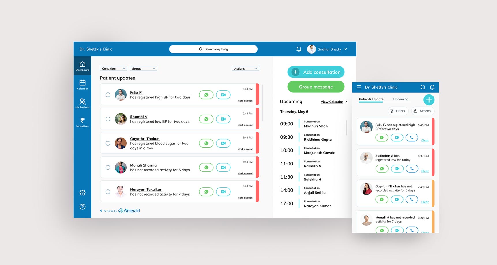
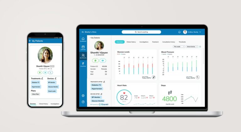
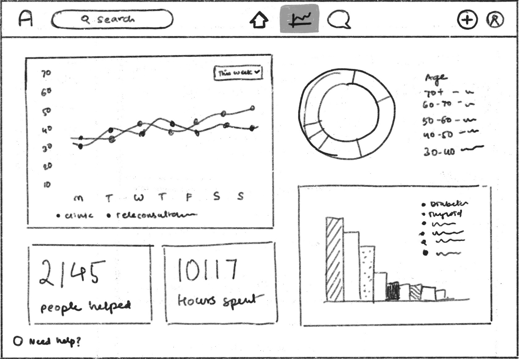
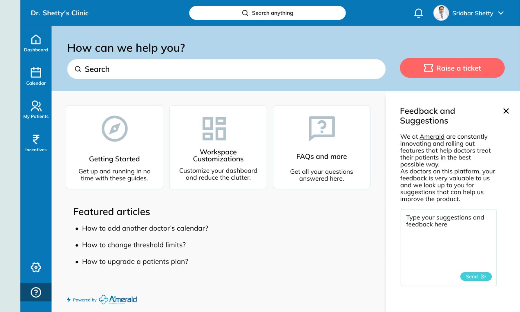
The ‘My Patients’ menu was the one stop for the doctor to view all his patients. Multiple filters like status, condition, BMI, assigned doctor were available for the doctor to use. Once you navigated to a particular patient, a detailed section that housed comprehensive data visualizations, a patient info panel and tabbed sections would open up. The team built the screens for the mobile app alongside the browser portal.
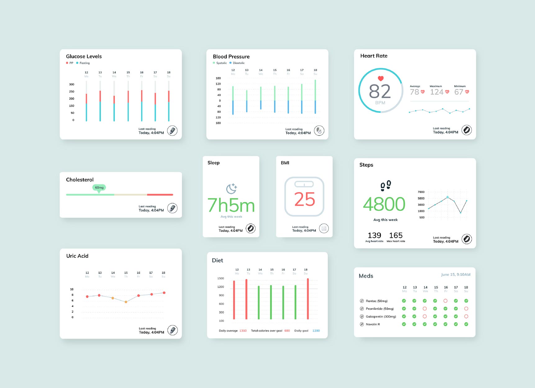
“The team depicted the data fed from the smart healthcare devices in the form of easy-to-understand visualizations”
Additionally, an advanced search feature with multiple filters was designed for the doctor to search for specific cohorts of patients.
Previous
Next
Patient portal UX Design
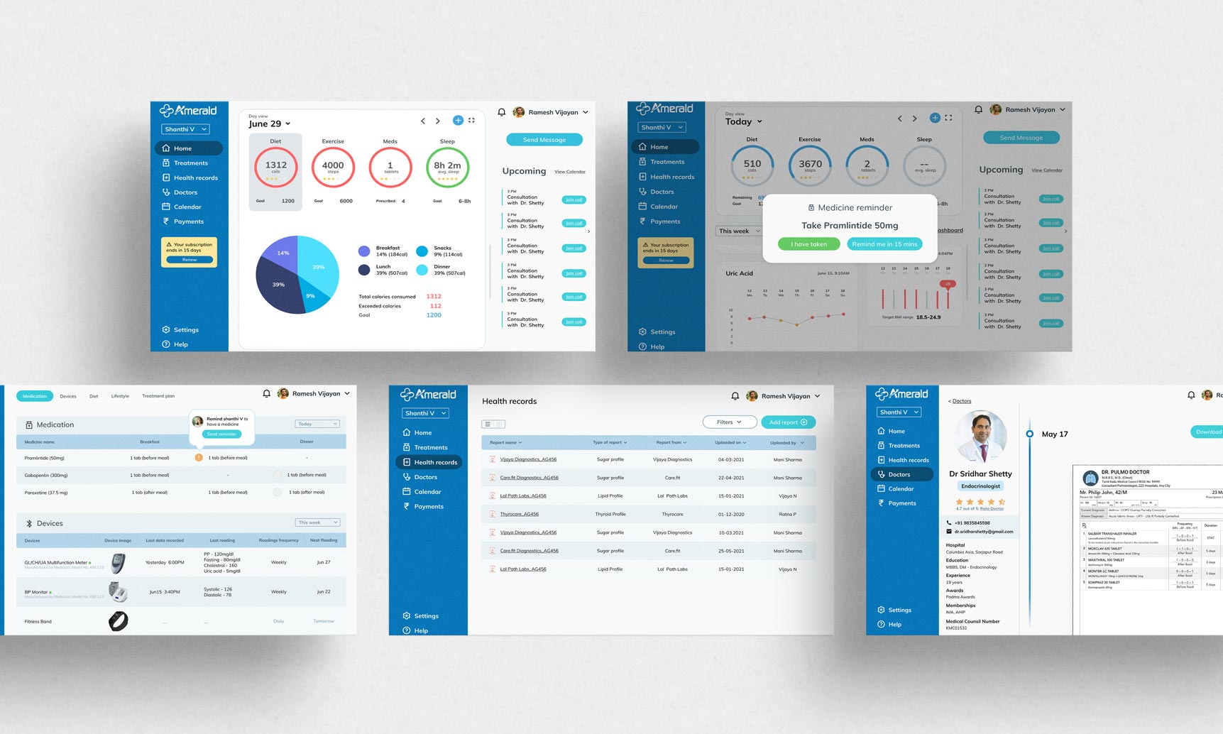
The patient portal UX Design carried forward the same visual language as the doctor portal. Here, the primary focus was to give the necessary health data to the patient at their finger tips. To do that, we depicted clear visualizations of data fed from the smart healthcare devices.
Values were colour coded in red, orange and green to indicate seriousness. The dashboard also had a Today counter at the top which indicated diet, exercise, medicines and sleep values for the day. This helped the patient keep track of their progress throughout the day.

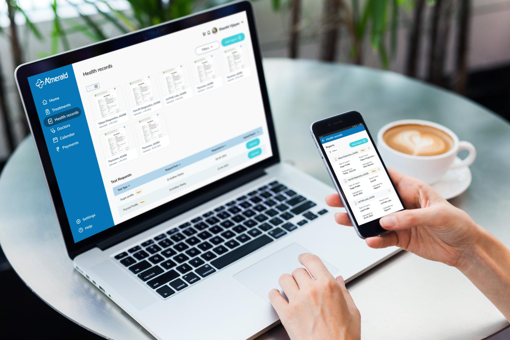
Other menu sections included treatments and health records which listed a detailed summary of the treatment details, medicines and devices connected along with test reports. Doctors section listed all the doctors on the platform that the patient was getting treatment from. Each doctor profile had a consultation history that the patient could refer to whenever needed.
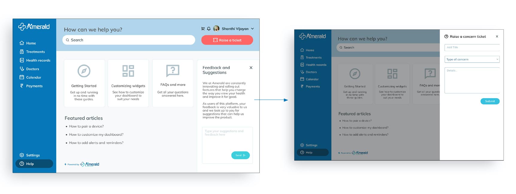
The Help section was a comprehensive repository of information and help that might be needed by the patient.
Caregiver portal UX Design
The caregiver portal – to be used by the patient’s children or care assistant – followed almost the same interface design as the patient
portal. They could do additional actions like renew plans, send reminders to the patient, view treatments, health records and doctors.
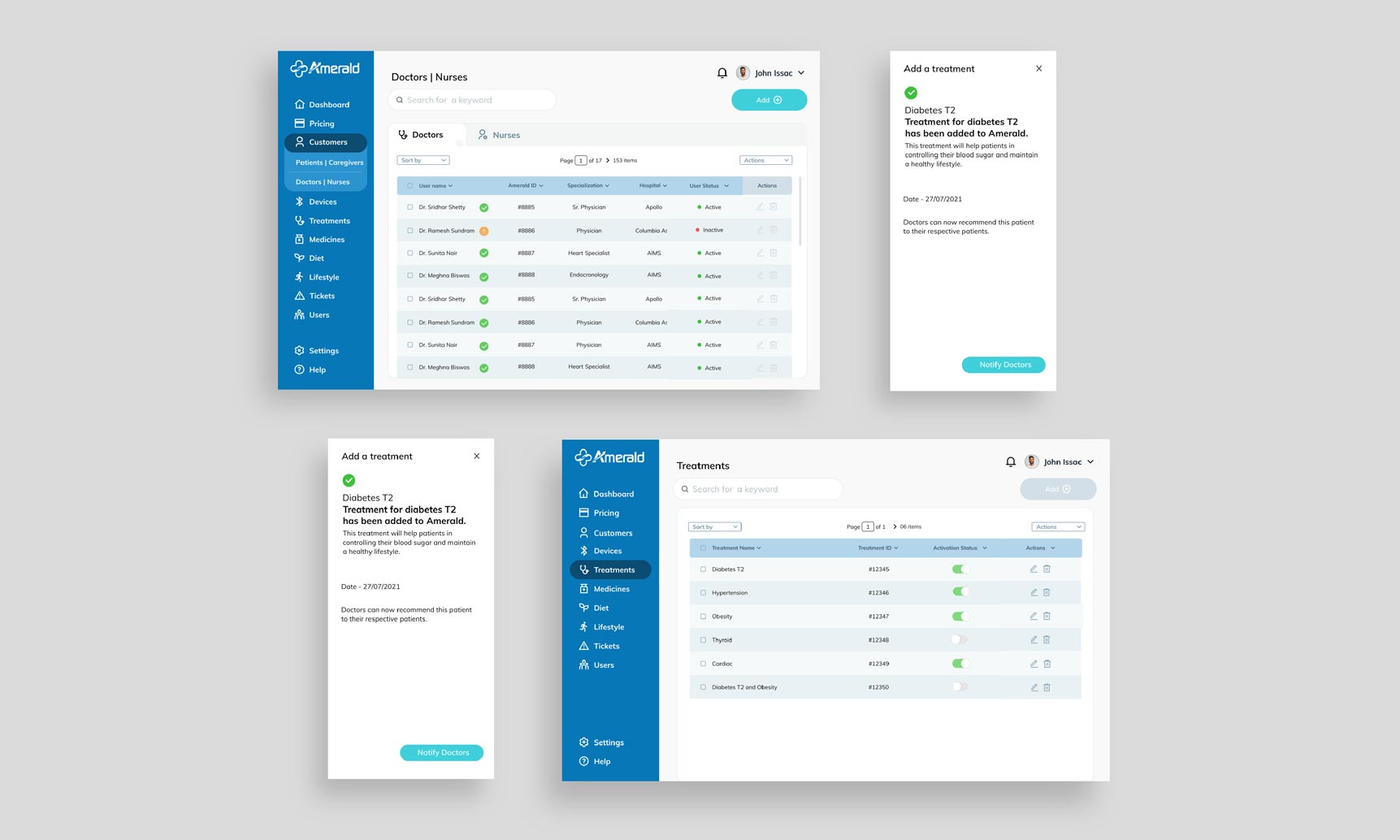
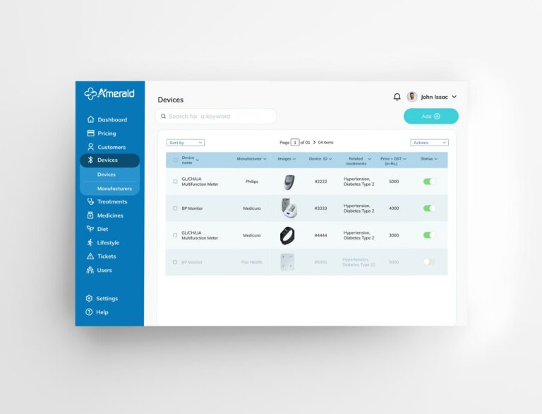
Admin portal
The admin portal was a backend portal for the Amerald admin staff. This too opened to a dashboard with stats about the number of users onboard, support tickets and quick onboarding.
Several other menu sections like pricing, customers, devices, treatments and more helped manage the entire platform.
Impact
The response to the app was positive from both doctors and patients alike.