
Let’s start a new design project together!
FONTS DO TELL A GREAT STORY
Ever wonder why brands choose
certain fonts?
How do you remember your favorite car? Does it have a cool and elegant logotype? Do you also flaunt your apparel brands? Well, then this article could possibly have your attention. I am sure a few car companies and fashion brands are already out there in your head.
Font &
Typeface
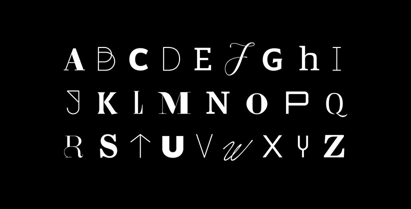
There are immense thoughts gone behind designing a specific font. Let me give you some basic insights on a typeface and a font because it is slightly confusing and it took some time for me to get into my head. You are all sharper and could probably grasp it in the first go. Here’s how I precisely differentiate a typeface and a font
A typeface is the overall design of lettering, the design can include variations, such as extra bold, bold, regular, light, italic, condensed, extended, etc. while a font is a particular size, weight, and style of a typeface.
A brand could attain impossible attention by just using the right font for their logotype.
1
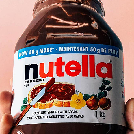
Nutella
Avant Garde Gothic
Nutella, something that holds a clear position in our daily life, something that makes our breakfast hustle easier and tastier. Let’s keep the cravings away for a while and have a closer look at the font. Nutella uses the charming Avant Garde Gothic Bold for their logo which is a geometric sans typeface released in the 1970s, by Herb Lubalin and Tom Carnase. Enjoy this piece of information along with your Nutella breakfast.
Spotify
LL Circular
Spotify is indeed a thing for the current world. Great music served on a great platform is always welcome, and so Spotify remains a good place in our hearts. Spotify uses the clean, crisp LL Circular bold, a geometric Sans Serif typeface released in 2013 designed by Laurenz Brunner. Know your Spotify better from now onwards.
2

3
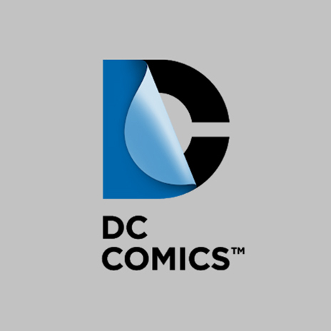
DC Comics
Gotham
We are all young enough for DC Comics, aren’t we? Yes, we are. We have always been, we will always be. DC Entertainment is one of the largest English-language publishers of comics in the world, featuring a wide variety of characters and genres.
Have you ever noticed the clean bold font they use, DC Comics uses the sensational Gotham Bold for their logotype. Gotham is a geometric sans-serif typeface family designed by American type designer Tobias Frere-Jones with Jesse Ragan in 2000. Let’s ponder upon this fact for the love for great comics.
Analyzing what pioneer designers have done before us is crucial. But even more fundamental is trying to grasp the reason for certain choices.
Rolls-Royce
Gill Sans
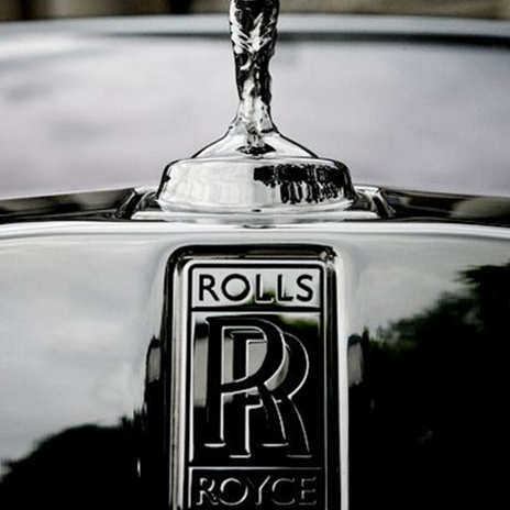
How would we depict the epitome of luxury? I am sure a good majority would be thinking about a Rolls-Royce, one majestic human creation. isn’t it?
When a company like Rolls-Royce fixes
a font for their logo, indeed the font is elevated to a new remarkable height. Rolls-Royce uses Gill Sans for their logotype. The British branch of Monotype in 1928 released Gill Sans designed by Arthur EricRowton Gill.
4
5
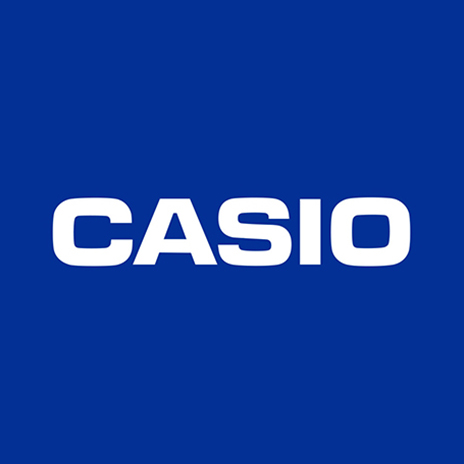
Casio
Eurostyle
The good old Casio, a legacy that goes on. We all have had a memory of a Casio. Maybe our first watch or that heritage piece our dad still owns. Yeah, have you ever had a moment staring at this font? Most of us have seen this quite close for over years on our wrists. Casio uses Eurostyle for its logotype, a geometric sans-serif typeface designed by Aldo Novarese in 1962. Now you have this good piece of information along with your good old Casio memories.
Observe more fonts from your daily life and try to figure out the logical thinking that went behind it.