Let’s start a new design project together!
Designing SaaS product for leading AI-focused tech player
Rezonant designed a SaaS Product for an AI-focused tech company, DataFoundry. They provide solutions to to pharma and medical clients.
Challenge
DataFoundry’s mSafety is an AI-focused product that is used by pharmaceutical companies to carry out rigorous drug safety testing procedures. This process is known as pharmacovigilance. As a team, the domain of pharmacovigilance was new to us and we began by understanding the fundamentals of this domain. mSafety had some unique and innovative features and we tried to come up with user-friendly solutions to incorporate them.
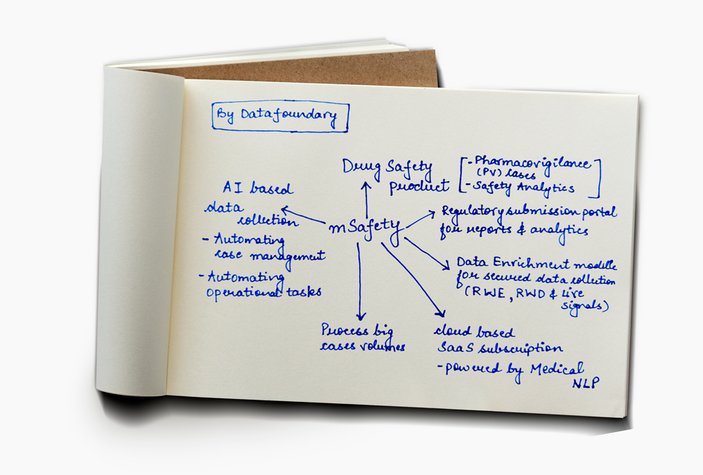
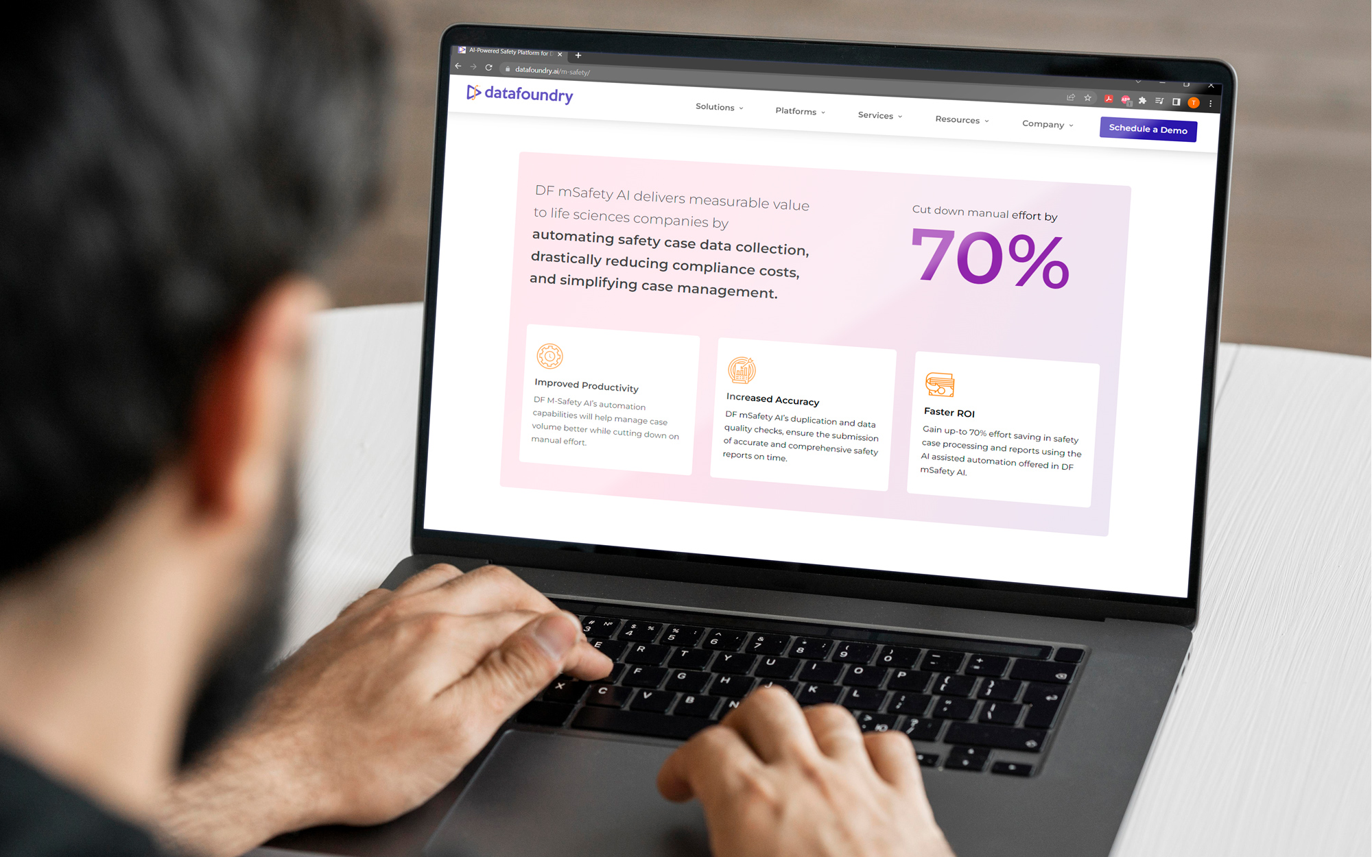
DataFoundry’s cutting edge AI-based safety software
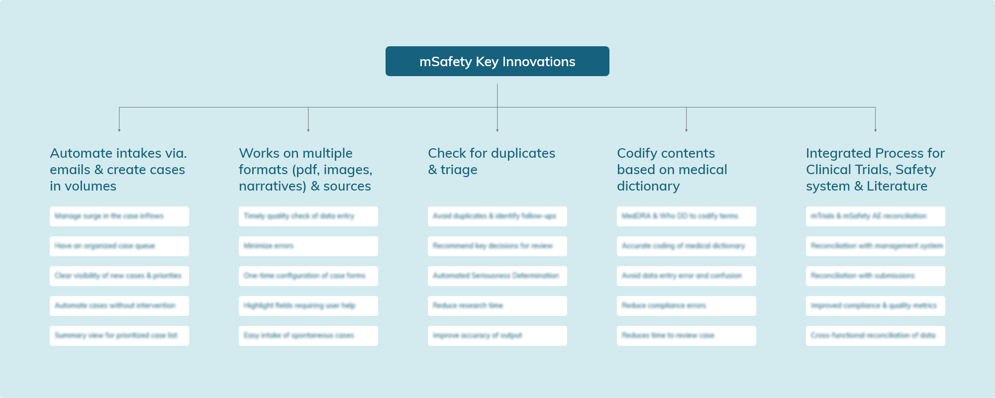
mSafty is a product catered to pharma and medical institutions. With pressure on safety departments to constantly innovate to catch up with the increasing number of adverse effects being reported, mSafety innovates on different levels to cater to the needs of the market.
mSaftey uses AI to perform pharmacovigilance to ensure the safety of medical drugs.
Key innovations that make mSafety stand out in the market
Strategy
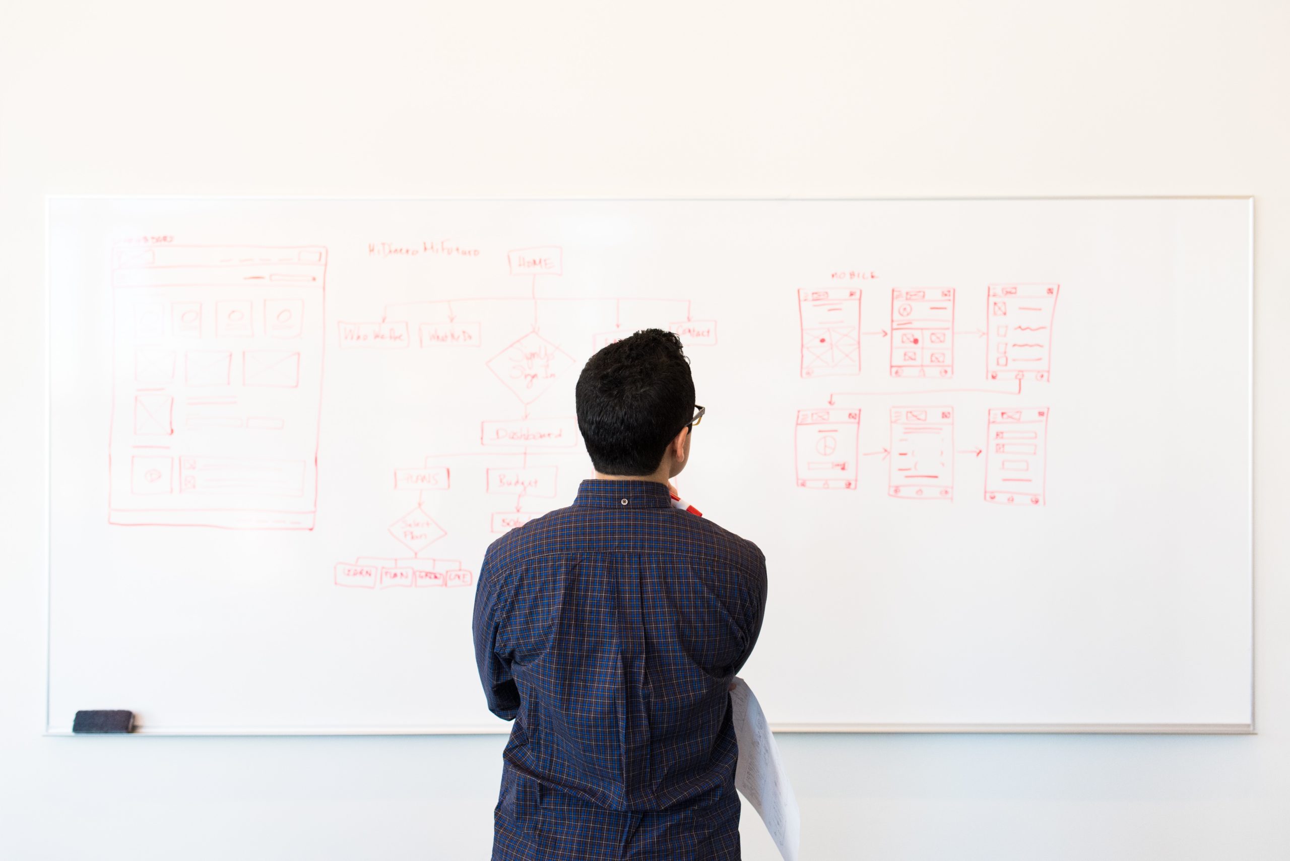
The team studied similar comprehensive ERP softwares to understand how complicated tasks can be translated to simpler flows. The team also spent time understanding user personas which helped chart out user flows.
Understand the customer personas
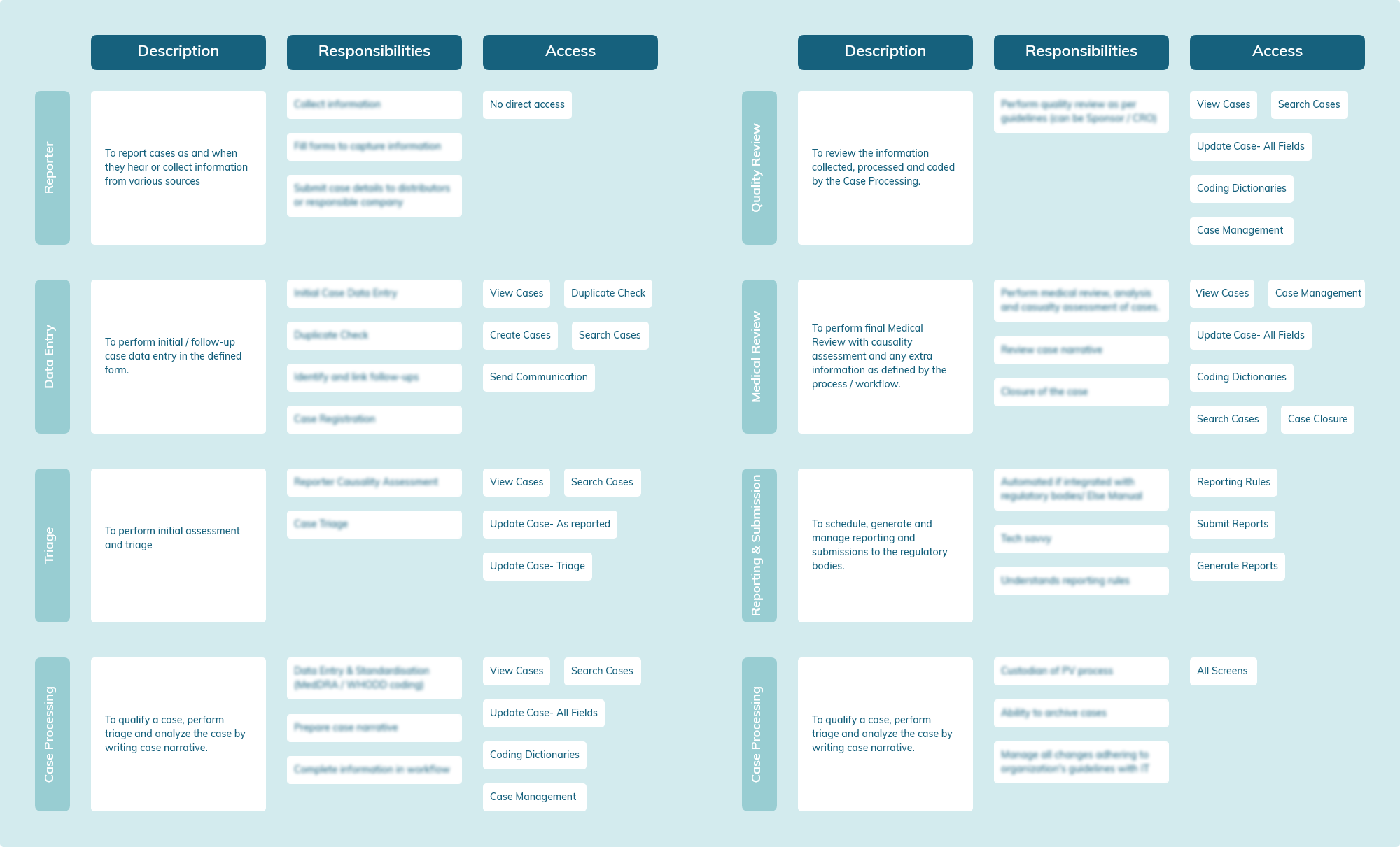
We had several sessions with the DataFoundry team to understand the user personas and the various needs of each role.
Working with a list of people who would use the application, we fleshed out the personas to understand how each employee would use and interact with the software based on their position and the different levels of access each of them would have to the interface.
Breaking down the flow for case management
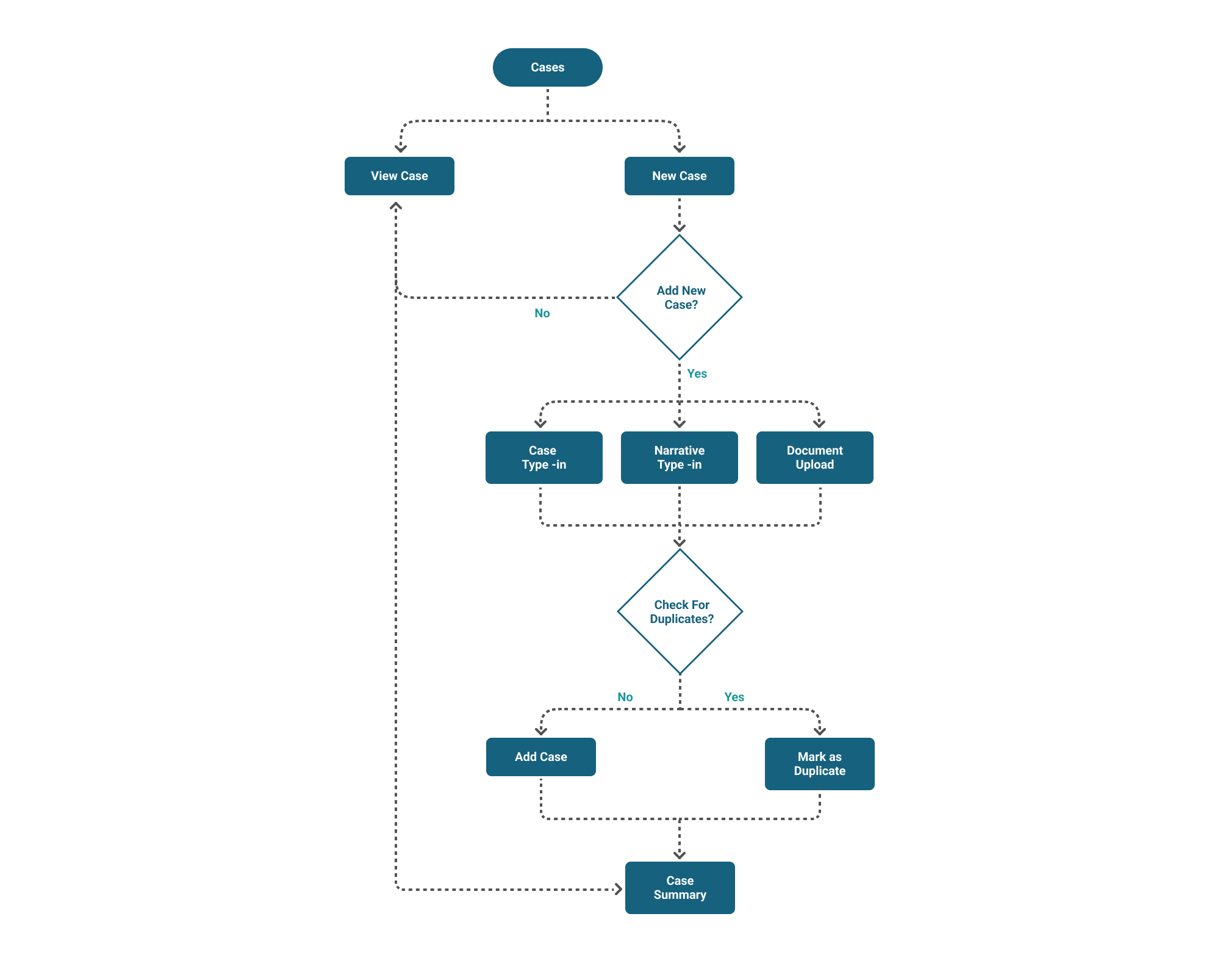
Since a lot of the innovation that mSafety has is around the intake of cases, we created an intuitive flow for uploading a case. We created forms for each intake flow which made the case upload process faster.
“What is a case? A case is an adverse event that is reported by any user of a drug. Cases can come in via various different media.”
One view to rule them all
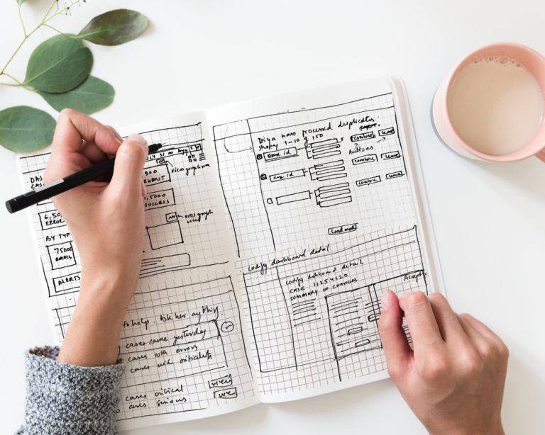
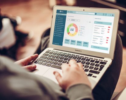
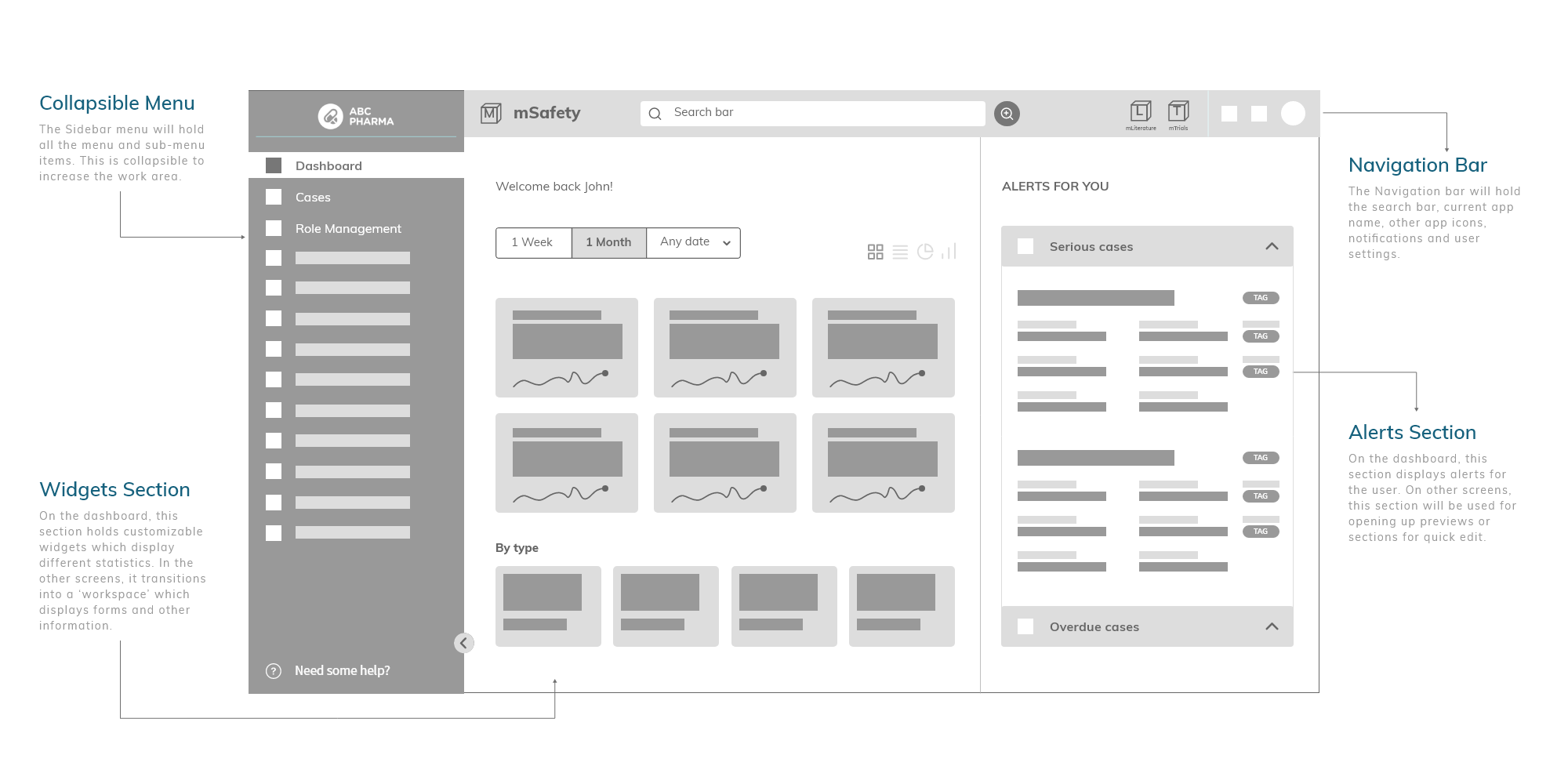
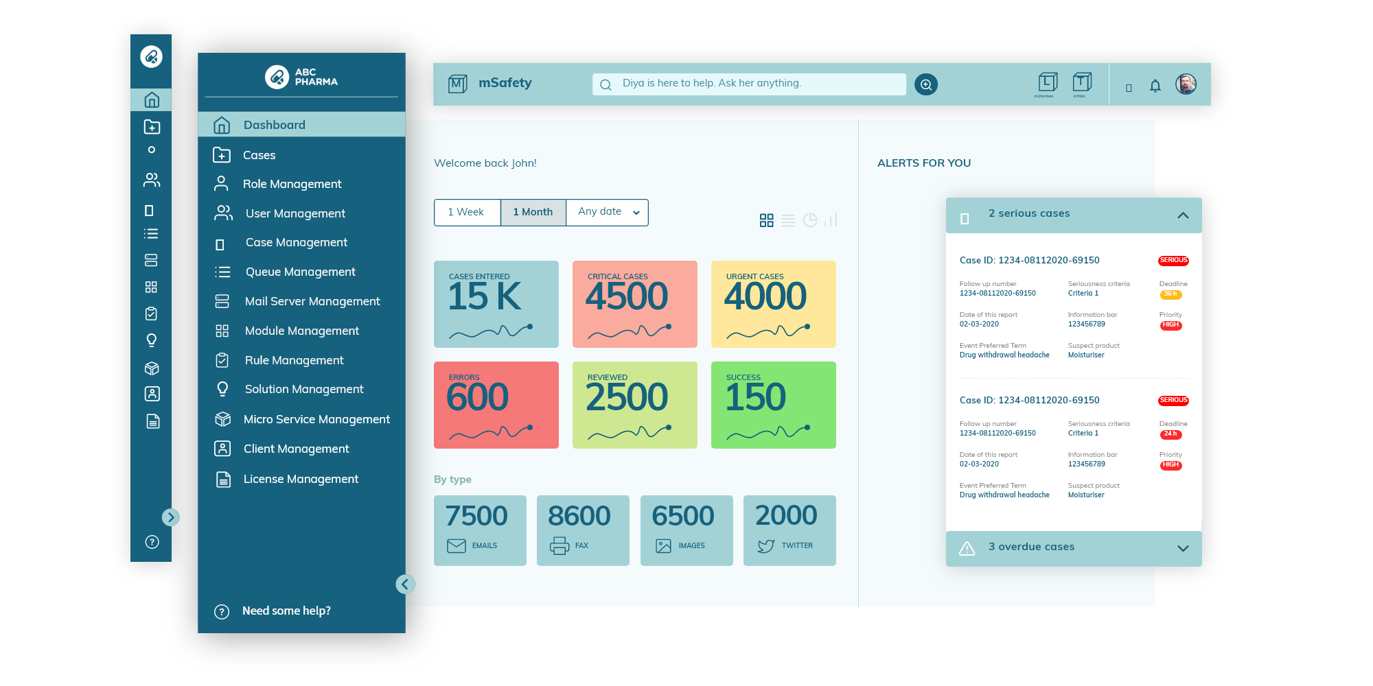
We introduced a dashboard to give users easy access to all the information that they needed.
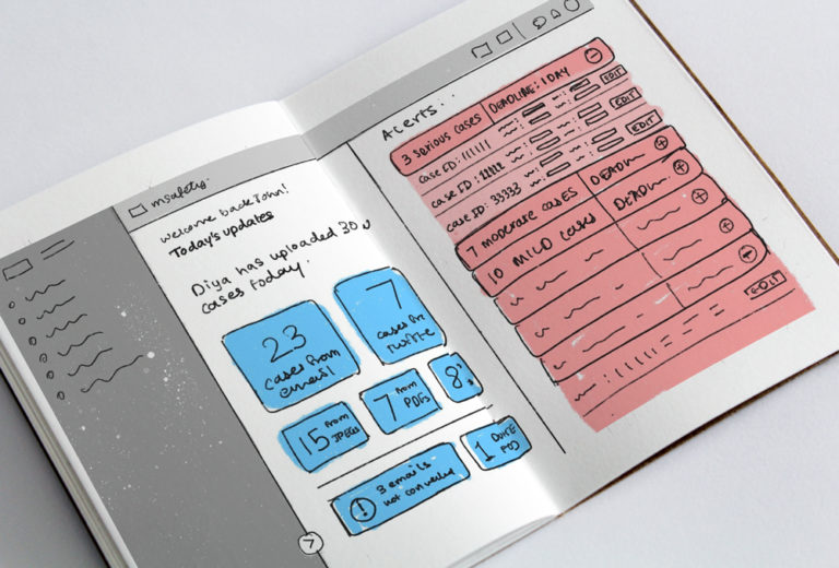
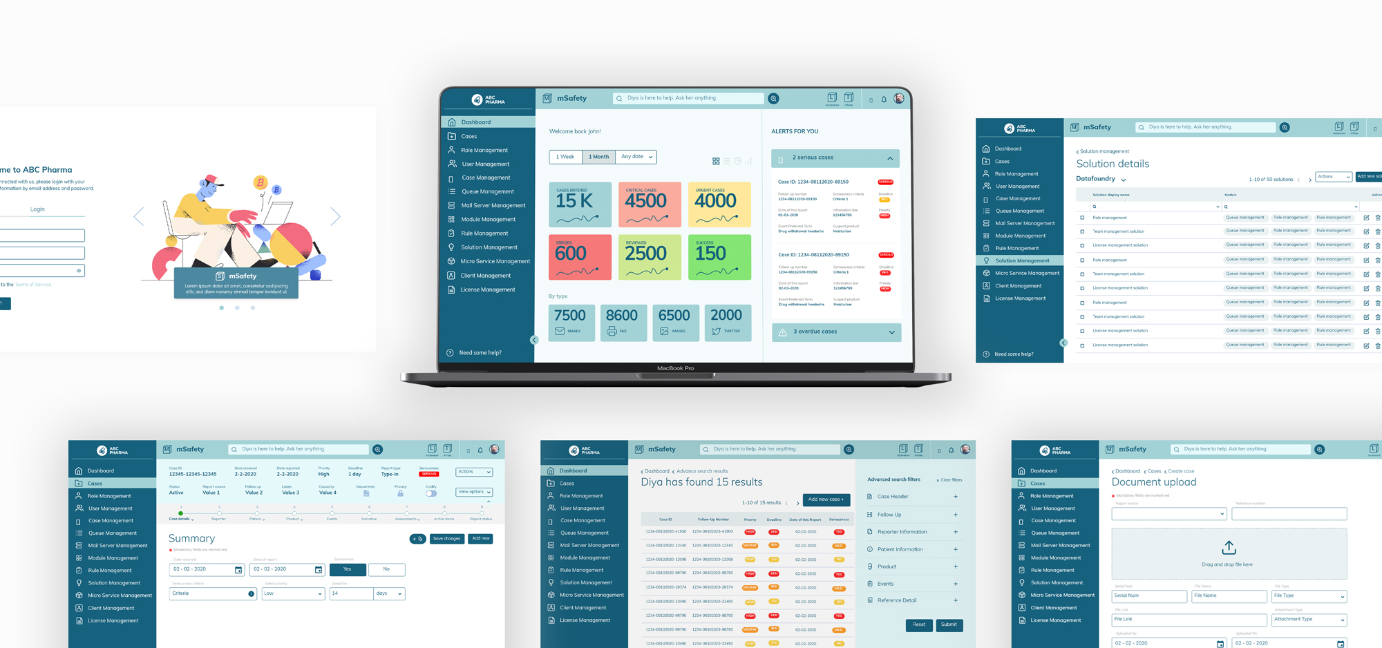
Since the application was cramped with lots of data and information, we simplified the user experience and added a dashboard layout that displayed actionable and relevant data. The dashboard was divided into 4 sections – Navigation bar, Collapsible menu, Widget section and Alerts section. Each user could customise their own dashboard
Design
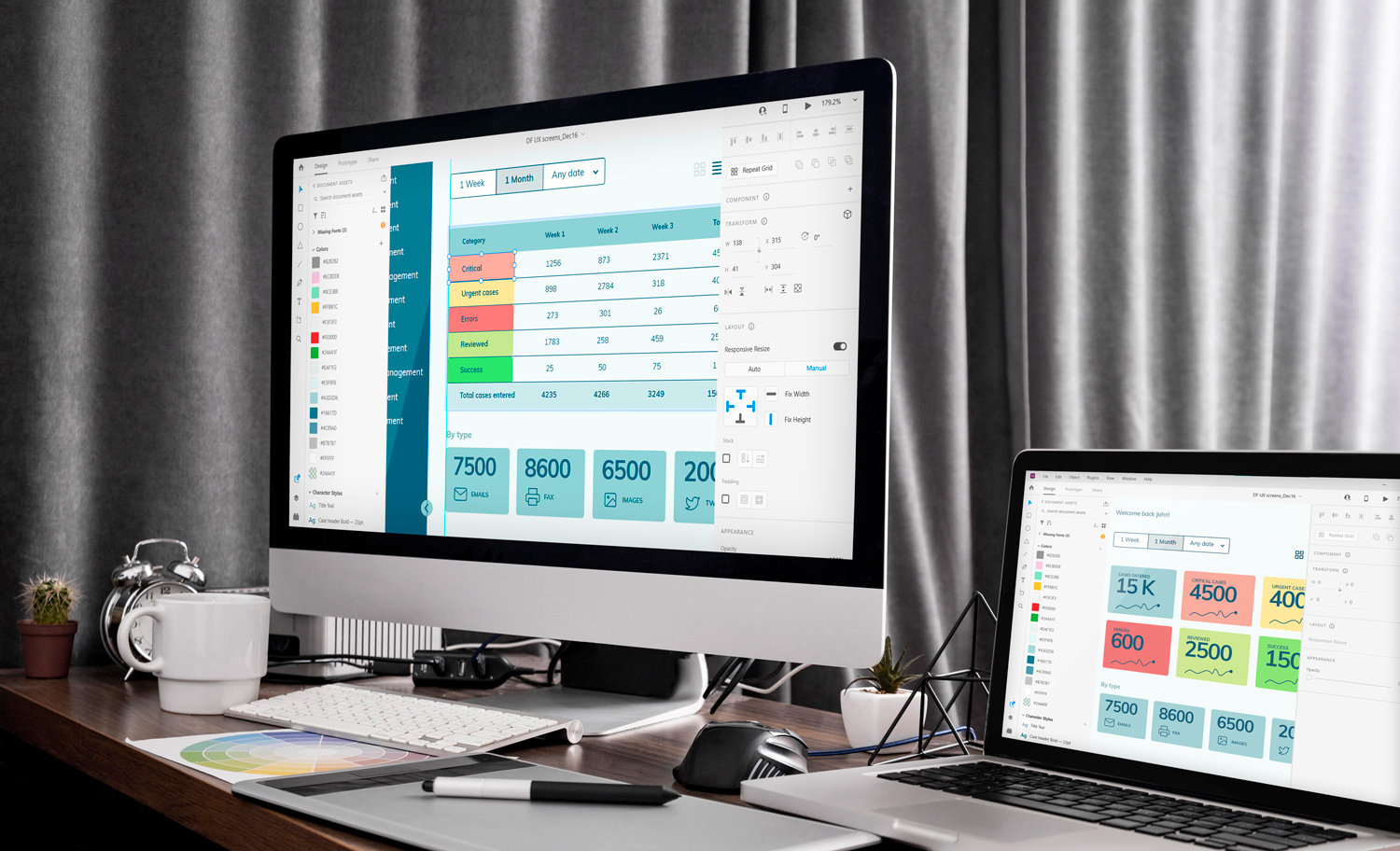
Along with the UX interventions, the team created different design options for the UI system. The key was to crack the dashboard design layout which would lay the foundation for the rest of the screens.
Design language and visual identity
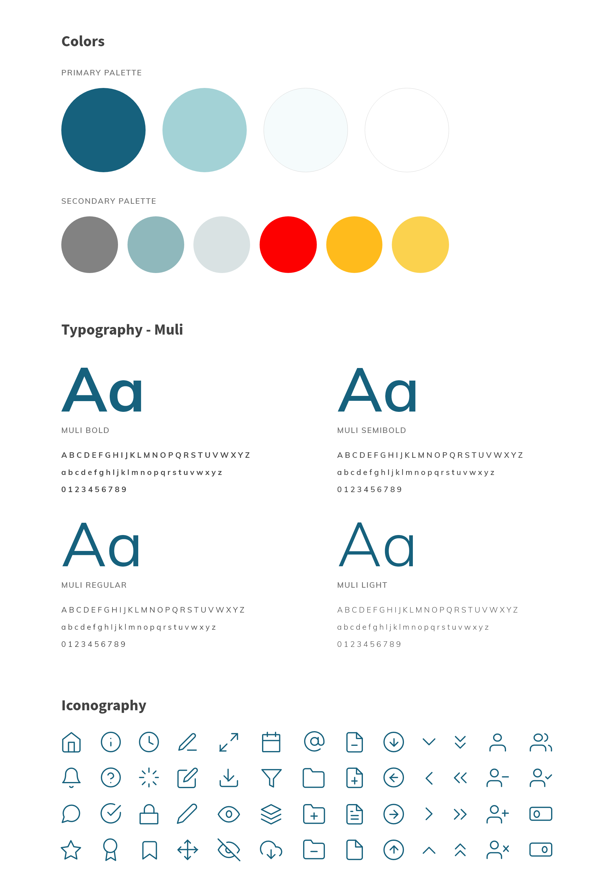
“Experimenting with various colour palettes to find one that reflects the brand.”
Using various combinations and colours, we experimented to find a colour palette that suited the AI-based platform. We wanted to ensure that the colours chosen helped the information stand out. The team decided to go with Muli, a contemporary sans serif type family that would be highly readable as well as appear friendly.

Simplifying the first screen user experience
The dashboard was designed to be easy to read and contain only essential information. This information varied according to different roles and was also designed to be customizable. We used basic principles of colour psychology to colour code different information according to importance.
“We showcased data in 3-4 easy-to-consume visualizations with big numbers and colour coding.”
AI-based search engine – Diya
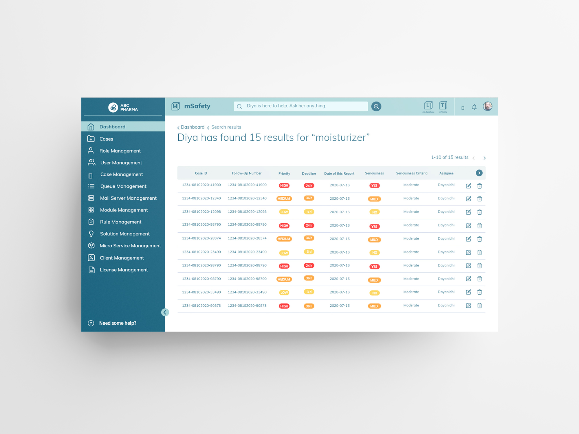
Diya is mSafety’s AI-generated search option. This feature helps navigate easily through multiple cases and numerous data sheets just by using keywords or phrases.
“A custom search engine Diya was created to simplify the search process.”
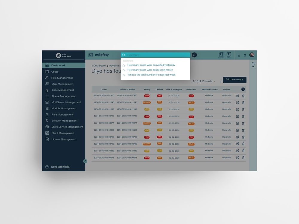
Suggested Search
In this method, the system suggests recommended queries based on a few words that the user has started typing. This would help users quickly navigate to what they were looking for.
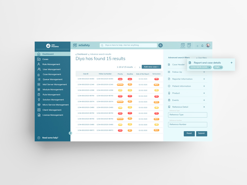
Advanced Search
This was a more in-depth search functionality that users would use only to search for something very specific. We created an accordion style UI design to showcase the multitude of filters that the user could select from.
Case input and management
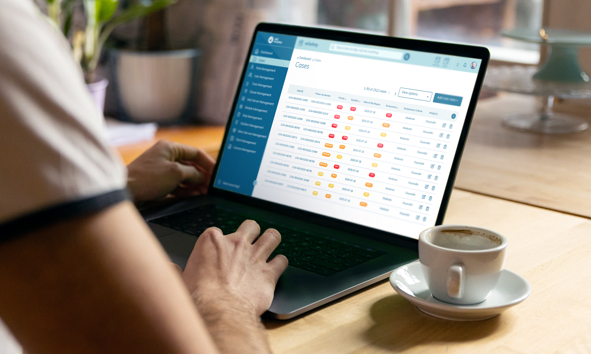
Every day multiple cases are logged in, either automatically or manually, and the case management table is the one place where the user can find them all.
“We created various view options and filters for the user to be able to view the cases via priority, deadline, date of report, seriousness and so on.”
Duplicate verification and comparison check
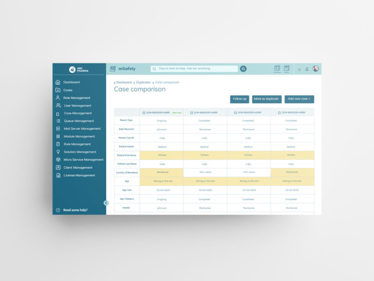
Case duplicates and their verification was a common problem faced by users in safety management. We created a comprehensive and easy-to-follow flow where a user can check whether a case is a duplicate by doing a comparison of different parameters. Similar fields of information were highlighted in yellow which made it easy for the user to spot the various similarities.
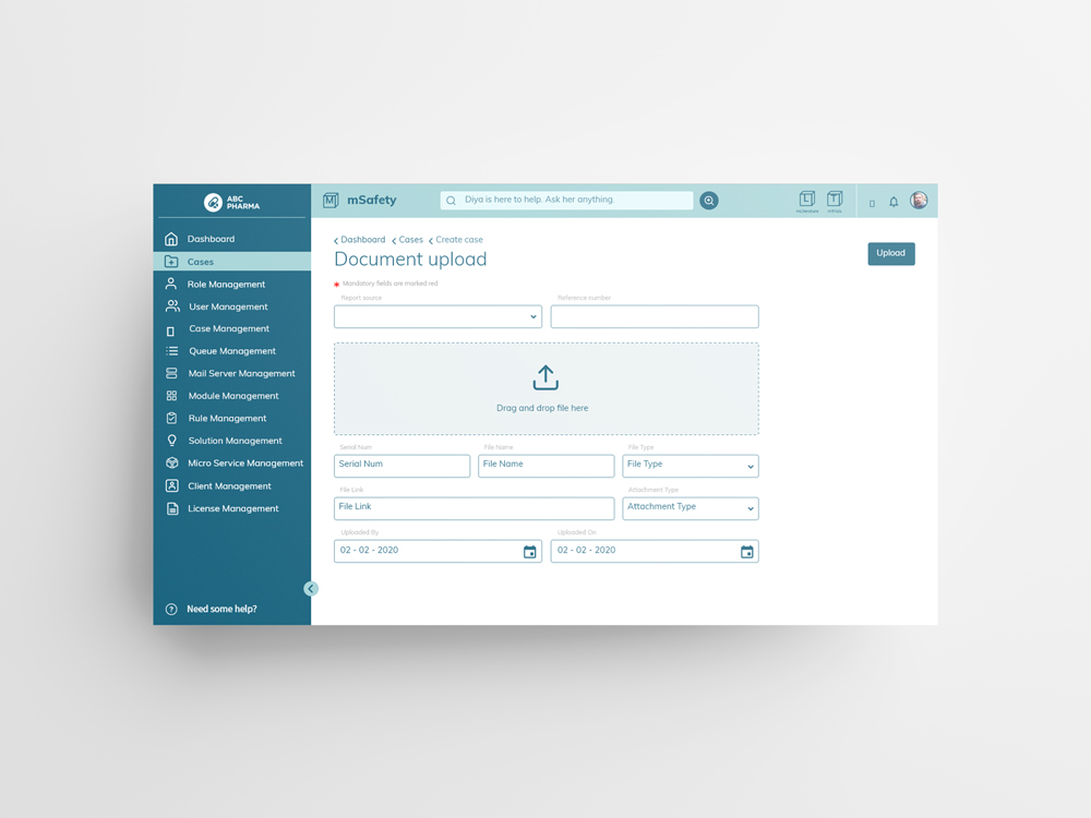
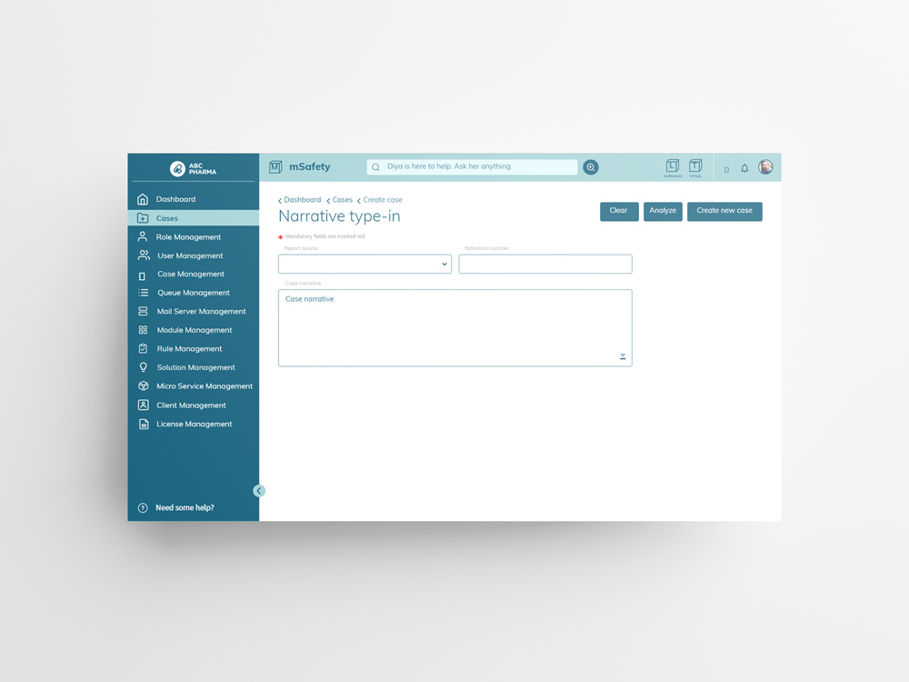
We also designed screens for the other two input methods – uploading a document and the speech-to-text method.
Case highlights and summary
To display all the important information in a case, a case header feature was created which would always remain sticky at the top. Each case had multiple pages and forms to be filled so we designed a step-by-step horizontal timeline which made the flow very clear to the user.
“A tool we used to simplify the UX was a case header and process timeline. This helped an employee get a brief summary of the case when they first viewed it.”
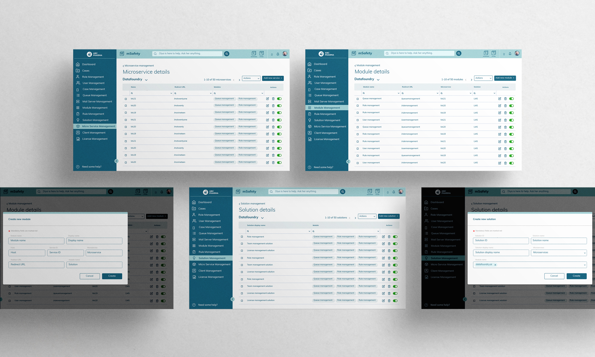
Admin Screens
The client admin screen helps decide what all tabs and dashboards are visible to employees of different roles.
“This screen helps manage the broader roles and the kinds of access they have.”

“Solution management talks about the various solutions mSafety provides.”
Features such as queue management and role management go hand in hand. It helps set the rules for how a case and the queue should be managed.
Impact
The product interface was seamless and met all the client’s requirements. The smooth flow and detailed structures were appreciated and well received by the clients.

