Let’s start a new design project together!
Brand Identity for Airports Infra-Leasing Company, Pushpak
Pushpak, a company that leases equipment to airports all over India, needed a new brand identity to showcase their new avatar in a more digital and tech-based working world.
Research
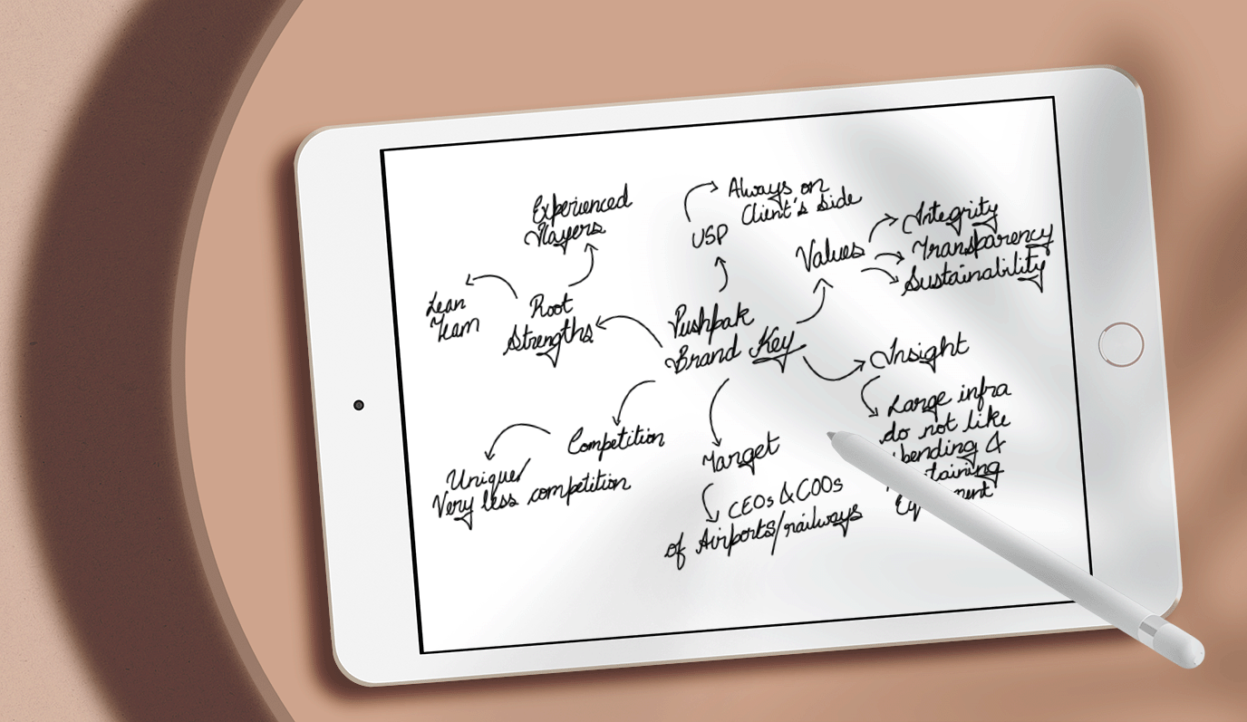
In the initial stages of the project, Rezonant conducted comprehensive research to gain a deep understanding of Pushpak’s business model, target audience, and industry positioning. The aim was to uncover unique aspects of Pushpak’s brand identity and determine key visual elements that could be integrated into the logo design.

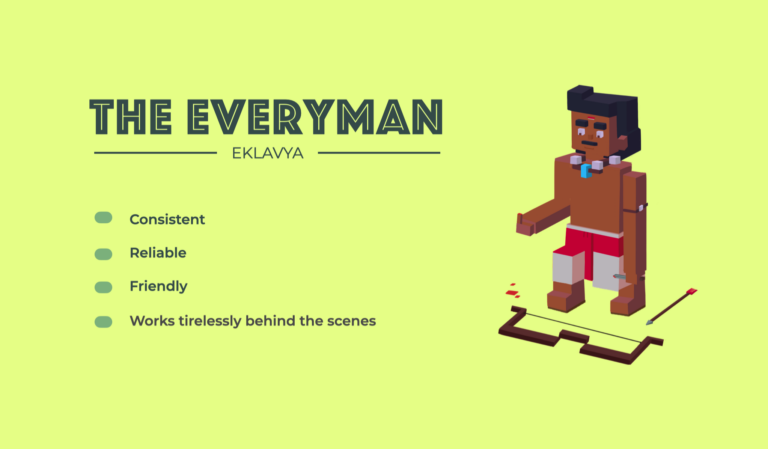
Brand Archetype- The Everyman
Aligning with one of Carl Jung’s renowned twelve archetypes, Pushpak embodies the ‘Everyman’ brand archetype in its operations and ethos.
The ‘Everyman’ archetype captures the essence of Pushpak’s brand personality—working tirelessly behind the scenes, reliable, friendly, and consistent. It is a trusted partner that integrates seamlessly into the operational fabric of airports, ensuring their smooth functioning and progress.
Design
Drawing inspiration from Pushpak’s mission and vision, Rezonant conceptualized a logo that captures the essence of growth and progressive momentum. The expanding petals in the logo reflect Pushpak’s relentless momentum and dynamic approach towards achieving its goals.
The core design element of the logo is a portion of a flower with burgeoning petals. The floral logomark represents the company’s steady growth and expansion within the aviation sector. The choice of a flower as a symbol is deliberate, as it signifies natural growth, beauty, and resilience – qualities that align with Pushpak’s brand values.
“The gradual increase in the logo’s size portrays the company’s continuous progress and its ability to adapt and evolve in a rapidly changing industry.”
“The choice of colours and fonts echo Pushpak’s ethos of being reliable, accessible, and approachable, lending a friendly and consistent voice to the brand’s visual communication.”


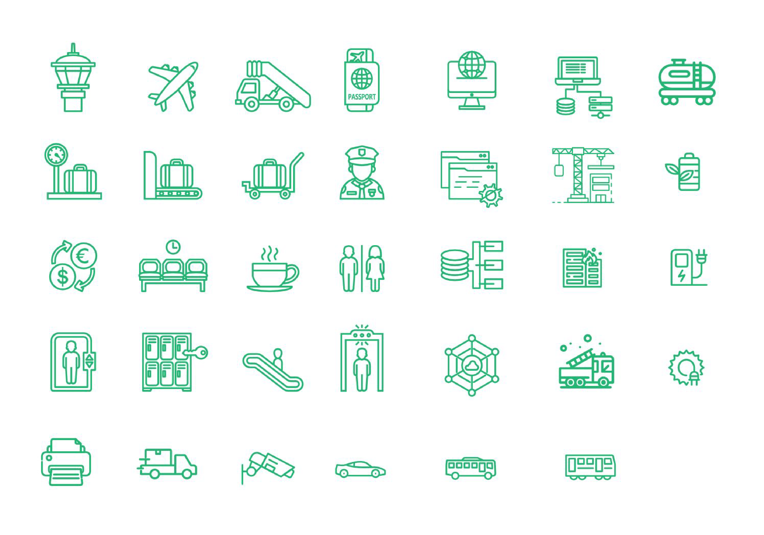
Iconography
Pushpak’s iconography aligns with the brand’s essence of simplicity and consistency, utilizing simple line icons rendered in the robust Brunswick Green colour. These icons, with their minimalist design, convey information efficiently & clearly, embodying the brand’s commitment to transparency and ease of understanding.

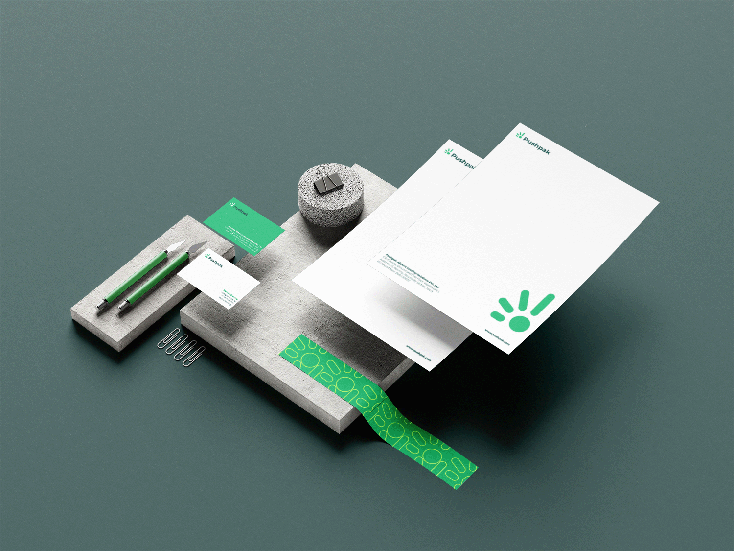
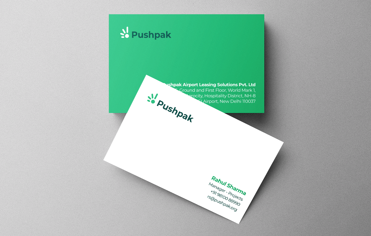
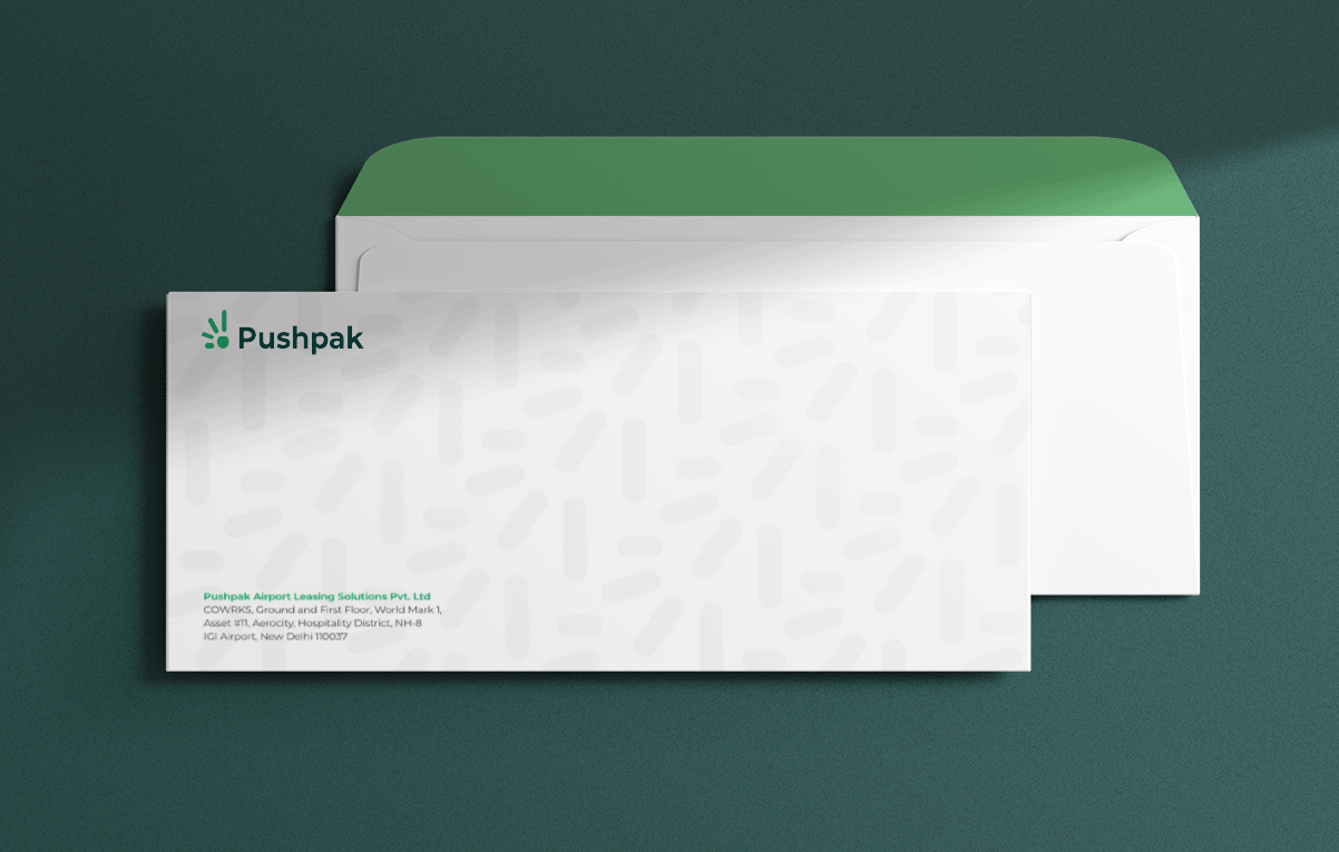
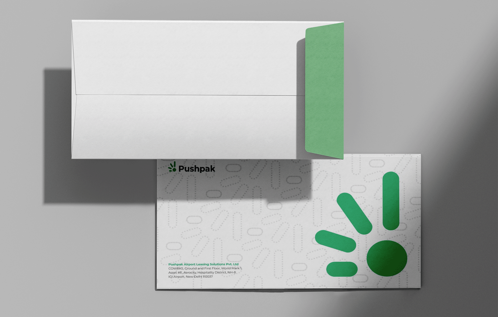
Primary Applications
Using the new identity of the brand we designed variety of printable brand assets that reflect the brand’s sophistication and commitment to quality service while maintaining a clean, uncluttered aesthetic.
“The designs embody Pushpak’s ethos of convenience and reliability, leaving a memorable impression on the recipients.”
Impact
Rezonant’s logo design effectively communicates Pushpak’s values and positioning. The visually striking logo captures attention, instills trust, and sets Pushpak apart from competitors, helping establish a strong brand presence in the industry.